As you already know, sunlight (solar energy, or energy from the Sun) is the primary source of energy for all processes that occur in Earth’s atmosphere and hydrosphere. This means that solar energy is also the primary driver of winds and ocean currents . But you might wonder: If the primary driver is just this single energy source, why are the patterns of global winds and currents that you saw in Figure 6.2–1 (repeated below) so complex?
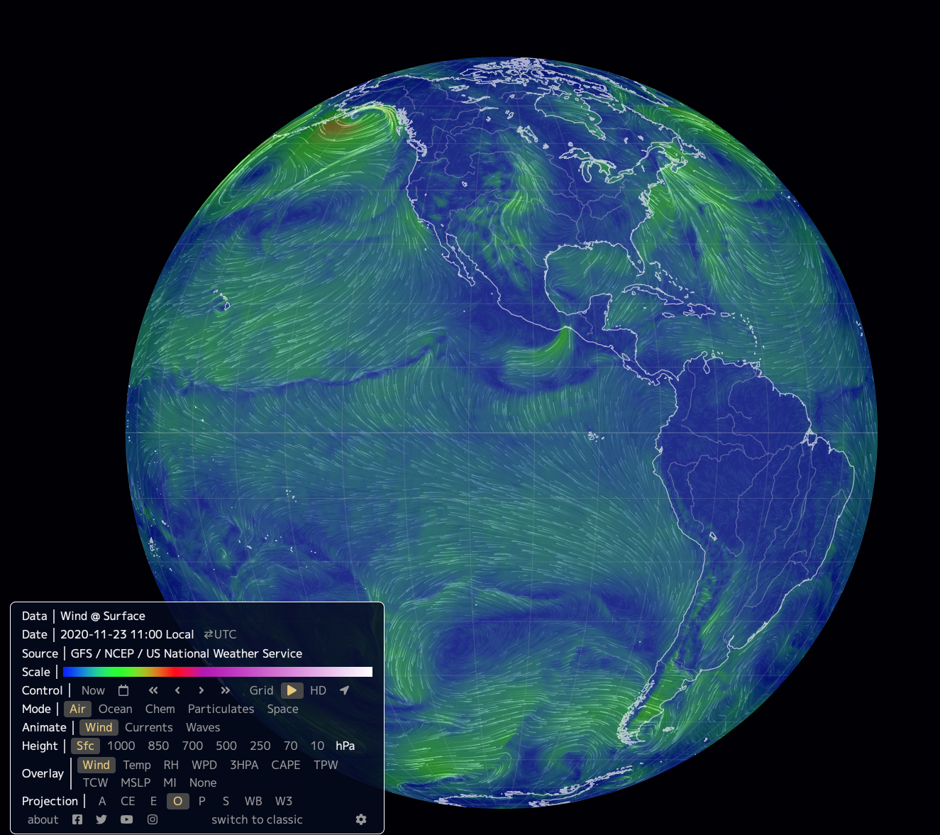
The answer gets to the heart of the complexity of Earth’s weather and climate: Winds and currents — along with other weather phenomena such as cloud formation and precipitation — are essentially ways by which energy moves from one place to another within Earth’s climate system. Because this energy is always in motion, it interacts both with itself and with other forces and features that are present on our planet. The result is the incredible complexity, yet with numerous clear patterns, that you see in Figure 6.2–1. In this section, we’ll explore the forces and features that work together to create global winds and currents.
Drivers of Wind
Let’s begin by considering the drivers of wind. We’ll focus on four major factors that play important roles, each explored below in more detail:
- variation in solar energy input with latitude and season.
- effects of Earth’s rotation
- local variations in air pressure
- effects of Earth’s surface features (the surface topography )
Variations in Solar Energy Input
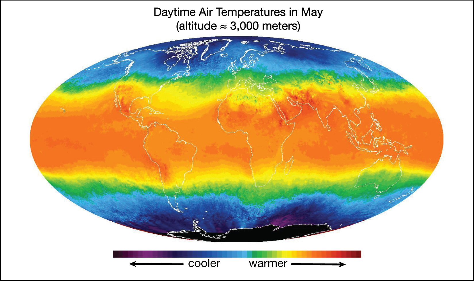
The first major factor in driving winds and weather is the fact that solar energy input varies around the world and at different times. The strongest influence is latitude. Regions near Earth’s equator get more direct sunlight and hence more solar energy than regions near the poles (Figure 6.2.1–2).
Remember that the precise location of the strongest solar heating varies with the seasons (see Section 2.2.1), because Earth’s axis tilt means that different latitudes get their most direct sunlight at different times of year. Use the following quiz to make sure you remember the seasonal effects. Then remember these effects as we continue our discussion of winds.
Quiz – Seasonal Effects on Temperature Around the World
Answer the following questions based on what you know about seasons. You may wish to review Figure 2.18.
Note: As always, after you finish the quiz, be sure you read the feedback that explains the correct answers, to make sure you understand the reasons for these answers.
Activity/Discussion
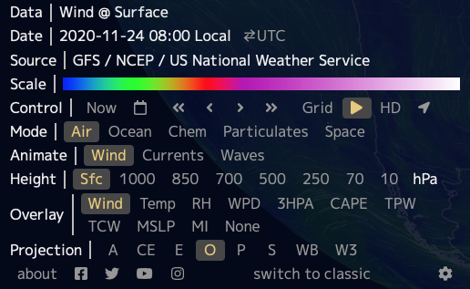
Viewing Temperature in the Earth Project
Again open The Earth Project of Figure 6.2–1, along with its menu. Be sure that you start with its default menu options in which the top line (Data) reads “wind @ surface.” If it doesn’t, you should be able to get to the default menu by setting the menu buttons to:
Mode = Air
Animate = Wind
Height = Sfc
Overlay = Wind
Projection = O
Now change the Overlay option to “temp,” so that the Data line reads “wind + temperature @ surface.”
- Briefly explain how the map supports the general idea that solar heating is strongest near the equator and weaker near the poles.
- Use the Control menu to view a temperature map for the Earth as it appears around the times of the June solstice, December solstice, and equinoxes. What changes do you notice with the seasons? Explain.
- Notice that Earth’s poles are always much colder than equatorial regions, no matter what time of year you choose. Why is that? Bonus: What planet in our solar system sometimes has one pole that is warmer than its equator, and why?
This activity/discussion can be done quite quickly if students remember how to change the menu settings in the Earth Project that they learned in the earlier activity “Explore the Earth Project.”
- (1) This first question simply makes sure that students understand the color scale on the “wind + temperature @ surface” map, in which case it is fairly obvious that the orange/red (warmer) regions are generally near the equator while the blue/purple (colder) regions are near the poles.
- (2) From the earlier activity and their understanding of seasons, students should know how to choose dates near each of the solstices and equinoxes. They should notice that the warmer temperatures generally shift northward in northern summer (June solstice) and southward in southern summer (December solstice), while being closest to the equator around the equinoxes. It does not matter what year they choose, because while there can be small weather differences from year-to-year, the general seasonal pattern remains the same.
- (3) Students should recall that the seasonal pattern arises from Earth’s axis tilt of 23½°, which is small enough that the poles never get direct sunlight. For the “bonus” question: Some students may recall that the planet Uranus has an axis tipped almost on its side (close to 90°). Therefore, as it orbits the Sun, it goes from having its North Pole getting nearly direct sunlight on one side of the orbit to its South Pole getting this direct sunlight on the opposite side of the orbit. At these times, the pole of Uranus that is facing toward the Sun will be warmer than the equator.
Effects of Earth’s Rotation
As an Earth Science teacher, you are probably aware of the important role that the Coriolis effect plays on Earth, but if you are like most teachers, you may still be confused about how the effect actually works. This is because the effect is often presented in confusing ways (in fact, you’ll find lots of confusing descriptions if you search the web for information on the effect). However, while the mathematical details can get complex, the effect itself is actually easy to understand: As you’ll see in our discussion below, it is really nothing more than translating lines that are straight in space onto a rotating reference frame. We urge you to get familiar with the concept yourself before you discuss it with students. You can do that by reading through this section, and in particular by doing for yourself the activities that illustrate the effect.
Our second major effect on winds comes from Earth’s rotation, through something known as the Coriolis effect . As a first step in understanding the Coriolis effect, let’s review the meanings of the terms clockwise and counterclockwise as they apply to rotation (Figure 6.2.1–3):
- Clockwise is the direction that the hands on a clock move. You can remember clockwise as the direction that the fingers on your left hand curl when your thumb is up (which is also the same as the direction the fingers on your right hand curl when your thumb is down).
- Counterclockwise is the direction opposite to that in which the hands on a clock move. In other words, it is the direction that the fingers on your right hand curl when your thumb is up (or the direction the fingers on your left hand curl when your thumb is down).
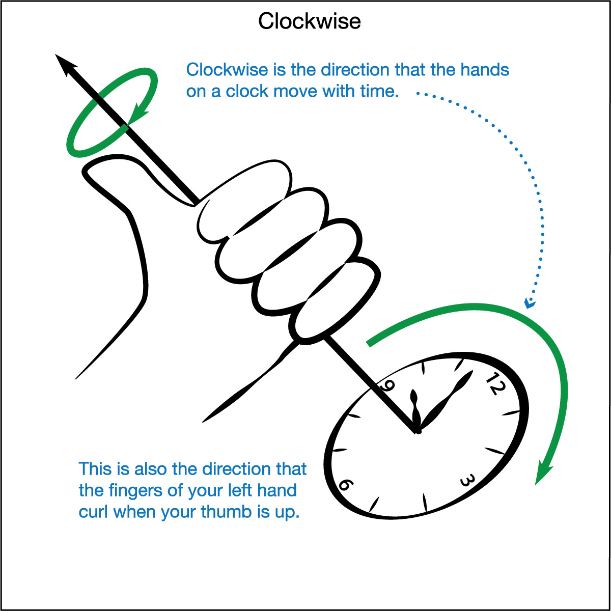
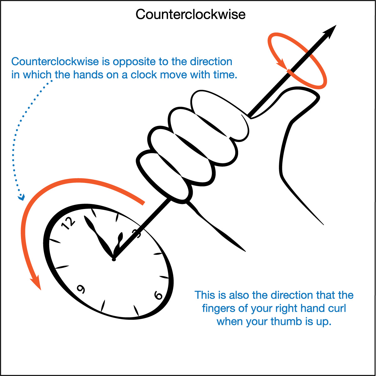
Figure 6.2.1–3 – These illustrations show the definitions of clockwise and counterclockwise rotation.
The Coriolis effect occurs on rotating objects like merry-go-rounds and planets. If you have access to a playground merry-go-round, you can experience the Coriolis effect for yourself by rolling a ball while the merry-go-round rotates (Figure 6.2.1–4). The rolling ball will seem to curve almost by magic, but the motion is easy to understand:
- If you were watching the ball from above the merry-go-round, you would see that the ball goes in a straight line .
- However, when you watch the ball while on the merry-go-round, the merry-go-round’s rotation makes the ball appear to follow a curved path.
If your merry-go-round is spinning counterclockwise, then the ball will always appear to curve toward the right as it rolls, no matter which direction you start it rolling. If the merry-go-round instead spins clockwise, then the ball will appear to curve toward the left.
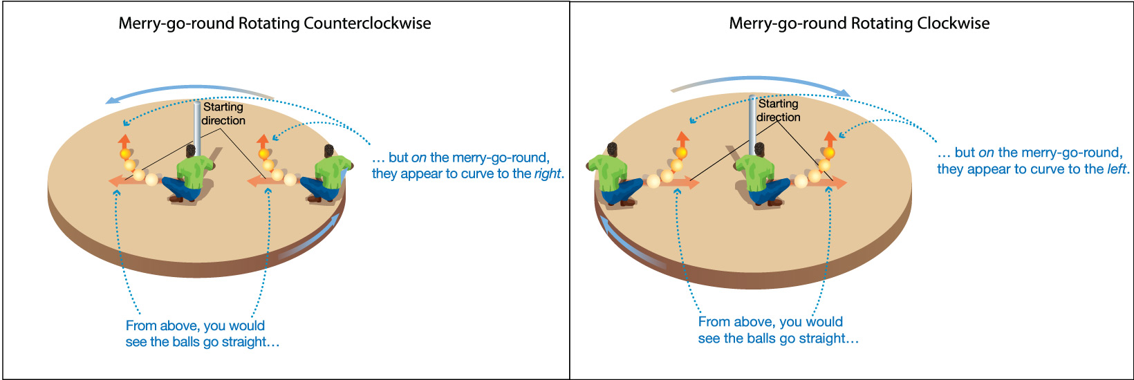
Figure 6.2.1–4 – The Coriolis effect explains why a ball rolled on a merry-go-round appears to follow a curved path. Credit: Adapted from The Cosmic Perspective.
Activity
The Coriolis Effect with Pen and Paper
You can demonstrate the basic idea behind the Coriolis effect with just a pen and paper. Each student needs a blank sheet of paper and a pen (preferably a marker pen) that will draw on the paper without requiring you to press down hard. It’s best to work in pairs, taking turns to do the following.
Step 1 – Your partner should hold your sheet of paper still. Put your pen on the paper near one end. Then, close your eyes, and move your pen as straight as you can, so that you draw a straight line on the paper.
Step 2 – Repeat Step 1, except this time your partner should rotate the paper counterclockwise while you are drawing your straight line with your eyes closed.
Step 3 – Repeat again, this time with your partner rotating the paper clockwise while your draw your straight line with your eyes closed.
Discuss: What happened to your “straight” lines when the paper was rotating as you drew them? Explain how your results compare to the Coriolis effect shown for the merry-go-rounds in Figure 6.1.2–4.
This activity can be done quickly and will demonstrate the underlying simplicity of the Coriolis effect. It is very important that students have pens that write easily on the paper, so that they don’t need to push down hard, since pushing down hard would make it difficult for their partners to rotate the paper beneath them while they work. Notes:
- The purpose of having students draw with their eyes closed is so that they’ll recognize that the changes from a straight line that they see in steps 2 and 3 are due to the rotation of the paper, not to how they moved the pen.
- Assuming they do everything correctly, they should clearly see that their lines curve to the right in step 2 and to the left in step 3, just as shown for the merry-go-round rotating the same way in Figure 6.2.1–4.
- Technical note: This activity shows how a straight line becomes curved in a rotating reference frame, which is the essence of the Coriolis effect. However, it ignores one component of the motion that leads to the Coriolis effect on Earth (or on a merry-go-round): Because the students draw their straight lines in a non-rotating frame (your classroom), the pen moves only with the velocity of the student’s hand. As you can see in Video 6.2.1–5 (or with the underlying simulator used in that video, which you can access at https://javalab.org/en/coriolis_effect_en/), the initial velocity of an object on Earth has two components: one based on the direction it is “thrown,” which is analogous to the pen direction in this activity, and one based on its instantaneous tangential velocity on the rotating Earth, which is not included in this activity.
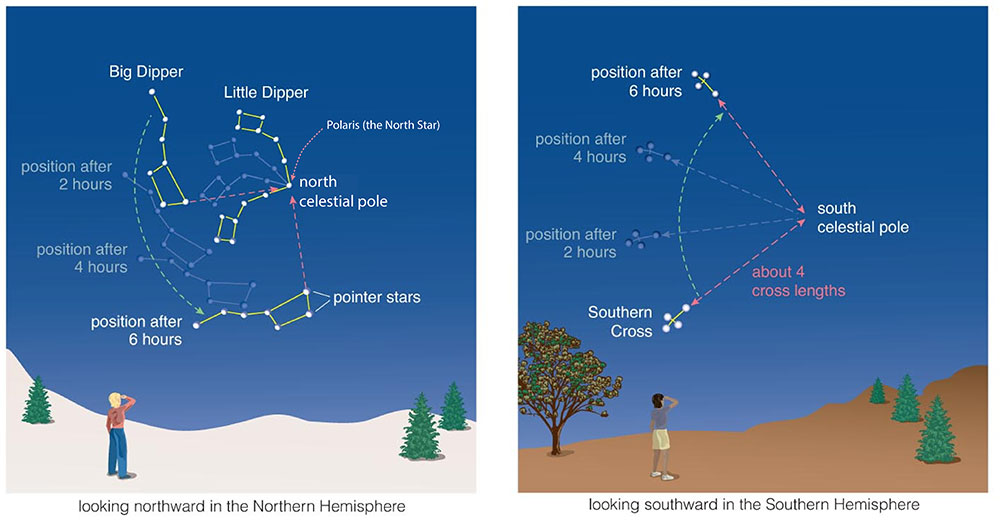
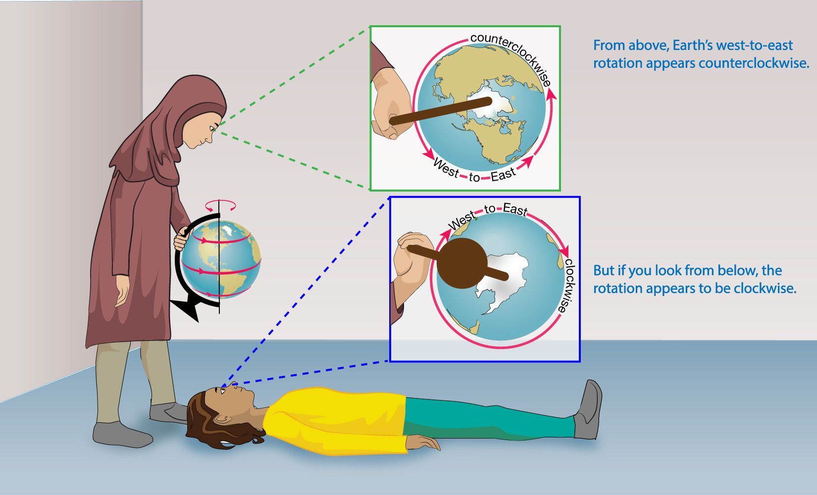
The Coriolis effect also occurs on our rotating Earth. Remember that Earth rotates from west to east, which is why the Sun, Moon, planets, and stars all appear to rise in the east and set in the west. If you grab a globe and rotate it in this west to east direction, you will notice that the rotation is counterclockwise as you look down from above the North Pole. But if you lay down on the floor so that you are looking up toward the South Pole, you’ll see that the rotation now appears clockwise (Figure 6.2.1–5). In other words, Earth’s rotation is always the same (from west to east), but whether it appears counterclockwise or clockwise depends on whether you look at it from above or from below.
Activity
Earth’s Rotation from Different Vantage Points
Let’s do the activity shown in Figure 6.2.1–5. It will work best if you have a globe that you can spin, but if you don’t, you could use any spinning ball instead. To make the activity easier, work with a partner, so that one of you can hold and spin the globe (or ball) while the other observes from above and below as follows:
- The student holding the globe (or ball) should spin it so it is going from west to east like the real Earth. Keep making it spin while your partner watches it.
- The student who is observing should first look down at the rotation from above, then lay down on the floor and look up from below. In each case, notice whether the spin is clockwise or counterclockwise.
Then trade places so that both you and your partner have a chance to observe, and discuss the following questions.
- Does the actual direction in which Earth is spinning ever change?
- Is the rotation clockwise or counterclockwise when you look down from above the north pole?
- What happens when you look up from below (while lying on the floor)?
4. Look back at Figure 2.15, which shows how the sky appears to turn around the celestial poles in the northern and southern hemispheres. How do your results from this activity explain why the sky appears to rotate counterclockwise when you look to the north and clockwise when you look to the south, even though the Sun, Moon, planets, and stars always rise in the east and set in the west?
This activity simply has students see for themselves the idea illustrated in Figure 6.2.1–5. Notes on the discussion questions:
- (1) Earth’s rotation never changes. It is always from west to east.
- (2) and (3): However, this rotation appears different depending on your vantage point: From above the North Pole it is counterclockwise and from “above” the South Pole it is clockwise.
- (4) The fact that we live on a planet that rotates from west to east means that the sky appears to turn in the opposite direction (from east to west), explaining the daily pattern of rising and setting. But this pattern looks counterclockwise when you look toward the north and clockwise when you look toward the south, explaining the rotation we see for circumpolar stars around the two celestial poles.
You can now understand the Coriolis effect on Earth, which is demonstrated in Video 6.2.1–6. As you watch the video, be sure to notice what you learned above: Earth’s rotation is always from west to east, but this rotation appears counterclockwise in the Northern Hemisphere and clockwise in the Southern Hemisphere. As a result, the paths of objects in the two hemispheres look much like the paths for the counterclockwise and clockwise merry-go-rounds rotating that you saw earlier:
- In the Northern Hemisphere, the path of any object traveling a long distance will tend to curve to the right.
- In the Southern Hemisphere, the path of any object traveling a long distance will tend to curve to the left.
It does not matter what kind of object we are talking about: it could be a ball or a missile or molecules of air carried along with the wind.
Video 6.2.1–6 – This set of animations demonstrates the Coriolis effect on Earth. Notice that the paths of objects traveling long distances always curve to the right in the Northern Hemisphere and to the left in the Southern Hemisphere. Credit: Video created with the JavaLab Coriolis simulator, which you can experiment with for yourself by going to this link.
The Coriolis effect on air explains something you may have heard about before: Storms like hurricanes circulate in opposite directions in the Northern and Southern Hemispheres. Video 6.2.1–7 explains why.
Video 6.2.1–7 - This animation shows how the Coriolis effect causes storms to circulate in opposite directions in the two hemispheres.
There is one more important idea to know about the Coriolis effect. As you study the merry-go-round or Earth examples, you’ll see that the curving paths created by the Coriolis effect are noticeable only when an object travels a significant distance compared to the size of the merry-go-round or Earth. It is not noticeable when the distance is small (in comparison to the size). This leads to the following important idea:
On Earth, the Coriolis effect is only noticeable only when winds or objects travel over distances of at least tens to hundreds of kilometers.
Therefore, contrary to a common myth, the Coriolis effect does not have any effect on the direction in which toilets flush or water goes down a sink drain.
Discussion
The Coriolis Effect on Our Round Earth
Discuss the following questions in small groups or as a class.
- First, just to be sure you understand what you saw in Video 6.2.1–7: Follow the arrows as you watch the video again. Explain how they show air curving to the right in the Northern Hemisphere and to the left in the Southern Hemisphere.
- Explain how that video also shows that the Coriolis effect only is noticeable over relatively large distances.
- The video shows the Coriolis effect as it applies to winds, but remember that the Coriolis effect applies to any object traveling a long distance. Suppose you aimed a missile directly at a target located a few hundred kilometers away from you. Would the missile hit the target? Explain.
- Explain how the Coriolis effect on storms provides yet one more proof that Earth is round (spherical) and rotating (which you add to the list of many other proofs discussed in the activity “Debunking Flat Earthers” in Section 3.1.1).
This discussion is designed to consolidate student understanding of the Coriolis effect, which we’ll use again in Section 6.2.2 as we discuss the general wind patterns of Earth.
- (1) Be sure that students actually follow the arrows and notice the directions in which they turn relative to their starting directions.
- (2) Students should see that the curvature is noticeable only after the arrow has moved some distance on Earth. Therefore, by remembering the size of the Earth (diameter almost 13,000 kilometers), they should realize that the Coriolis effect will be noticeable only over large distances (at least tens to hundreds of kilometers).
- (3) The missile will miss, because even if you aimed perfectly, the Coriolis effect will cause the missile’s path to curve away from its target (away to the right in the Northern Hemisphere and away to the left in the Southern Hemisphere). If you want to hit such a target, you must either account for the Coriolis effect and aim somewhat away from the target or use a missile that has active guidance controls.
- (4) There would be no Coriolis effect without rotation, so its existence proves Earth’s rotation. Moreover, if Earth were flat, the entire Earth would be rotating in the same sense (either clockwise or counterclockwise), so storms would circulate the same everywhere. The fact that storms circulate opposite in the two hemispheres therefore proves that Earth must be a sphere, since that is the only way it is possible for the rotation to appear opposite in the two hemispheres (as shown in Video 6.2.1–7).
Local Variations in Air Pressure
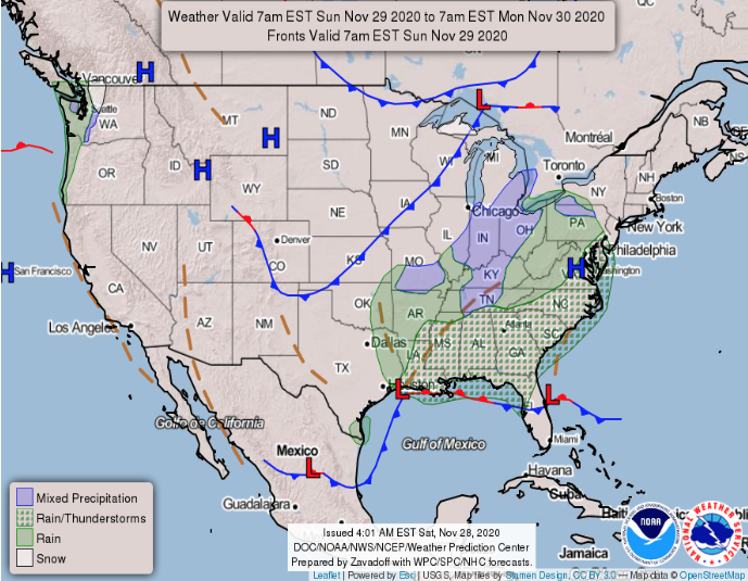
Our third major factor in driving winds is variations in local air pressure. Recall from Section 6.1.1 that Earth’s sea level atmospheric pressure is approximately 1 kilogram per square centimeter. However, the precise pressure can vary by up to a few percent with the weather. That is why barometer readings are useful in describing weather, and it is also why weather maps show “L” for low-pressure regions and “H” for high-pressure regions (Figure 6.2.1–8).
Just as pumping up a bicycle tire pushes high pressure air into a lower pressure tire, winds tend to flow from high pressure regions toward low pressure regions (Figure 6.2.1–9) . In fact, you’ve already seen this phenomenon in Video 6.2.1–7, where you saw how air flows from all directions toward a low pressure region, and that air therefore circulates around low pressure regions counterclockwise in the Northern Hemisphere and clockwise in the Southern Hemisphere.
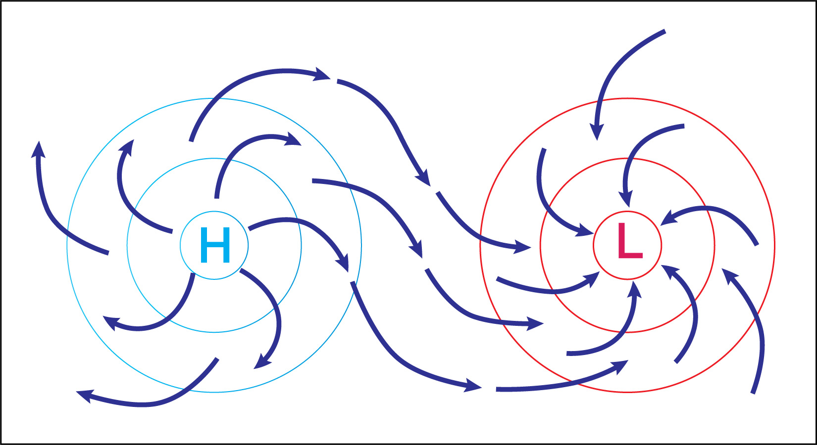
Figure 6.2.1–9 – This illustration shows how winds tend to flow outward from high pressure
regions toward low pressure regions. Notice that the air flows all curve to the right due to
the Coriolis effect , indicating that this diagram represents air flow in the Northern Hemisphere.
Credit: Zofostro Science.
What creates the difference in pressure between high and low pressure regions? Figure 6.2.1–10 shows the answer:
- High pressure systems are regions in which air is flowing downward, which essentially pushes “extra” air toward the surface, creating the higher pressure region.
- Low pressure systems are regions in which air flows upward, reducing the surface air pressure.
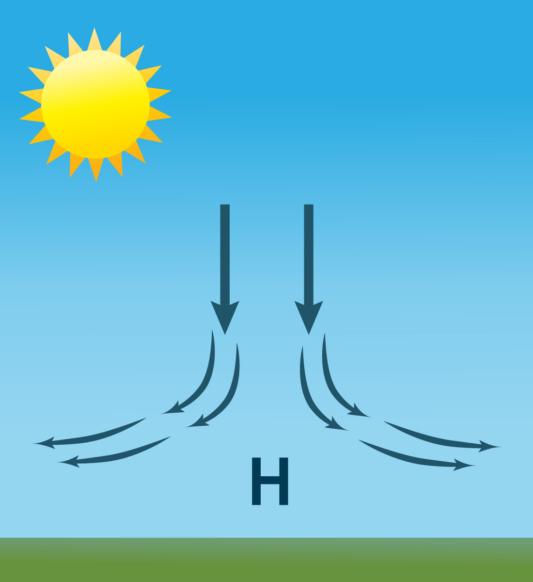
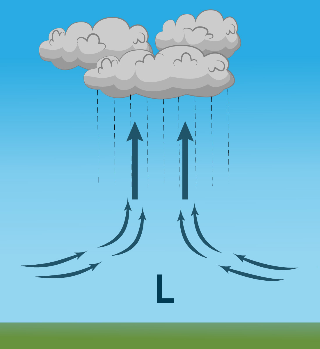
Figure 6.2.1–10 – This figure shows how vertical air flows create high and low pressure regions. Credit: Zofostro Science.
Figure 6.2.1–10 also shows a related idea about high and low pressure systems: Highs tend to be associated with clear skies, while lows tend to be associated with clouds and storms. You already know enough to figure out why, so try the following questions to help you understand it.
Discuss the following questions with a classmate. Then click to open the answers to see if they agree with what you came up with.
Hint: Recall the conditions that can lead to convection , which you’ve previously learned about both generally in Section 5.3.2 and in the troposphere in Section 6.1.1.
- Choose the correct words to fill in the blanks below. Explain your choices.
a. When air is falling, as in a high-pressure system, it must be (warmer/cooler) in temperature and (less/more) dense than the air above it.
b. When air is rising, as in a low-pressure system, it must be (warmer/cooler) in temperature and (less/more) dense than the air above it.
Remember that convection occurs when warmer and less dense material rises upward while cooler and more dense material falls. So the correct answers are:
a. When air is falling, as in a high-pressure system, it must be cooler in temperature and more dense than the air above it.
b. When air is rising, as in a low-pressure system, it must be warmer in temperature and less dense than the air above it. - Choose the correct word to fill in the blank, and explain your answer.
Therefore, the rising air in a low-pressure system will tend to get (warmer/cooler) as it rises to higher altitude.
The answer is cooler, because the warmer air that rises up becomes surrounded by cooler air, and it therefore loses heat to this surrounding air.
- The rising air of a low-pressure system is likely to contain water vapor (particularly if it is over the ocean, where there is plenty of water to evaporate). Based on your answers to the prior questions and what you’ve learned previously, what will tend to happen to this water vapor as it reaches high altitude?
The water vapor will tend condense to form droplets or ice crystals, thereby making clouds. The way you know this is as follows:
- From Question 2, you know that the rising air containing the water vapor will cool as it reaches higher altitude.
- From earlier in this chapter, you know that cooling leads to condensation and cloud formation.
- Based on your answers above, why are low-pressure systems associated with cloudy skies and storms, while high-pressure systems are associated with clearer skies?
Any water vapor in the rising air in a low-pressure system will tend to condense and form clouds as it rises, which is why these systems are associated with clouds and storms. High-pressure systems contain falling air, which makes condensation less likely, and therefore tend to be associated with clear skies.
Video 6.2.1–11 summarizes many of the connections between temperature, pressure, and wind.
Video 6.2.1–11 - This video summarizes the effects of pressure (and temperature) on winds. Credit: NOAA.
Activity/Discussion
Viewing Pressure Effects in the Earth Project
Again open The Earth Project of Figure 6.2–1 and make sure it is set to its default menu, so that the top line (Data) reads “wind @ surface.” Then change the Overlay option to “MSLP,” which is short for “mean sea level pressure” (and recall that “mean” is another word for “average”). The Data line should now read “wind @ surface + mean sea level pressure.”
- Study the scale bar values. Does the range shown on the scale agree with the statement (from a few paragraphs above) that pressure can vary by “up to a few percent with the weather”? Explain. Hint: You can figure out the percent change from the numerical values associated with the scale bar, even without knowing the meaning of the “hPa” units shown. However, in case you are interested: “hPa” is short for “hectopascals,” and a pressure of 1,000 hPa is the same as a pressure of 1 kilogram per square centimeter (the approximate average sea level pressure).
- Identify regions of low and high pressure on the map. Are the winds flowing from high to low pressure as you expect? Explain.
- Can you see the Coriolis effect in action? Explain.
- Notice that most low pressure regions are not major storms like hurricanes. Under what conditions would you expect a storm to be strong enough to become a hurricane? Bonus: Look up the date of a recent hurricane, then use the “Control” option to go to that date. Can you see the hurricane on the map, and does it confirm your answer about the expected pressure conditions?
This activity revisits The Earth Project to focus on pressure. Students will have already explored this briefly in the activity at the beginning of this section, but here we go into a little more detail and with a little more context.
- (1) Students should notice that the scale bar covers a range from about 930 to 1,050 hPa. Given an average value of 1,000 hPa, this is indeed “a few percent” in either direction.
- (2) Students should notice that the winds are indeed flowing generally from high pressure to low pressure regions, even though the patterns can be complex given the many such regions around the globe.
- (3) Students should notice that winds are circulating counterclockwise around lows in the Northern Hemisphere and clockwise around lows in the Southern Hemisphere, noting that this is due to the Coriolis effect.
- (4) This is a challenging question, but you can direct the discussion to help students realize that major storms form around regions of unusually low pressure.
For the bonus question: Assuming students successfully set the project to the date of a recent hurricane, they should indeed see that the winds are swirling around a very low pressure region.
Effects of Earth’s Surface Features
Our fourth and last major factor in driving Earth’s winds is the surface topography , by which we mean features of the landscape such as mountains and valleys. Surface topography affects wind by physically blocking its path and by creating friction with moving air.
Almost any landscape feature can affect wind patterns, which is why winds often swirl in seemingly surprising ways around hills and valleys. It is also why you can take shelter from the wind simply by “hiding” behind large rocks or trees when the wind is blowing. In fact, even human-made structures like buildings can affect winds. You’ve probably noticed how winds can be very different on one side of a building than the other, and if you’ve ever walked through a big city on a windy day, you may have noticed how tall buildings can channel the wind to make it accelerate through the streets or spaces between them (sometimes called a “wind tunnel” effect). Engineers must take these effects into account when designing tall buildings, or else the buildings might sway dangerously when the wind blows.
Larger landscape features can have much more dramatic effects. One famous example is the rain shadow effect, which occurs in places where wind blows from the ocean toward hills or mountains. Figure 6.2.1–12a shows that the process works as follows:
- Air blowing from the oceans tends to contain a lot of water vapor.
- When this air runs into hills or mountains, the air is forced upward.
- The rising air becomes cooler (because temperature declines with altitude in the troposphere ), which causes the water vapor to condense to make clouds and rain that falls on the side of the hills or mountains facing into the wind (the windward side).
- The air that makes its way over to the other side (the leeward side) now has very little water left in it, making that side very dry. We say that this side is in a “rain shadow” (by analogy to a shadow in sunlight).
The rain shadow effect can lead to dramatically different climates on two sides of islands or mountain ranges. Figures 6.2.1–12b and c shows two dramatic examples, one on the big island of Hawaii and the other on opposite sides of the Himalayas.
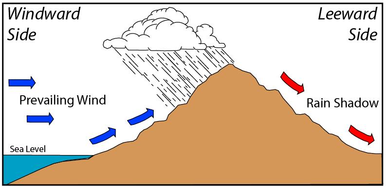
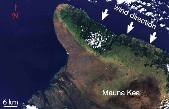
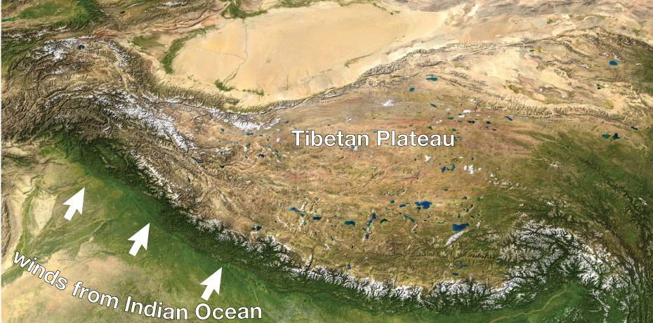
Figure 6.2.1–12 – The rain shadow effect occurs when winds blowing from oceans reaches hills or mountains that force the winds to go up and over them. On the side facing the winds (the windward side), the rising air cools and water vapor condenses to make clouds and rain. This leaves very little water in the air that blows over to the opposite side (the leeward side), which is therefore very dry.
As you would expect, surface features have much greater effects on winds that are close to the surface than winds blowing at higher altitudes in the atmosphere. In fact, at very high altitudes, surface features play little or no role at all. As a result, high-altitude winds differ from surface winds in two major ways:
- High-altitude winds tend to blow at much higher speeds than surface winds, because they don’t experience friction with the surface.
- High-altitude winds can blow continuously over much longer distances than surface winds, because there is nothing to block their paths.
One famous example of these ideas is the type of wind called a jet stream (Figure 6.2.1–13). These high-altitude winds get their name from the fact that they are at altitudes where jet airplanes typically fly, and their high speeds mean that airplanes flying with them can travel much faster than airplanes flying against them.
Activity
Viewing Jet Streams in the Earth Project
Again open The Earth Project of Figure 6.2–1 and make sure it is set to its default menu, so that the top line (Data) reads “wind @ surface.”
1. Notice that the “Height” is set to “Sfc,” which is short for “surface,” meaning that the globe is showing you surface winds (that is why it says “wind @ surface”). Review how you can scroll over the “Scale” bar to see the wind speeds (shown to the lower right on the screen) that correspond to each color. What is the range of wind speeds that you see on Earth’s surface right now?
2. Notice that other options for the “Height” button are given in units of “hPa.” As we discussed in a prior Activity, these are units of air pressure. Explain why lower values of air pressure represent higher altitudes (or heights). Hint: You may wish to review Figure 6.1.1–11.
3. Set the Height button to 250 hPa, which corresponds to the air pressure at an altitude of about 10 kilometers. What is the range of wind speeds that you see now? Can you see any jet streams? Explain.
4. Which direction do jet streams generally flow? What does this tell you about why airplane trips between two cities generally take much longer in one direction than the other?
This activity again revisits The Earth Project, this time as a way of viewing jet streams.
- (1) Students should see that surface winds are relatively low in speed, rarely over about 100 km/hr.
- (2) By reviewing Figure 6.1.1–11, students should recall that pressure declines with altitude.
- (3) With the pressure set to 250 hPa, corresponding to an altitude of about 10 kilometers, the far higher wind speeds at high altitude should be clear, and several jet streams should be identifiable as ribbons of high speed purple and white arrows.
- (4) Students should notice that jet streams all generally flow west to east, which is why airplane trips going eastward tend to be shorter than the same trips in a westward direction.
- Note: It can be fun to explore winds at other altitudes as well (other values of the Height setting), but this goes beyond the scope of typical middle school science.
Drivers of Ocean Currents
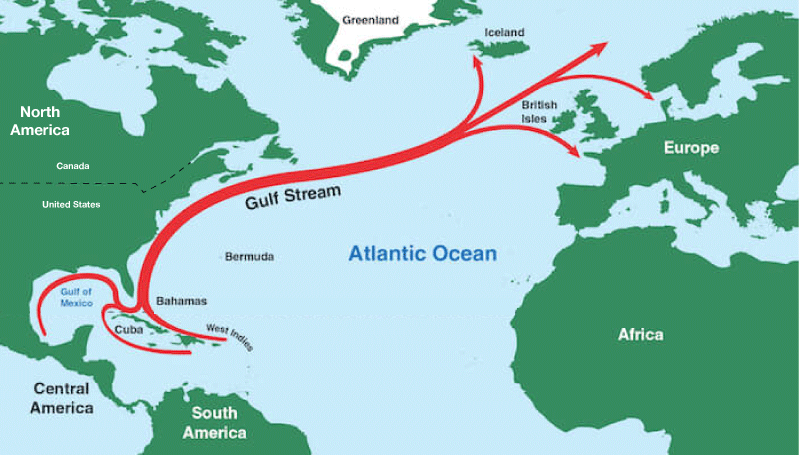
Air and water can both move fairly easily, which is why they are both considered to be fluids , a word used in science for any substance that can flow easily . However, we give different names to air flows and water flows. We generally use the word wind to talk about flows of air and the word current to talk about flows of water. For example, an “ocean current” describes a flow of water within the ocean. Some ocean currents, such as the Gulf Stream (see Figure 4.33), continue for very long distances, much like rivers flowing within the ocean.
Like winds, ocean currents are quite complex but are driven by only a few major factors. Here we’ll focus on the following four factors, each explored below in more detail:
- winds
- the land distribution (continents and islands)
- the rise and fall of the tides
- the density and salinity of the seawater
Winds and Surface Currents
One of the major drivers of currents that flow near the surface of the ocean is the push that the water is given by winds. Notice that this means that, like winds, ocean currents are affected by Earth’s rotation through the Coriolis effect . The connection between winds and currents is fairly straightforward, and since we have already discussed wind, we won’t say much more about it here.
Effects of the Land Distribution (Continents and Islands)
Much as surface topography shapes winds, the distribution of continents and islands affects ocean currents by physically limiting where currents can flow. That is why many ocean currents follow the outlines of coastlines. Again, the idea is fairly easy to understand, so we won’t talk much more about it.
Activity
Viewing Surface Currents in the Earth Project
As in prior activities, open The Earth Project of Figure 6.2–1 and make sure it is set to its default menu, so that the top line (Data) reads “wind @ surface.”
- Set the Animate option to “currents,” so that Data line says “Ocean currents + wind @ surface” (the same view used in question 5 in the Activity at the beginning of Section 6.2). Discuss any correspondence that you see between winds and surface currents.
Hint: Be sure to notice that the colors on the map still represent wind speed (scroll over the scale bar to see this), but the motion shown is the ocean currents. If you are having trouble seeing a correspondence, it may help to switch back and forth between this view and the “wind @ surface” view. - Set the Mode to “ocean,” Animate to “ currents,” and Overlay to “currents.” The Data line should now say “Ocean currents @ surface.” What is the scale bar now showing? Briefly discuss what the map shows now, and how you can see the effects of the land distribution.
We again make use of The Earth Project. As usual, the key is to make sure students set the menu controls correctly, which you can check by the words on the Data line (as noted in the activity).
- (1) The correspondence may be difficult to see, but students should notice at least a few places where it will be clear that the winds are moving in the same direction as ocean currents, particularly when looking at large-scale patterns.
- (2) The influence of the land distribution on currents should be quite clear. Students should be able to see, for example, the way the Gulf Stream follows the contours of North America and the Kuroshio current (also called the Japan current) flows near Japan and Asia.
The Rise and Fall of the Tides
A third important factor in ocean currents is the rise and fall of the tides . In most places around the world’s coastlines, the tide goes in and out about twice each day, so that there are two high tides and two low tides each day . In fact, tides affect not just coastlines but the entire oceans, effectively causing vast amounts of water to slosh back and forth in the ocean basins. Video 6.2.1–14 allows you to visualize the global effects of the tides.
Video 6.2.1–14 - This NASA animation shows Earth’s general tidal pattern in which the tide rises and falls about twice each day (more precisely, about 12 hours and 25 minutes from one high tide to the next ). The timer in the upper left represents time in hours and minutes, showing a repeating loop in the video. Higher tides are blue and lower tides are brown. The video shows clearly that tides move across the entire ocean, even though we generally notice them only along coastlines. Credit: NASA Scientific Visualization Studio.
Discussion
Understanding NASA’s Global Tide Animation
In small groups or as a class, discuss the following questions based on Video 6.2.1–14.
- With the video paused at its start, identify at least one location where it is close to high tide and one location where it is close to low tide.
- Advance the video until the clock shows a time of about 6 hours, then pause it. How has the tide changed in the locations you identified in question 1?
- When (on the video clock) is the tide for your locations back to the same (high or low) that it was when the video started?
- Briefly discuss how the video shows that tides cause water to slosh back and forth across the entire ocean basins.
This should be a very brief discussion, intended to make sure students interpret the video correctly. Notes:
- (1) Students can choose many locations. For example, at the start of the video, it is close to high tide (blue) on the east coast of the United States and close to low tide (brown) on the west coast.
- (2) If students have successfully advanced the video by 6 hours, they should see that the tides have reversed, so their low tide location now is close to high tide and their high tide location is now close to low tide.
- (3) Students should see that the tides are back to their starting condition after about 12 hours (more precisely, 12:25).
- (4) The colors in the video show how the tides affect the entire ocean, not just the coasts, and students should be able to see the general pattern of ocean water sloshing back and forth with the tides.
Why do tides occur, and why are there two high and low tides each day? To understand the answers, we must consider the cause of tides. The Moon and the Sun both play a role in tides, but the largest role is played by the Moon, so we’ll focus first on that. Slide Show 6.2.1–15 shows how the Moon’s gravity leads to two high and low tides each day. Notice these key points:
- The Moon’s gravity tugs on the entire Earth. However, because the strength of gravity depends on distance (review this Key Concepts box), the Moon’s gravity tugs harder on the side of Earth that faces the Moon than on the opposite side.
- This difference in the gravitational tug causes Earth to stretch slightly along the Earth-Moon line, creating two “tidal bulges.” One tidal bulge faces toward the Moon and the other faces away.
- Therefore, as Earth rotates, any location experiences high tide when it is in either of the tidal bulges, and low tide when it is halfway between them.
 Slide 1 - The black arrows represent the strength of the Moon’s gravity tugging on different parts of Earth.


Slideshow 6.2.1–15 – Scroll through this sequence of diagrams to understand why Earth has two tidal bulges, leading most locations to have two high tides and two low tides each day.
Claim-Evidence-Reasoning Activity
Understanding the Tidal “Stretching Force”
As you study Slide Show 6.2.1–15, notice that the Moon’s gravity pulls in only one direction (toward the Moon), yet it creates two tidal bulges. This surprises many people, so in this activity we’ll look a little more deeply at why this happens and what it means for our planet. Each student can do the rubber band activities individually, but you should discuss the questions in pairs or small groups.
Before you begin, be sure to find a few rubber bands.
- Get a rubber band and hold one side with each hand. Then slowly pull your hands apart so that the rubber band stretches out. (This activity works best if you stretch it a little bit but not too much.) If we wanted to use your rubber band as an analogy to the way Earth is stretched out to make tidal bulges, which parts of the rubber band represent high tide and which parts represent low tide?
- Start over, again holding one side of the rubber band with each hand. This time, don’t move your left hand, but pull with your right hand twice as far as you did the first time. Does the stretched rubber band look any different this time than it did the last time? Explain why or why not.
- Based on your results with the rubber band, use evidence and reasoning to evaluate the following claim:
Claim: Pulling on a rubber band will stretch it in both directions relative to its center, even if you pull from only one side (while holding the other side still). In much the same way, the Moon’s gravity causes Earth to stretch on both sides to create tides, even though the Moon’s gravity is pulling only from one side.
- Now use evidence and reasoning to support this next claim.
Claim: The fact that the Moon causes Earth to stretch out explains why most coastal locations have two high tides and two low tides each day.
- The Moon’s gravity pulls on the entire Earth, not just the oceans. We should therefore expect the entire Earth to stretch out, including the land as well as the oceans. In fact, it does! That is, there are daily “land tides” that go along with the ocean tides, except the “land tides” are much smaller: the land rises and falls by less than about a centimeter with the tides, while the oceans rise and fall by a couple meters. Can you explain why the “stretching force” created by the Moon’s gravity affects the oceans so much more than the land?
- Use evidence and reasoning to support the following claim:
The existence and pattern of the tides is further proof that our planet Earth cannot be flat and is in fact round and rotating.
This CER activity will help students understand why the fact that the Moon’s gravity exerts a stronger gravitational tug on one side of the Earth than the other leads to a “stretching force” that creates two tidal bulges. It also addresses the common misconception that tides affect only the oceans and not the land. The final question then offers yet another proof that Earth is round, which you can use to build on the “Debunking Flat Earthers” activity in Section 3.1.1.
- (1): The analogy is that the stretched ends represent high tides and the in-between locations represent low tides.
- (2): Students should see that the rubber band still stretches just the same in this case, because you’ve applied just as much “stretching force” to it, even though this time you only pulled in one direction.
- (3) The key point is for students to realize that it does not matter whether you pull a rubber band in two directions or only in one direction. All that matters is that if you are pulling the two ends differently, it will stretch out. In the same way, the Moon’s differing gravitational tug causes Earth to stretch out, which means it will end up with bulges on both sides.
- (4) To support this claim, students will need to add in the fact that Earth’s daily rotation means we rotate through both bulges each day, leading to the two daily high tides and corresponding daily low tides.
- (5) The reason that the ocean tide is so much more noticeable than the land tide is simply the fluid nature of water, which allows it to flow so much more easily than solid land.
- (6) If Earth were flat, all locations would have to experience high or low tide at the same time, which is not the case. To prove this, students could point to Video 6.2.1–14, which showed tides moving across the Earth, or to tide tables or even to the idea that we could in principle call people in different parts of the world to ask about the tides at any moment. The tidal pattern makes sense only if Earth is spherical, and rotation is necessary to explain how we move through the tidal bulges each day.
For our current purposes of understanding ocean currents, you now know enough to understand the general influence of tides. However, the details of tides are much more complex. For example, the heights of tides are also affected by the phase of the Moon:
- Tides are more extreme at new and full moons,
- and less extreme at first- and third-quarter moons.
If you want to know exactly how high (and low) the tide will be at any location on any day, you can find local tide tables that will tell you.
Activity
Local Tides
There are many web sites that offer tide tables for locations around the world. Here are two sites you might wish to use for tide tables:
- For tides in the USA: NOAA’s Tides and Currents site.
- For global tides: tide-forecast.com
If you live along the coast, check a tide table (one of the above or any other that you wish) for your location. If you live inland, choose either a location near you or another place that interests you. Then discuss the following questions.
- When is the next high tide and low tide for your location?
- Using either the table or an accompanying chart, look for the local pattern in the tides. Does your location have the most common pattern, which is two high tides and two low tides each day? If not, what kind of pattern do you see?
- Look at the tides for different dates over a period of about a month. Can you see the effects of the phase of the Moon? Explain.
- Discuss the impact of tides in your location. For example, consider effects of tides on fishing, recreation, tourism, storms, and anything else you can think of.
This optional activity gives students an opportunity to explore tide tables either locally or for some location of their choosing. Answers will depend on the location chosen.
- Even if you skip the rest of this activity, you may wish to discuss Question 4, since this gives students a chance to think about how tides affect us on a human level.
Density, Salinity, and Vertical Water Circulation
So far we have talked about effects noticeable primarily in currents flowing along or near the ocean surface. But there are also currents that flow downward and upward. These deep-ocean currents are driven primarily by the fact that cooler or saltier water is slightly denser and therefore tends to sink, while warmer or less salty water is less dense and tends to rise (Figure 6.2.1–16).
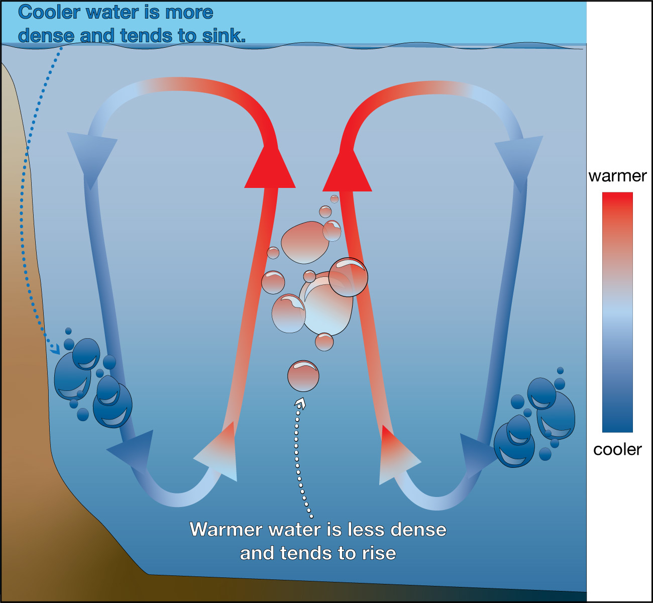
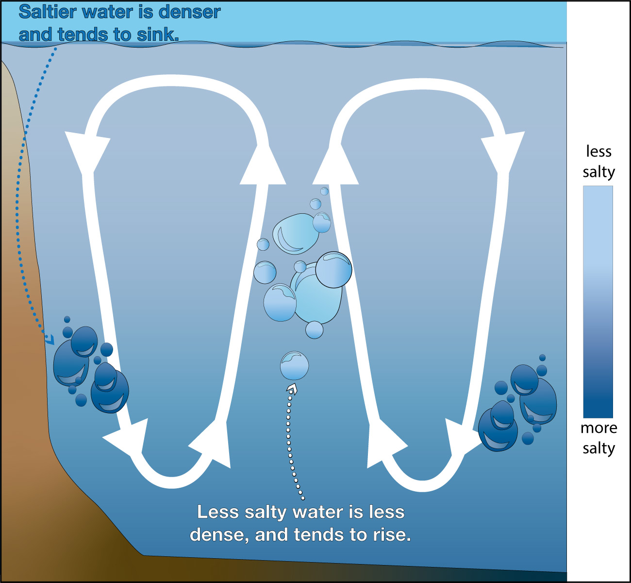
Figure 6.2.1–16 – The density of water depends on its temperature and salinity . Less dense water tends to rise and more dense water tends to sink. Credit: Zofostro Science.
As we’ll discuss in Section 6.2.3, these density effects play a major role in driving the overall flow of currents in oceans around the world. Video 6.2.1–17 will help prepare you for this discussion, while also summarizing three of the four major drivers of ocean currents that we have discussed (it does not discuss the effects of the land distribution).
Video 6.2.1–17 - This NOAA video summarizes some of the major drivers of ocean currents. Note that it refers to deep-ocean currents driven by density differences with the fancy name “thermohaline circulation.” Credit. NOAA.
Claim-Evidence-Reasoning Activity
Density of Salt vs. Fresh Water
For this activity you’ll need an egg and two large glasses for water. You’ll also need some of the salt water you made for the earlier activity “Making Sea Water” (or make a new batch), or some actual seawater.
- Fill (not quite to the top) one of the glasses with fresh tap water and the other with your salt water. What happens if you try to float the egg in the fresh water glass? What happens when you move it to the salt water glass?
- Next, pour out about half of the salt water from its glass. Then, very slowly and carefully, see if you can pour fresh water into the salt water glass, in a way that makes the fresh water “float” above the salt water. Once you do that, try floating the egg again (putting it in very slowly and carefully). What happens?
- Based on your results, use evidence and reasoning to support the following claim:
Claim: The results of these experiments demonstrate that salt water is denser than fresh water.
This CER activity uses simple experiments to demonstrate the density difference between fresh water and salt water.
- (1) If they have used a sufficiently salty batch of salt water (as should be the case if they use the “sea water” made earlier), the egg should sink in the fresh water and float in the salt water.
- (2) This part is challenging to do correctly, because the fresh water must be poured in very gently to avoid it simply mixing with the salt water. But with sufficient care, students should see that the fresh water forms a layer above the salt water. Once they do that, the egg should float at the level of the salt water layer, with the fresh water above it.
- (3) They key is for students to recognize and explain how these results show that salt water is denser than fresh water. The second experiment is easier to interpret if it was successful, since they should recall that less dense liquids float on more dense ones, much like oil and water. With regard to the egg, they should realize that floating requires having a lower density than water. Therefore, since the egg floats in salt water, it must be less dense than salt water, while the fact that it sinks in fresh water shows it is more dense than that.
Thermal/Energy Interactions
At this point, we’ve discussed four major factors that drive winds and four more that drive ocean currents. But how do these all interact to create general global patterns of the type you have seen in Figure 6.2–1?
The interactions are complex, but they all have one major theme running through them: Because the individual drivers all involve movement (or “transport”) of energy, their interactions are shaped by the way energy tends to flow. The most important of these tendencies is what is often called thermal energy transfer , referring to the general tendency for energy to flow from regions where there is more heat to regions with less heat.
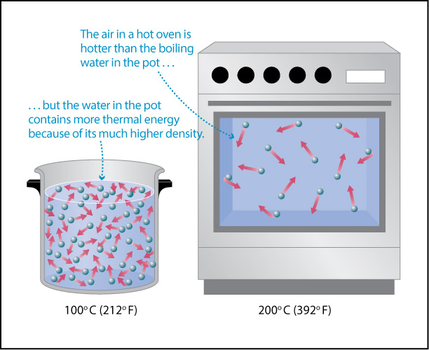
Recall that the thermal energy content (also called “heat content”) of a substance depends on both its temperature and density. For example, as you saw in Figure 4.44, the higher density of water compared to air means that a pot of hot water contains much more thermal energy (heat) than the air in a hot oven, even though the air is at a higher temperature.
The fact that water can hold much more heat than an equivalent volume of air leads to two important ideas about weather that you have probably noticed before:
- Weather changes will change the air temperature much more rapidly than the water temperature in the same region.
For example, when cold temperatures move into an area, the air becomes cold quite quickly while it may take some time for a lake to freeze. - Oceans (and large lakes) tend to moderate climates around them, because they can transfer more heat to the air when it is cold and absorb more heat from the air when it is warm.
That is why coastal regions tend to experience less extreme temperature changes than inland regions.
There is also a second important reason why oceans (and large lakes) have moderating effects on climate: Sunlight can penetrate more deeply into water than into land. Therefore, as sunlight warms an area, the water can absorb thermal energy from the sunlight down to a depth of many meters, while the land absorbs it only very close to the surface. The following activity will help you understand these ideas.
Activity
Land and Water Temperature Changes
For this activity, you will need two thermometers and two small paper or plastic cups.
Step 1: Fill one cup with soil from outside your home or school, and the other with water.
Step 2: Put the thermometers into the two cups in a way that allows you to measure the temperature only about a centimeter (or less) below the surface of the soil or water.
Step 3: Make sure both cups are at the same starting temperature. Hint: If they are not, start with water that is colder than the soil, then slowly mix in warmer water until the overall water temperature matches the soil temperature.
Step 4: Put both cups in a window where they will be exposed to direct sunlight. Alternatively, you could place both cups under a heat lamp. (A bright, incandescent light bulb will also work.)
Step 5: After a few minutes, measure the temperatures of the water and soil again. If you don’t yet notice a difference in temperature, let the cups warm under the sunlight or lamp for a bit longer.
Discussion:
- Which cup warmed up more? Explain why, based on what we discussed above about thermal energy in water, air, and soil (land).
- If you’ve ever dug into the sand on a beach on a warm, sunny day, you may have noticed that as you dig down, you reach colder sand. Explain why, using what you’ve learned from this experiment.
- The amount of sunlight that a region receives on Earth depends primarily on its latitude and the season. For example, all regions at latitude 35°N get about the same amount of sunlight on any particular day of the year (not counting differences in cloud cover). Which region at a particular latitude (such as 35°N) would you expect to have greater seasonal weather changes: a region near the coast or a region deep inland? Explain why.
- Imagine that you could place a giant thermometer into the ground, so that you could measure the temperature about two or three meters underground. How would you expect the temperature to vary over the course of the year, compared to the temperature at the surface? Explain why.
Note: The idea in this question leads to a very useful technology for heating and cooling homes, called a geothermal heat pump (or “ground-source” heat pump), which we’ll discuss in Chapter 7 (see Video 7.3.1-9).
This activity demonstrates and discusses how water exerts a moderating effect on temperatures. The experiment should be fairly simple and straightforward. Just be sure students don’t put the thermometer too deep into the soil, and don’t pack the soil too tightly. Notes on the discussion questions:
- (1) Students should have found that the soil warmed more than the water. The reasons are: (i) the sunlight penetrates deeper into the water, so the same amount of sunlight is heating a larger volume of water, which takes longer than heating the small volume of soil into which the sunlight penetrates. (ii) just as water can hold more heat (thermal energy) than an equivalent volume of air, the water also holds heat more effectively than the soil (more technically, the water has a higher heat capacity).
- (2) Just as in this experiment, the surface layer of the sand heats up quickly in sunlight. But as you dig down, where little or no sunlight has penetrated, you reach sand that has not been warmed by the sunlight and is therefore cooler.
- (3) The inland region will have greater seasonal changes. In both case (inland and coastal), the land can warm (and cool) much more quickly than water. But near the coast, the slower warming and cooling of the ocean helps maintain the air temperature, moderating the climate.
- (4) The subsurface temperature stays much more constant over the course of the year than the surface temperature. As discussed in the linked portion of Chapter 7, this fact means that homes and buildings can use geothermal heat pumps to extract heat from the ground in winter and dump heat into it in summer, thereby supporting energy efficiency in heating and cooling.
Discussion
Local and Global Thermal Energy Transfer
Discuss these questions in small groups or as a class.
- For the local region where you live, give as many examples as possible of the moderating effects of water on weather and/or climate.
- Now think about Earth as a whole. Would you expect there to be a general direction (or directions) for thermal energy transfer on our planet? If so, which way would you expect the thermal energy to flow, and why.
This question will help students think about local effects as well as a global pattern that we’ll discuss in the next section.
- (1) Local effects will of course depend on where you live. If you are near an ocean or large lake, students may cite the moderating effects of the oceans on the local climate compared to regions further inland. If you are inland in a region where winter temperatures drop below freezing, students might note, for example, the way rivers or lakes in your area freeze in winter.
- (2) The general flow of thermal energy is from the equator to the poles; that is, north and south from the equator. This is because sunlight shines more strongly on the equator, so there is more thermal energy in equatorial regions than polar regions. This energy will therefore tend to move from the equator to the poles, which is an important part of the global circulation (as we’ll discuss in the next section). Note that this also is part of the reason why, as we’ll discuss in Chapter 7, global warming is causing polar regions to warm more than equatorial regions.