The tale of two planets that we completed in the prior section leaves no scientific doubt that:
- the greenhouse effect really does make planets warmer than they would be otherwise, and
- more greenhouse gases mean even warmer temperatures.
This is a cause for concern because we also know that human activity has been raising the concentration of carbon dioxide (and also of other greenhouse gases) in Earth’s atmosphere, thereby strengthening the greenhouse effect. We’ll explore how we know this in this section.
Direct Measurements of Carbon Dioxide in the Atmosphere
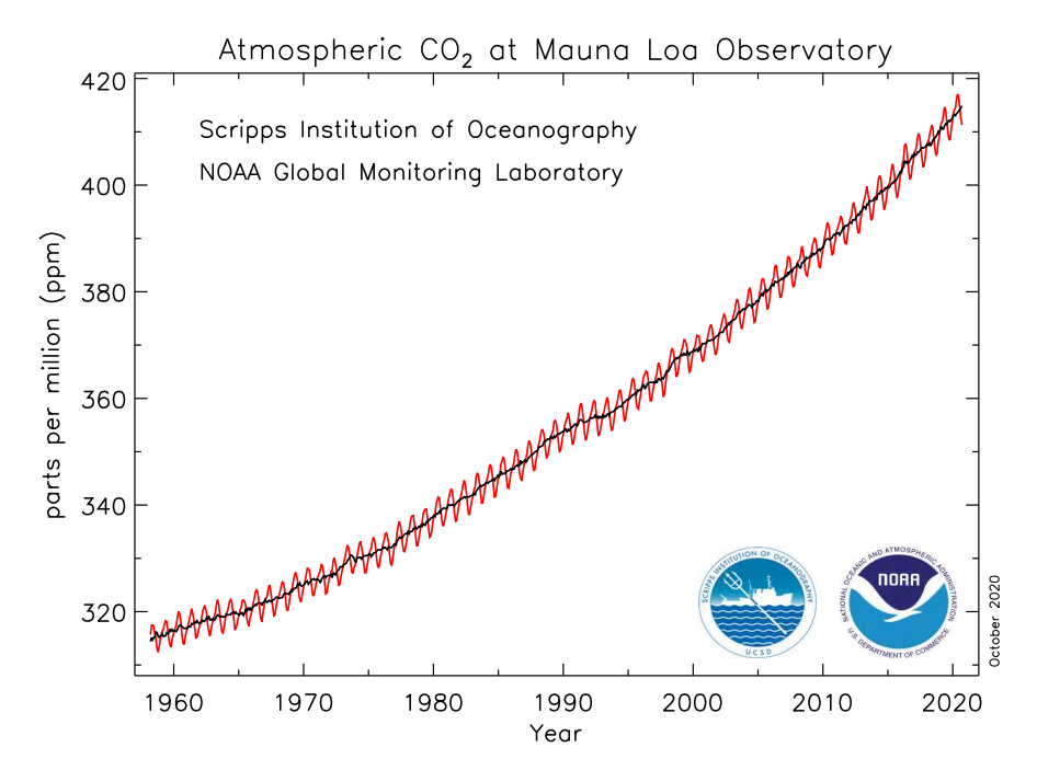
The first way by which we know that the carbon dioxide concentration is rising is through direct measurements. Figure 7.1.2–1 shows the data.
Note: NOAA updates this graph monthly at www.esrl.noaa.gov/gmd/ccgg/trends.
Note the following key ideas about this graph, then try the quiz to make sure you understand how to interpret the graph.
- The graph begins in 1958, because that is when scientists first started making direct measurements of the carbon dioxide concentration in Earth’s atmosphere. Scientists do this by collecting air samples, then analyzing the samples to see how much carbon dioxide they contain.
- The carbon dioxide concentration is measured in units of “parts per million,” which simply means the number of carbon dioxide molecules among each 1 million total molecules of air. For example, a carbon dioxide concentration of 400 parts per million means that out of every 1 million molecules of air, 400 of them are carbon dioxide molecules. Note that this is a fairly small amount, equivalent to only 0.04% of the atmosphere. But as you already know, this small amount is very important because of the fact that carbon dioxide is a greenhouse gas.
- This particular graph is based on air samples collected at the Mauna Loa Observatory in Hawaii, because that is where the measurements were first made . However, similar measurements are now being made in many places around the world, and all show the same trend.
Quiz – Reading the Carbon Dioxide Graph
Answer the following questions based on the graph shown in Figure 7.1.2–1.
Note: As always, after you finish the quiz, be sure you read the feedback that explains the correct answers, to make sure you understand the reasons for these answers.
Evidence That Humans Are Responsible
The data (as shown in Figure 7.1.2–1) show a dramatic rise in the carbon dioxide concentration, but how do we know what is causing this rise? There are only two general possibilities:
- Perhaps the carbon dioxide comes from natural sources, such as volcanic eruptions or other geological processes.
- Or, perhaps it comes from human activity, such as the burning of fossil fuels (oil, coal, gas). Fossil fuels release carbon dioxide when they are burned, because they contain carbon that, when burned, combines with oxygen to make carbon dioxide.
To investigate these possibilities, scientists add up how much carbon dioxide is coming from each of those sources. These studies show that all natural sources combined add up to less than abut 1% of the carbon dioxide being released from the burning of fossil fuels. We can therefore rule out the first possibility, because it simply does not release enough carbon dioxide to account for the observed rise.
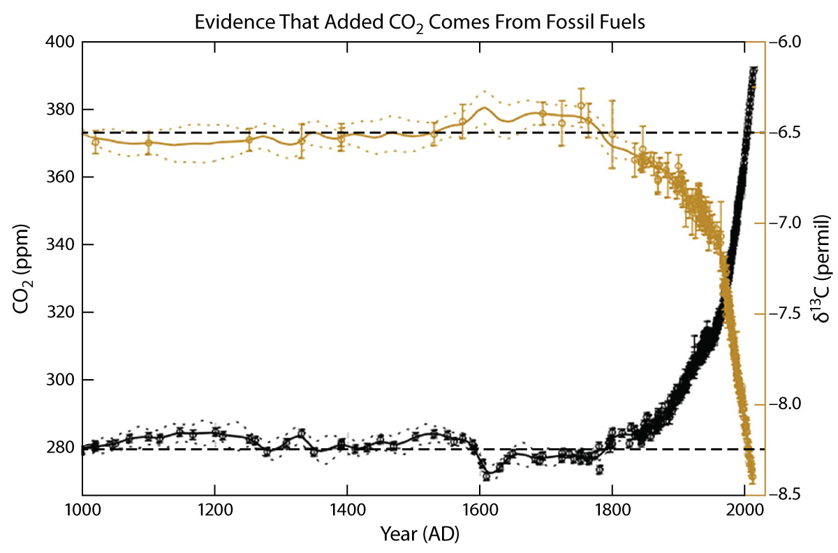
Of course, this doesn’t automatically make the second possibility (human-caused) correct, since it’s always possible that there are other possibilities that we didn’t think of yet. But we can be very confident that it is correct, because these emissions precisely track the rising carbon dioxide concentration (Figure 7.1.2–2).
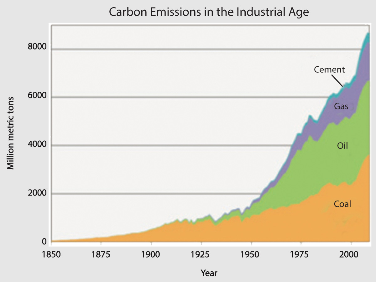
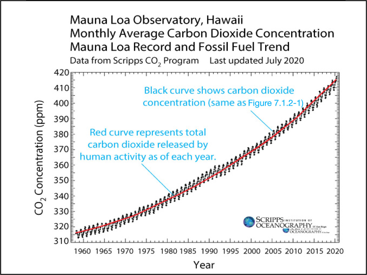
Figure 7.1.2–2 – These graphs show clearly that the rising carbon dioxide concentration that has occurred in recent times is a direct result of carbon dioxide being released by human activity, especially the burning of fossil fuels.
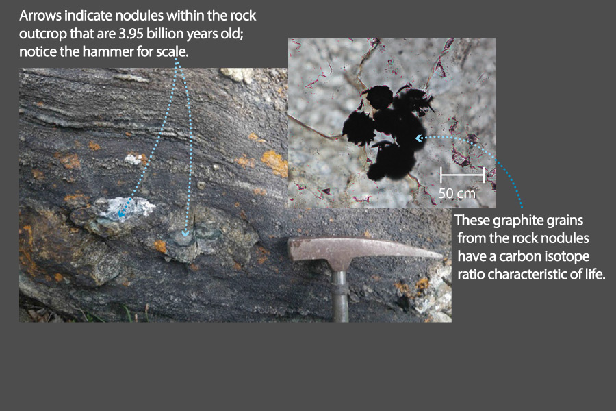
In addition, scientists can actually “see” that the added carbon dioxide is coming primarily from fossil fuels. Recall from Chapter 5 that carbon comes in more than one different form (“isotope” ), and that the proportions of these forms found in life is different than it is in nonliving material; we even discussed how this fact provides the oldest evidence of life on Earth (see Slide 7 from Slide Show 5.1.2–1).
Because fossil fuels are the remains of living organisms, they have the “life” proportions of the different forms of carbon, which are different from the proportions found in carbon from non-fossil sources, such as volcanoes. Careful chemical analysis of carbon dioxide in Earth’s atmosphere shows that virtually all of the added carbon dioxide has come from fossil fuels, not from non-fossil sources. For scientists, this is like observing a “smoking gun” to prove who committed a crime: It leaves no room for doubt that it is human activity, primarily the burning of fossil fuels, that has caused the recent rise in carbon dioxide concentration.
We don’t go into detail about the “smoking gun” evidence above because it involves discussion of isotopes that is above middle school level, but we offer it here to you in case you are interested or have advanced students who would be interested.
- The key to understanding this evidence is to recognize that carbon comes in three different isotopes: carbon-12, carbon-13, and carbon-14, with the latter being radioactive with a half-life of about 5,700 years. (Carbon-12 and carbon-13 are both stable.)
- The relatively short half-life of carbon-14 means that it exists today only as a result of ongoing production (which occurs as cosmic rays hit atoms in Earth’s upper atmosphere). Carbon-14 becomes incorporated into living organisms through respiration, but it decays after the organisms die, and the organisms that made fossil fuels died so long ago that there is no carbon-14 in fossil fuels at all. As a result, if fossil fuels are the source of the rising carbon dioxide concentration, then the relative abundance of atmospheric carbon-14 (compared to ordinary carbon-12) should be falling as the total carbon dioxide rises — and this is just what has been observed.
- Even more impressive isotope evidence comes from changes in the relative abundance of carbon-13. Overall, carbon-13 represents about 1.07% of all natural carbon on Earth, but its percentage is slightly lower in living organisms (because life incorporates carbon-12 more readily into living tissues than carbon-13), which means it is also slightly lower in fossil fuels (since they are the remains of living organisms). The figure below shows ice core data for the past 1,000 years with the total carbon dioxide concentration in black and the relative abundance of carbon-13 in brown. Notice that the carbon-13 abundance has been dropping in tandem with the rise in carbon dioxide, just as we should expect if the rising carbon dioxide comes from the burning of fossil fuels, since they have a lower abundance of carbon-13. (The carbon-13 abundance is shown as “δ13,” which is a standard scientific unit used for this purpose.)
Discussion
Possibilities and Realities
You may recall that the first two reasons the authors gave for the value of science in Section 3.3.3 were the following:
- Science gives us a way to distinguish possibilities from realities.
- Science provides us with a way of bringing people to agreement.
Briefly describe how these ideas are illustrated in the way that we’ve learned that the rise in carbon dioxide concentration is being caused by human activity (as discussed above).
This discussion can be very brief, but should be useful in reminding students of the value of science as discussed in Chapter 3. Specific notes:
- “Science gives us a way to distinguish possibilities from realities”: This is clearly illustrated by the fact that we can see two basic possibilities for the added carbon dioxide — natural and human-caused. Evidence (in this case, the accounting of each of those possible sources) clearly rules out the natural possibility.
- “Science provides us with a way of bringing people to agreement.” As we’ve emphasized in the discussion, the fact that only one possibility seems to remain is not by itself enough to establish it as correct, because there may be possibilities we have not yet thought of. However, in this case, the further evidence that we see in the match to the observed rise (Figure 7.1.2–2) and the “smoking gun” of the carbon types (isotopes) leaves no more room for doubt that the recent rise in the carbon dioxide concentration is being caused by human activity, especially the burning of fossil fuels.
Activity
Future Carbon Dioxide Levels, Part 1
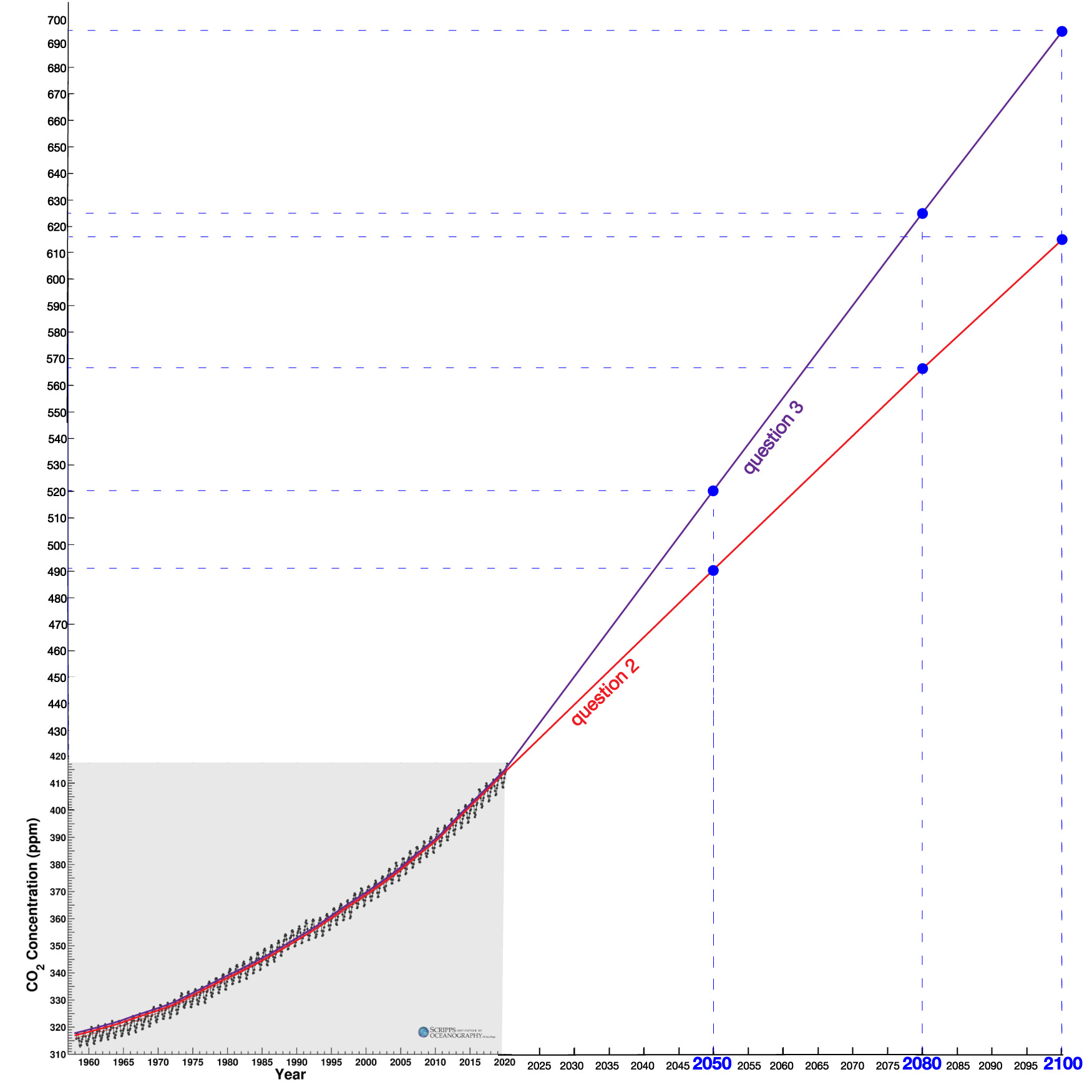
Look again at the graph of the rising carbon dioxide concentration in Earth’s atmosphere shown in Figure 7.1.2–1. Notice that the concentration increased from about 315 parts per million in 1958 to 415 parts per million in 2020, which is an increase of a full 100 parts per million. It also shows (as you found in the earlier quiz) that the rate of increase has been accelerating. Work in small groups to answer the following questions about what this could potentially mean for future carbon dioxide levels.
- About how much did the carbon dioxide concentration increase from 2010 to 2020? What was the average increase per year during this period?
- Suppose that the carbon dioxide concentration continues to rise at this same rate. What would the concentration be in the years 2050, 2080, and 2100? How old will you be at each of those times?
- Suppose instead that the rate of increase continues to grow, so that the carbon dioxide concentration rises by an average of 3.5 parts per million each year. What would the concentration be in the years 2050, 2080, and 2100 in this case?
- Extend the graph in Figure 7.1.2–1 to the year 2100 for the assumptions in each of questions 2 and 3. You can print this sheet for making the graph. Note: You don’t need to show the seasonal wiggles, just the general trend.
- Look carefully at the data shown in Figure 7.1.2–2a. Based on this graph, does it seem more likely that the rate of increase in the carbon dioxide concentration would stay as it was from 2010 to 2020 or that it would increase after 2020? Explain.
- Suppose that we want to reduce the rate at which the carbon dioxide concentration increases. Based on what you’ve learned, what would we have to do?
This activity asks students to extrapolate the trend on the graph into the future, using varying assumptions. Be sure to have students record their answers, since we’ll use them again in Part 2 of the activity below.
- (1) Results may vary a bit depending on how students read the graph, but students should see that the 2010 concentration was about 390 parts per million (ppm), rising to 415 ppm in 2020. This is a rise of 25 ppm in the 10-year period, which is a rate of 2.5 ppm/yr.
- (2) If we start from the 2020 level of 415 ppm and apply an increase rate of 2.5 ppm/yr:
- 2050 is 30 years after 2020, so the concentration would have risen by 30 yr x 2.5 ppm/yr = 75 ppm, which would bring it to 415 + 75 = 490 ppm.
- 2080 is 60 years after 2020, so the concentration would have risen by 60 yr x 2.5 ppm/yr = 150 ppm, which would bring it to 415 + 150 = 565 ppm.
- 2100 is 80 years after 2020, so the concentration would have risen by 80 yr x 2.5 ppm/yr = 200 ppm, which would bring it to 415 + 200 = 615 ppm.
- For the question about ages, students should realize that they will still be relatively young in 2050, and will very likely still be alive in 2100.
- (3) The calculations for this case:
- 2050: The rise would be 30 yr x 3.5 ppm/yr = 105 ppm, so the concentration would be 415 + 105 = 520 ppm.
- 2080: The rise would be 60 yr x 3.5 ppm/yr = 210 ppm, so the concentration would be 415 + 210 = 625 ppm.
- 2100: The rise would be 80 yr x 3.5 ppm/yr = 280 ppm, so the concentration would be 415 + 280 = 695 ppm.
- (4) This question asks students to show their results from questions 2 and 3 on the graph. If they are making it themselves (rather than using the provided pdf sheet), be sure to help them select a large enough piece of paper so that they’ll be able to extend it far enough both horizontally (to the year 2100) and vertically (to reach the 695 ppm projected in question 3). The result should look something like this:
graph
- (5) The data show that the use of fossil fuels has been accelerating. So based on these data, it seems more likely that the rate of increase would continue to grow, unless the world makes some dramatic changes.
- (6) As found in question 5, the trend points to a continued acceleration of the rate of increase, and a reduction in the rate means going in the opposite direction. There is only one plausible for way for that to occur, and that is through a dramatic reduction in the carbon dioxide emissions from, or overall use of, fossil fuels.
 graph
graph
Carbon Dioxide in the More Distant Past
The measurements we’ve discussed show clearly that humans have been causing the carbon dioxide concentration to rise since at least 1958. But the carbon dioxide concentration can also vary naturally, so to put the recent rise into context, we’d like to know how it compares to past changes. You might think it would be difficult to learn about the carbon dioxide concentration at earlier times, since no one was measuring it before 1958. However, scientists have a variety of ways to determine past carbon dioxide concentrations.
The most reliable records come from air bubbles trapped in ancient ice — that is, ice that has remained frozen for long periods of time in glaciers or in Greenland or Antarctica. Although the work is difficult and requires great care, the basic idea is simple: Scientists drill down into the ice and bring up an ice core (Slide Show 7.1.2–3). The ice is made from the accumulated snow of many years, which over time is compressed into solid ice. The deeper layers of the ice core represent snow that fell at earlier times.
 Slide 1 - These photos show the drilling of an ice core. Because ice cores can be very long, they are cut into slices for easier handling and study. Credit: NASA, Goddard Space Flight Center; photos copyright by photographer Reto Stöckli; used with permission.


Slide show 7.1.2–3 – These images show how scientists use “ice cores” to study Earth’s past atmosphere concentration and climate.
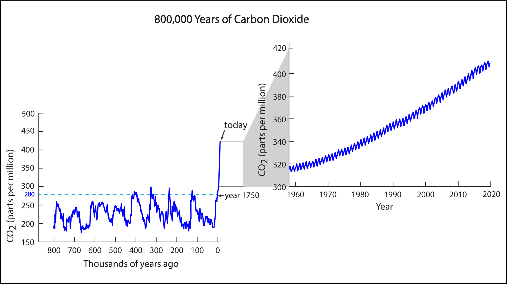
The longest ice core ever drilled extended to a depth of about 3.2 kilometers (2 miles) in the Antarctic ice.This ice is made of compressed snow that fell and accumulated over a period of 800,000 years . Therefore, by studying air bubbles in this long ice core, scientists have been able to measure how the carbon dioxide concentration has varied in Earth’s atmosphere over the past 800,000 years. Figure 7.1.2–4 shows the results, along with a zoom-out to show the direct measurements made since the 1950s.
Before you continue, discuss the following questions about Figure 7.1.2–4 with a classmate, then click to open the answers and see if they agree with what you came up with.
- Briefly explain what the numbers along the x-axis mean. For example, what does “0” represent, and why do the numbers get higher as you go to the left along the x-axis?
The x-axis label tells us that the numbers along it represent “thousands of years ago.” Therefore, the “0” that is located near the far right represents the present time. The numbers increase to the left because they are telling us how far in the past they represent. For example, the “500” represents a time that was 500,000 years ago.
- The 800,000-year ice core record shows that the atmospheric carbon dioxide concentration has varied significantly over time. Were humans responsible for these variations? How do you know?
Except for the recent rise (since about 1750), the changes must have been due to natural processes, not human-caused processes. We know this because most of the changes shown in the ice core record occurred long before the existence of human civilization.
- Based on the data, approximately what has been the natural range (minimum to maximum) of the carbon dioxide concentration over the past 800,000 years?
Not counting the recent, human-caused rise, the data show that the carbon dioxide concentration has varied between a minimum of about 180 parts per million and a maximum of about 280 parts per million over the past 800,000 years.
- The graph identifies the year 1750 as the last time the carbon dioxide concentration was at or below 280 parts per million. This level is often called the “pre-industrial” carbon dioxide concentration. Why do you think we call it that?
The year 1750 roughly marks the beginning of what is called the “industrial revolution,” which is when humans first began to use large amounts of fossil fuels.
- The graph might at first make it look like many of the past rises in concentration happened just as fast as the rise that is occurring today, but that’s not actually the case. To understand why not, picture what a rise of 100 parts per million — the same rise that occurred between 1958 and 2020 — would look like on the 800,000-year graph. Do any of the natural changes appear to have happened that quickly?
The recent rise of 100 parts per million has occurred in only about 60 years, which is so small compared to 800,000 years that it would look straight vertical on the 800,000-year graph. Indeed, that is why the period since 1750 is also essentially vertical, and why we need the zoomout to see the recent trend more clearly. None of the natural changes have occurred anywhere close to this fast.
- Overall, how would you say that the recent rise (since about 1750) in the carbon dioxide concentration compares to the rises that occurred in the prior 800,000 years?
The recent rise has been both larger and faster. It is larger because the rise since 1750 has been much more than 100 parts per million, which is the largest rise that occurred in the prior 800,000 years. It is faster because, as you found in the previous question, the natural rises occurred over much longer periods of time.
Claim-Evidence-Reasoning Activity
Future Carbon Dioxide Levels, Part 2
Consider what you have learned about past carbon dioxide concentrations and the work you did in the Part 1 activity earlier. Then use evidence and reasoning to support or refute the following claim.
Claim: If the current trend in the rise of the carbon dioxide concentration continues, the level will reach double the pre-industrial concentration within my lifetime.
Students should support this claim as follows:
- The pre-industrial concentration (year 1750) was about 280 ppm, so double that is 560 ppm.
- As we discussed at the beginning of this chapter, the year 2100 is likely to be well within the lifetimes of many or most middle school students, and 2080 is certainly within their expected lifetimes.
- From the Part 1 activity, at the current increase rate (2.5 ppm/yr) we’ll surpass 560 ppm before 2080, and if the increase continues to accelerate, we would reach that level much sooner.
Discussion
Uses of Fossil Fuels
You’ve seen that the burning of fossil fuels is the primary reason that the carbon dioxide concentration is rapidly increasing. What do we use fossil fuels for? Work in small groups or as a class to make a list of major ways in which we use fossil fuels today. Then briefly discuss whether you think it would be possible for us to obtain the benefits we get from fossil fuels without actually using them (for example, by using non-fossil energy sources).
The goal of this discussion is to have students think about the many ways in which we use fossil fuels, and then to begin thinking about how we might replace them. Students probably know many of the uses of fossil fuels already, so the key is to have them try to organize their lists as clearly as possible. We suggest that you make sure their lists include the following, in at least some form:
- oil (petroleum) to make gasoline for cars and trucks, or jet fuel for airplanes; oil is also used to make plastics
- coal, oil, and gas for electricity production that powers homes, offices, and machinery;
- coal, oil, and gas for home heating and cooking
For the last part of the discussion, try to get students to focus on the “inspiration” side of things by realizing that we could in principle still get all the benefits we currently get from fossil fuels without needing to use them; all we have to do is to replace them with non-fossil sources.
Other Greenhouse Gas Sources
We’ve focused on the carbon dioxide released by the burning of fossil fuels, because that is the largest single way in which humans are adding greenhouse gas to Earth’s atmosphere. But it’s not the only way in which human activity is increasing the strength of the greenhouse effect. There are a number of others. Here are three that are particularly important:
- Food production (agriculture): The production of food uses fossil fuels for things like operating farm machinery and transporting and packaging food, but it also releases two other important greenhouse gases: methane and nitrous oxide.
- The methane comes mostly from livestock — especially cows, sheep, and goats — because these animals produce it in their stomachs and then “burp” it out into the atmosphere. Significant amounts of methane are also released by rice paddies and by food waste (which releases methane when the wasted food rots in landfills).
- The nitrous oxide, along with some additional methane, is released primarily by the production and use of manure and other fertilizers.
- Methane leakage: Remember that natural gas is made mostly of methane, and when this methane burns, it is converted into carbon dioxide. However, sometimes the methane from gas or oil wells leaks directly into the atmosphere. Over the past few decades, this leakage and agriculture (as above) have led to a dramatic increase in the atmospheric methane concentration.
- Deforestation: The cutting and burning of forests adds to the carbon dioxide concentration in two ways: First, when plants are burned, they release carbon dioxide into the atmosphere. Second, because planets “breathe in” carbon dioxide, having less forest means that less carbon dioxide can be taken out of the atmosphere, which means the carbon dioxide concentration rises faster than it would otherwise.
There’s one more major category that we don’t list above due to the more involved chemistry questions that would be required: halocarbons, which include chlorofluorocarbons (CFCs). These are industrially produced and do not exist naturally. While small in total quantity, they are potent greenhouse gases, so this makes them important, though they contribute less in total than the other categories of greenhouse emissions that we’ve discussed. Halocarbon concentrations are no longer rising as fast as they once were, due to international action to regulate and reduce them. Interestingly, this action was spurred not by global warming, but by the fact that these same gases are the cause of ozone depletion. Once ozone depletion was recognized as a major global issue in the 1980s, the world came together to reduce usage of these gases.
Figure 7.1.2–5 summarizes the major ways in which human activity is adding greenhouse gases to the atmosphere.
 Burning fossil fuels releases carbon dioxide. Credit: Zofostro Science


Figure 7.1.2–5 – Major sources of greenhouse gases.
Discussion
Global Warming from Beef Production and Food Waste
Two of the major ways in which food production contributes to global warming are through beef production/consumption and through food waste.
- Read this article about food waste and the steps that can be taken to reduce it. Then, in small groups or as a class, discuss how you can help your family reduce food waste.
- Among other ways in which food production leads to increased greenhouse gases, the largest single contributor is beef production. Do a little research to find out why beef production causes so much greenhouse gas emissions (this article is a good place to start). Then, in small groups, discuss potential ways in which the impacts of beef production could be reduced.
- One possible way to reduce beef consumption is to find beef substitutes. For example, some companies are already producing plant-based substitutes that are intended to taste like real beef. Have you ever tried one of these? In your small groups, discuss whether anyone has tried any of these (and, if so, how it tasted) and whether you think these companies will be successful.
- Another substitute for beef from cattle would be to “grow” beef in laboratories. The advantage of this approach is that the lab-grown beef should in principle be identical to real beef, but doesn’t require all the land and energy that is needed by cattle. Would you eat lab-grown beef? Do you think this is an idea that should be pushed to help combat global warming? Discuss and defend your opinions.
This discussion is designed to help students think about ways that their food choices can have impacts on greenhouse gas emissions and global warming. It will work best in small groups, though you should be careful to make sure that no students “shame” other students for their opinions on these issues. Notes:
- (1) Many students will be unaware that food waste contributes to global warming. The discussion should be interesting, since reducing food waste is easy in principle but often very difficult in practice.
- (2) Because it gets a lot of media attention, many students will already be aware of the fact that meat (especially beef) consumption contributes to global warming; you may even have some vegetarians or vegans in your class. However, for this question, try to steer discussion to how beef production leads to greenhouse emissions, which is primarily through the combination of the intense land use necessary to raise cattle and the methane emissions they produce. Once students understand these causes of the emissions, they should be able to discuss various options for reducing the impacts of beef production (which can include reducing consumption).
- (3) This question concerns plant-based beef substitutes (such as those from the companies Beyond Meat and Impossible Foods). Some students will have tried these already. Consumer surveys suggest that these products are likely to become increasingly popular.
- (4) In principle, lab-grown meat is an excellent way not only to reduce greenhouse gas emissions but also to improve global nutrition and to reduce land use and water use more generally. However, some people seem to have an aversion to the concept, so this question should generate a very interesting discussion. If you’d like to learn more about lab-grown meat, two good articles to start with are this one from Scientific American and this one from Science X.