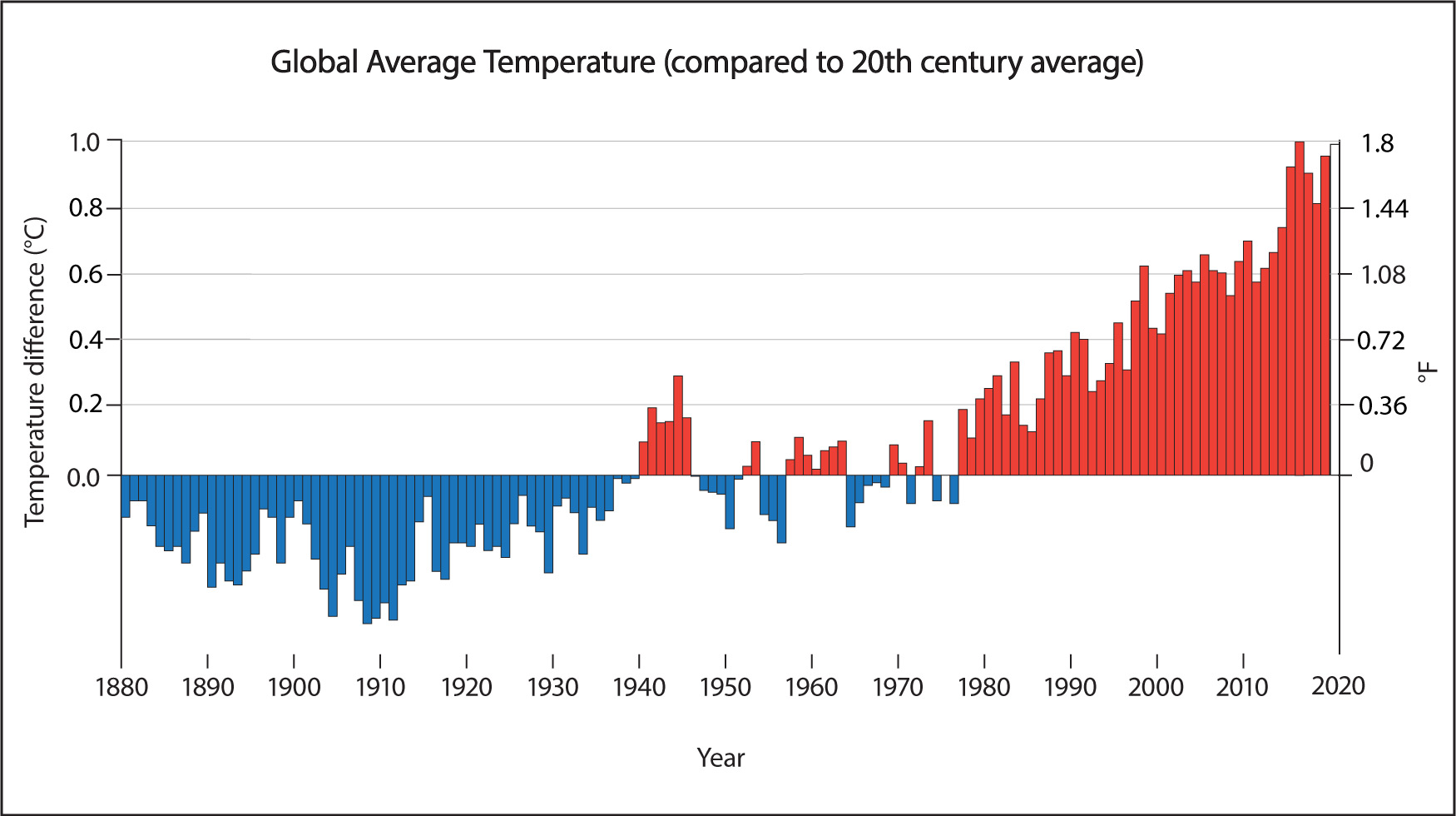
The most obvious consequence of global warming is the rising trend in global average temperature that you saw in Figure 7.1.3–1. But this, in turn, causes many other local, regional, and global consequences.
To keep our discussion as simple as possible, we’ll divide the many consequences of global warming into five major categories:
- Local and regional climate change
- Storms and extreme weather
- Melting of sea ice
- Sea level rise
- Ocean acidification
In the rest of this section, we’ll briefly investigate each of these categories. Keep in mind that this is just one possible way of categorizing the consequences of global warming, so you may see them categorized differently in other places.
Discussion
Seeing the Light at the End of the Tunnel
As we begin to discuss the consequences of global warming, you may find that that the topic feels depressing or scary. It’s normal to feel that way. After all, most of the scientists who have studied this topic are very concerned for the future, as are most politicians (look again at the quote from Margaret Thatcher) and most of the public. It’s therefore very important to remember that, as we’ll discuss in Section 7.3, it is quite possible for the human race to stop the ongoing warming and build a far better future.
Therefore, because you are young and have a long life ahead, there’s a good chance that most of your life will be lived after the problem of global warming has been solved. With this in mind, hold a brief class discussion about the following questions:
- Look up the meaning of the expression “seeing the light at the end of the tunnel.” How can the idea embodied in this expression help you stay focused on the positive promises of the future even while you are learning about some of the gravest threats that we now face?
- Discuss why, for almost any situation (not just global warming), it is important to keep a focus on the positive even when facing great adversity or danger.
This discussion is again designed to help you keep the focus on “inspiration not fear,” even as you begin to cover some of the scariest aspects of the science of global warming. You can think of this discussion as a continuation of the earlier discussion about “your world at age 100.” Once again, we hope students will realize that if the world can halt all greenhouse emissions before about 2050, then their future could look quite bright (especially if we develop technologies that can pull greenhouse gases out of the atmosphere and thereby reverse much of the damage that has already been done). Notes on the two discussion questions:
- (1) Many students will already be familiar with the expression, and a web search on it will give you numerous variations on its meaning. In general, the “light at the end of the tunnel” is taken to mean something along the lines of “a long-awaited indication that a period of hardship or adversity is nearing an end.” Students should then see how this can be applied to a topic like the consequences of global warming. We’ve already been facing the dangers of these consequences for decades (see the Margaret Thatcher quote), and it may seem they can only get worse. But even though we haven’t discussed the solutions yet, students are probably already aware that solutions exist, so we can see the “light” if we focus positively on the future.
- (2) This question gets more into psychology than physical science, but hopefully students will use it to think more generally about the benefits of keeping a positive attitude in the face of adversity.
Local and Regional Climate Change
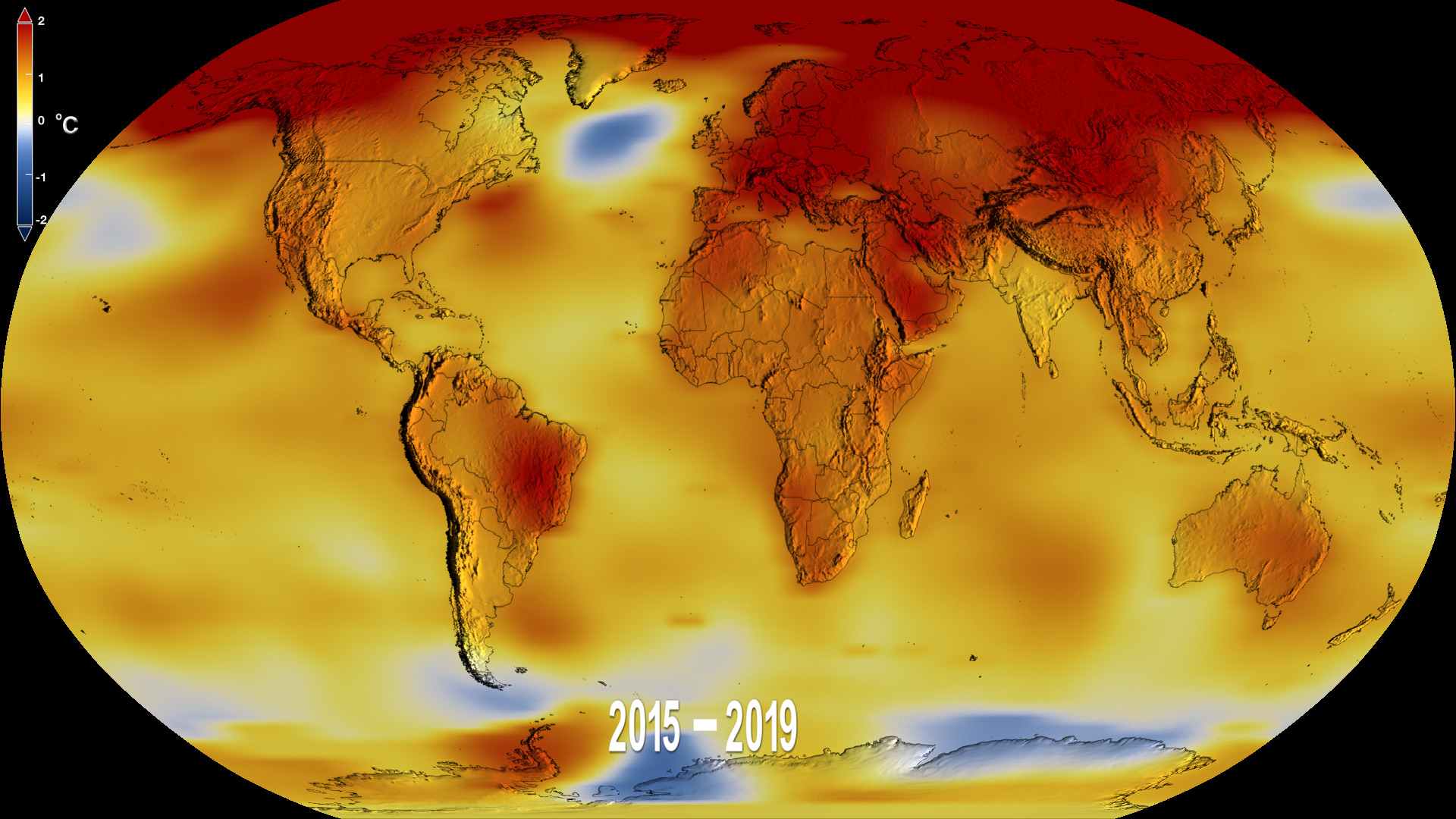
This first category of consequence refers to the fact that global warming affects local and regional climates differently in different places. You’ve already seen how the average amount of warming differs from place to place in Figure 7-1, repeated below. Notice that while warming is occurring nearly everywhere, the warming has been much greater in some regions than in others, particularly in the far north.
Of course, changes in the average temperature are only one way in which global warming affects local climate. Let’s look at just a few more, and you can probably think of others.
Journal Activity
Ask Your Parents
Conduct a brief interview with your parents or other adults around you. Ask them each of the following questions, then in your journal write down a brief summary of their responses:
- Compared to when you were younger, have you noticed any change in how hot it is in summer or how cold it is in winter?
- Have you noticed any change in how often we have major storms?
- Have you noticed any other changes in our local weather or climate that might have been caused by global warming?
This journal activity is designed to get students thinking about how local weather/climate has already changed. Because the students are too young to remember more than just a few years back, we ask them to ask their parents (or other adults), who will obviously have a longer memory. Notes:
- You can have students do this activity even if you’ve already moved ahead in the discussion of consequences below. In that case, you may simply need to adjust the timing of exactly when you hold the various follow-up discussions.
- The responses from parents/others will work best when they have lived in the same area for a long time, since in that case they will have a memory of your particular locality. However, it should still work fine even for students whose families have moved a lot; just keep in mind that, in this case, the answers may reflect the adults’ views in a more general sense, rather than of a particular location.
- Keep in mind that some students may have parents who deny global warming and will therefore say they haven’t noticed any change. Because this journal activity is only asking students to record their interview responses, such answers are perfectly acceptable here.
More Hotter Days
Consider a place where the average temperature increase has been the same as the global increase. As you saw in Figure 7.1.3–1, this global increase has been about 0.9°C (which is the same as an increase of about 1.6°F) compared to the 20th century average.
If every day were warmer by just this amount, you might barely notice the change. But that is not what happens. Instead, some days are much warmer, some are unchanged, and some might even be colder, as long as the average works out to the 0.9°C increase. Figure 7.2.1-2 shows how the increase has affected summer temperatures, showing that we now experience many more “unusually hot” days than we did just a few decades ago. In fact, you might say that such days are rapidly becoming our “new normal.”
 Slide 1: This graph shows the distribution of summer temperatures for the period 1951-1980. Notice the characteristic bell shape, which tells us that most days are "normal" and equal numbers of days are particular amounts above or below normal.

Figure 7.2.1-2 – Scroll back and forth between the two slides here to see how summertime temperatures
have changed due to global warming in just a few decades. Notice that “normal” temperatures for recent
years (2009–2019) would have been considered “hot” during the period 1951-1980. Credit: Data from James
Hansen and Makiko Sato, Climate Science, Awareness and Solutions, Columbia University Earth Institute.
We don’t go into detail about interpreting Figure 7.2.1-2, because most middle school students are not yet familiar with the statistics of normal distributions (bell curves). But they should be able to understand the general point as described by the annotations we’ve included on the curves. For your background: The curves represent a normalized data set for all land locations in the Northern Hemisphere for summers (June to August), and the key point is that the entire distribution has shifted a full standard deviation to the right, so that what used to be “hot” is now “normal” (and if the trend continues, what used to be “very hot” will become the new normal). You can find full details about how the curves in Figure 7.2.1-2 are constructed in the data source article here.
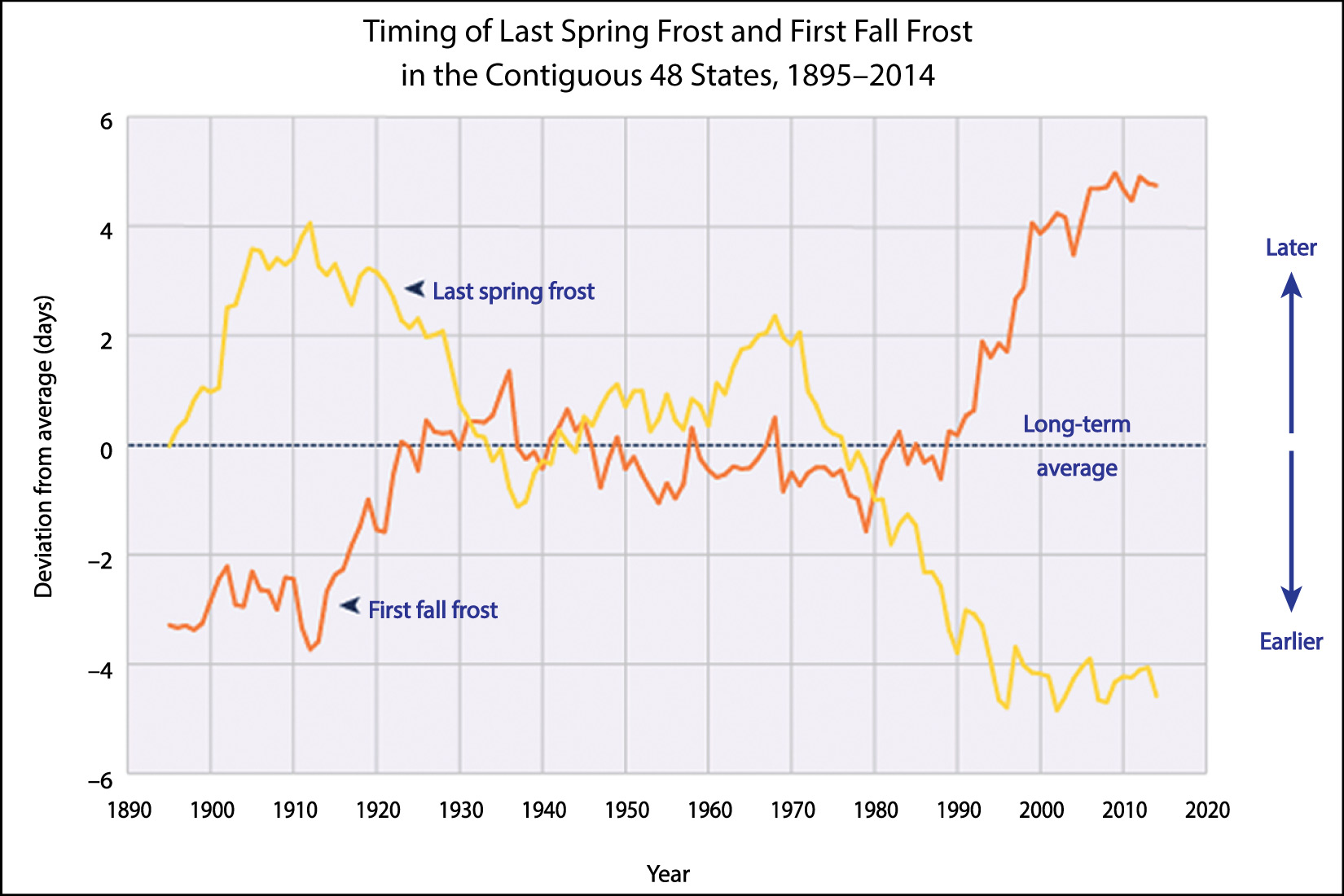
A closely related effect is that in terms of warmth and cold, summers have essentially become longer and winters have become shorter. For example, Figure 7.2.1-3 shows how the average date of the first fall frost (meaning a day with temperatures below freezing) has moved later while the date of the last spring frost has moved earlier. The overall result is that there are fewer freezing days than their used to be (in regions where freezing winter temperatures are common). This has many detrimental effects. For example, it allows pests to spread more widely, and has had a major impact on ski resorts, which now on average have shorter ski seasons than in the past.
Discussion
Noticing the Temperature Change
Before you continue on, hold a brief class discussion about whether you, your parents, or other adults around you have noticed temperature changes like those shown in the figures above. For example, are there more heat waves and very hot summer days than there used to be? Has there been local change in seasonal patterns of warmth and cold? Discuss these and similar effects on local temperature that you and others have noticed.
This can be a very brief discussion, but it is important to help students see that the kinds of effects we are talking about are indeed noticeable to most people. Note: It will be helpful if students have already done the Journal Activity “Ask Your Parents,” since that would mean all students would have some adult perspectives to share. However, the discussion should still work even if they have not yet interviewed their parents/adults, since many students will already have heard adults talk about these topics. You should also talk about what you have personally noticed in your lifetime, since that will be another valuable perspective for your students.
Changes in Rainfall/Snowfall
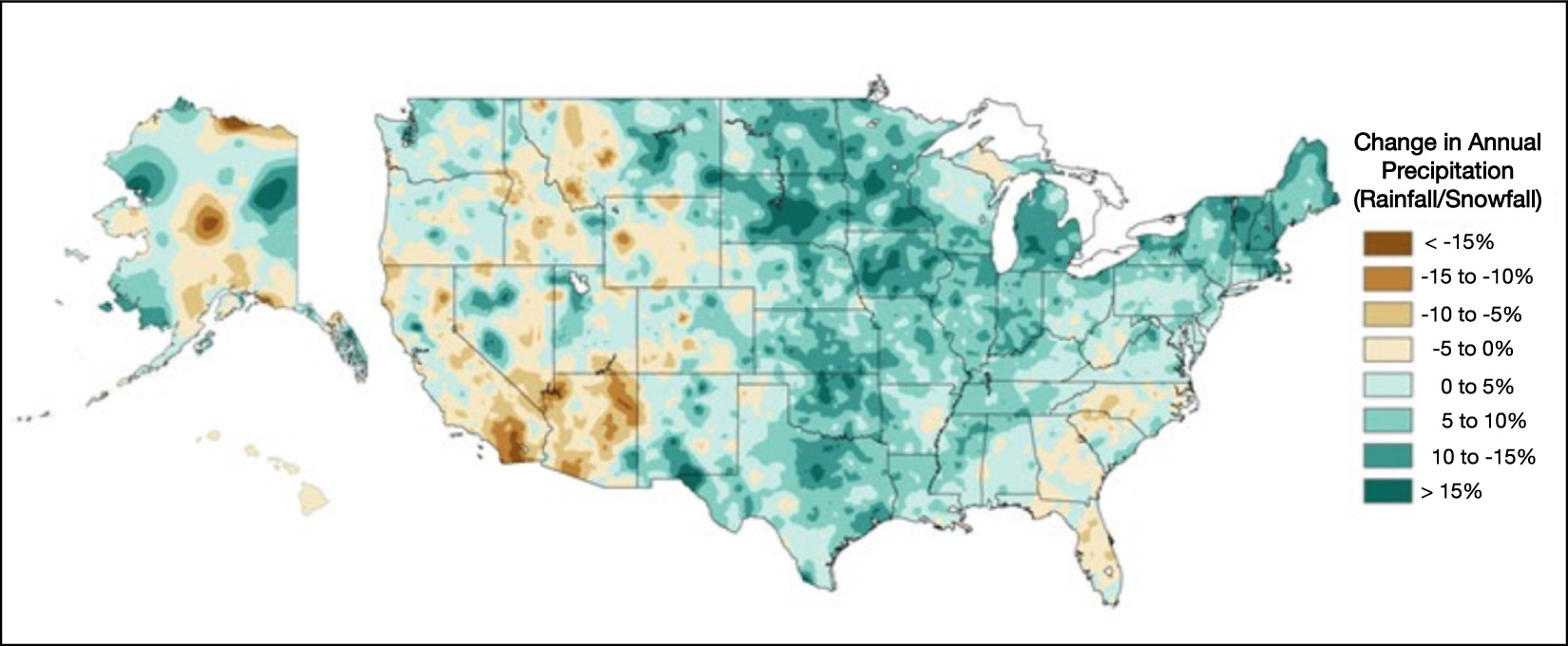
Patterns of rainfall and snowfall have also been changing with global warming. For example, the map of the United States in Figure 7.2.1–4 shows how the total amount of precipitation (rainfall and snowfall) in recent decades compares to that from about the first half of the 20th century. Notice that while most areas of the United States have become wetter, some have become drier, particularly in the southwest.
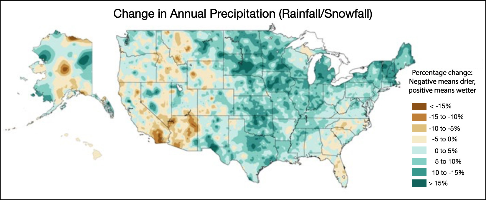
It’s worth noting that although there are some exceptions, there’s a useful general way of thinking about the precipitation changes: in general, global warming is making wet climates get wetter and dry climates get drier. There’s even a simple explanation for this general pattern:
- Dry regions are dominated by evaporation, and warmer temperatures mean more evaporation, making them drier.
- Wet regions are dominated by rainfall (or snowfall), and the fact that there is more evaporation globally means that there is more total moisture in the air, so there is more total rain to fall.
Discussion
Noticing the Precipitation Change
Hold a brief class discussion about whether either you, your parents, or other grownups you’ve talked to have noticed changes in rainfall or snowfall in your area. If so, has it become wetter or drier?
This discussion is similar to the prior one, but now focuses on precipitation. If you are in the United States, you can use the map above to help guide the discussion.
Secondary Effects: Wildfires, Disease, Extinctions, and More
Changes in temperature and precipitation patterns have many “secondary” effects, meaning effects that are essentially consequences of those changes. Slide Show 7.2.1-5 shows a few examples of the effects of changes to local and regional climates. Note in particular:
- Wildfires: Drier and hotter conditions lead to greater danger from wildfires, and significant increases in wildfires already have been seen in many places around the world, including the American West (notice the drier areas in Figure 7.2.1-4), Australia, and Russia.
- Dying forests: The pine forests of the Rocky Mountains are currently dying off due to an explosion in the population of pine beetles that kill the trees. This increase in the pine beetle population has been tied to the shorter and warmer winters that are a result of climate change (see Figure 7.2.1-3), because this allows the beetles to survive longer each season and to reproduce in larger numbers. Similar ecological effects are happening in many other regions around the world.
- Pests and diseases: Global warming is contributing to increases in the spread of insect-borne illnesses and crop-damaging pests. For example, diseases such as malaria, zika, dengue fever, and chikungunya are transmitted by mosquitoes, which pick up these diseases by biting infected people and then, after some incubation period, spread them to other people through subsequent bites. Research has shown that warmer temperatures shorten the incubation period, which means the diseases can spread more rapidly. Warmer temperatures also tend to increase the geographic ranges of insects, which is thought to be a major reason why insect-borne illnesses and pests are becoming more widespread.
- Species extinctions: Some species cannot migrate fast enough as local climates change, causing them to go extinct as the ecosystems they rely upon are altered or disappear.
 Slide 1: Wildfires - Drier and hotter conditions lead to greater danger from wildfires, and significant increases in wildfires already have been seen in many places around the world. Credit: U.S. National Forest Service.


Slide Show 7.2.1-5
Before you continue, try the following questions to make sure you understand the relationship between some of the data graphs you’ve seen and the expected consequences of local and regional climate change.
Discuss the following questions with a classmate. Then click to open the answers to see if they agree with what you came up with.
1. Devastating heat waves have become increasingly common in many regions of the world, including Europe, Australia, Asia, and the American southwest. Explain how you can account for these more frequent heat waves based on the data shown in Figure 7-1 and the bell curves shown in Figure 7.2.1-2.
Figure 7-1 shows that large areas of these regions have had much greater than average warming. Figure 7.2.1-2 shows that in any region, a rising average temperature means an increasing number of days that are “very hot.” Together, these facts mean that heat waves are going to come more often and last longer in these regions.
2. Even before global warming became noticeable, the city of Phoenix, Arizona (in the desert of the American southwest) was one of the hottest cities in the world. In recent years, some summer days have become so hot that pavement essentially begins to melt, and Phoenix has several times been forced to close its airport for this reason. How do the figures from the prior question explain this fact?
Phoenix is in a region (the American Southwest) that has experienced above average warming, and again, Figure 7.2.1-2 shows that in any region, a rising average temperature means an increasing number of days that are “very hot.” Because Phoenix was already very hot even before global warming, “very hot” for Phoenix is more extreme than in almost any other place in the world.
3. In recent years, wildfires have caused large loss of life and major economic damage in the American southwest (such as in California, Arizona, and Colorado). Briefly explain why that is an expected consequence of global warming, based on the data shown in Figure 7-1 and the precipitation map in Figure 7.2.1-4.
Figure 7-1 shows that the American Southwest has had greater than average warming, while Figure 7.2.1-4 shows that these regions have generally become drier. The combination of higher temperatures and reduced rain and snowfall make forests and grasslands dry out faster, so that they become more prone to wildfires.
4. Ski resorts around the world are very important to many local economies, but the average length of ski seasons has been getting shorter. How does Figure 7.2.1-3 explain why ski seasons have been getting shorter on average?
Skiing obviously requires snow, which melts when temperatures are above freezing. In Figure 7.2.1-3, the “first fall frost” essentially represents the first time that snow can begin to accumulate, and snow can only melt, not accumulate, after the “last spring frost.” The fact that the average time between these is shortening due to global warming means that snow cover lasts for a shorter time, reducing the length of the ski season.
5. Briefly explain how global warming is contributing to the fact that some mosquito-borne diseases are spreading into regions that previously did not have them.
Many disease-causing mosquitos survive best in warmer conditions. Therefore, as the world warms, these mosquitos can range into regions where they previously could not survive, bringing their diseases with them.
Discussion
Effects of Local Climate Change
Continue your class discussion about local climate effects. Have you or the adults around you noticed any “secondary” effects of climate change in your region? You can consider any type of secondary effect, not just the ones we’ve discussed above.
This is another continuation of the above discussion, this time focusing on various secondary effects. Depending on where you are located, the most important of these may be wildfires, pests, disease, or a variety of other things. Again, the key is just to make sure students see how the topics we are discussing relate directly to their own lives.
Storms and Extreme Weather
A second major category of global warming consequences concerns extreme weather events. In particular, we expect global warming to make events such as hurricanes, thunderstorms, floods, droughts, heat waves, and even winter storms to become either stronger or more frequent, or both. For example, Figure 7.2.1-6 shows that extreme precipitation events — meaning unusually heavy rainfall or snowfall — have become much more common over large portions of the United States.
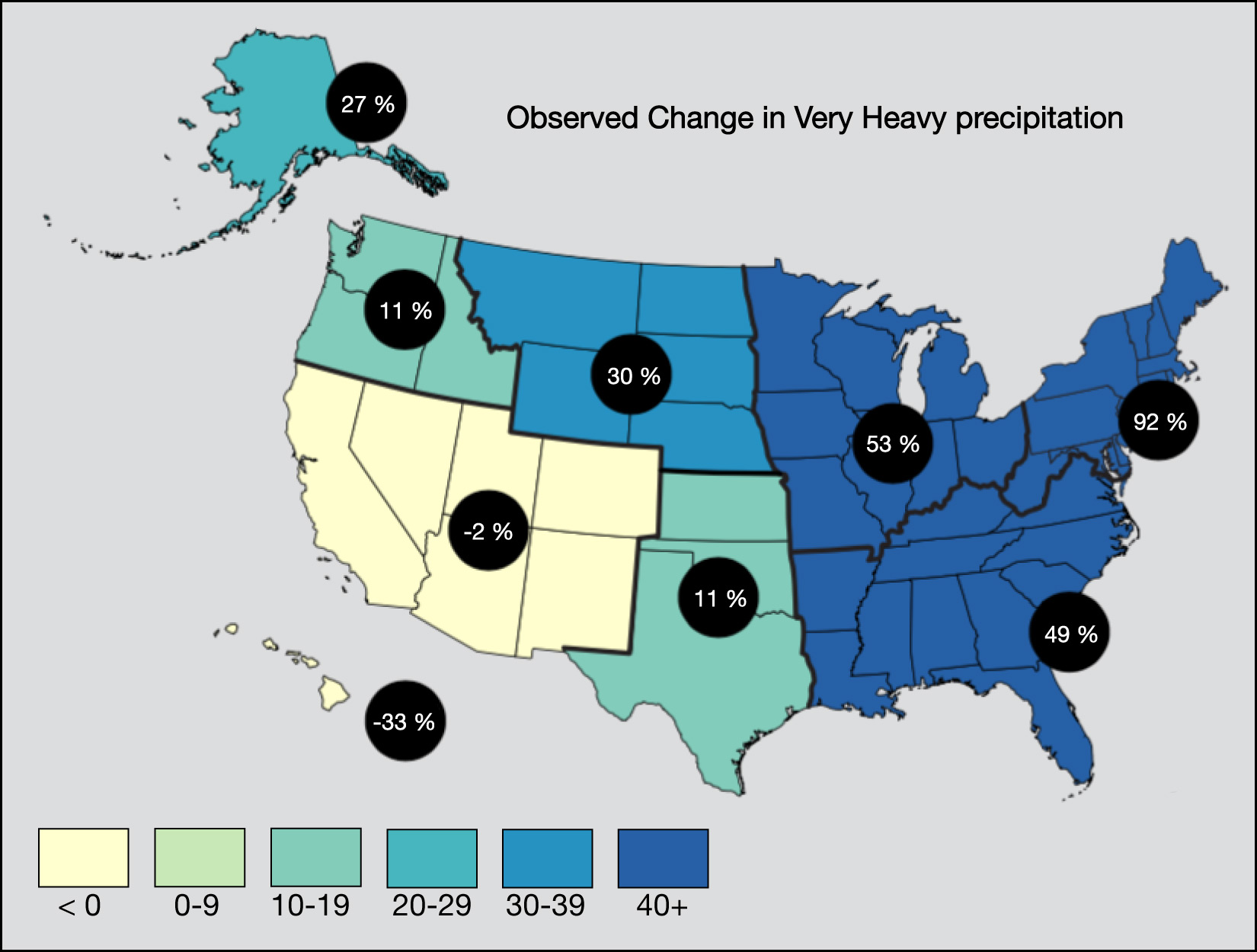
(a) This graph shows the percentage change in heavy rain and snow events for different regions of the United States from 1958 to 2016. Notice that most regions (except the southwest and Hawaii) have seen a significant increase in heavier rain and snow events; in other words, when it rains, it pours (and when it snows, it blizzards). Credit: Fourth National Climate Assessment (U.S. Global Change Research Program).
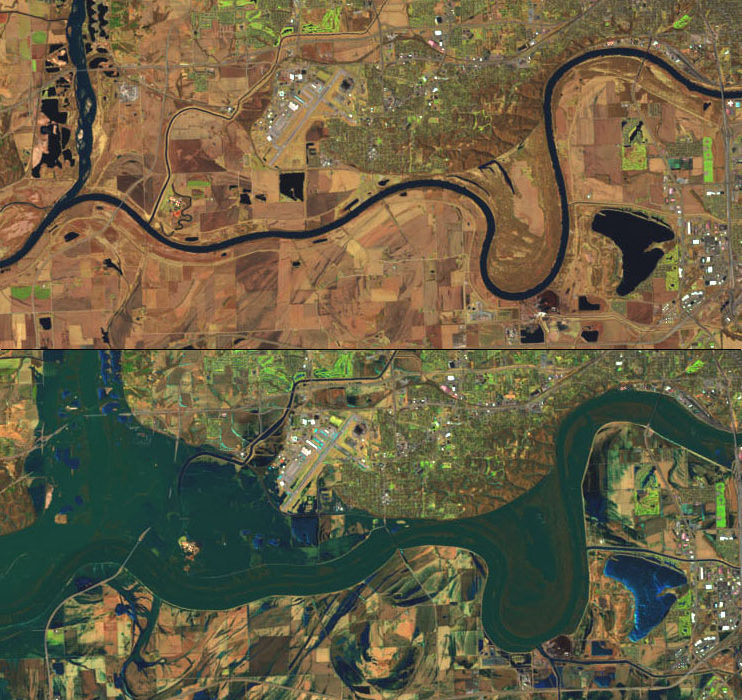
Figure 7.2.1-6 – Climate change is increasing the frequency of extreme precipitation (rainfall or snowfall) events.
It’s easy to understand why we should expect global warming to mean more extreme weather. Remember that the greenhouse effect traps heat and energy in the lower atmosphere and oceans. Therefore, the fact that human activity is strengthening the greenhouse effect means that more heat and energy is being trapped. Because heat and energy are the drivers of weather events, more heat and energy will naturally mean more extreme weather events. Try the following questions to help build your understanding of why these extreme events are becoming increasingly common.
Discuss the following questions with a classmate. Then click to open the answers to see if they agree with what you came up with.
- For Earth as a whole, would you expect global warming to mean more or less total precipitation (rainfall and snowfall)? Why?
More, because the warming climate means more total evaporation (especially from the oceans), which increases the amount of moisture in the atmosphere that must eventually fall as rain or snow.
- Numerous hurricanes (and cyclones and typhoons ) would be expected to occur every year on Earth even without global warming. However, you might expect global warming to change the strength of these storms. Would you expect very strong hurricanes to become more or less common as a result of global warming? Why?
Stronger hurricanes (like the one shown in Figure 7.2–1) should become more common . Hurricanes draw their energy from the warmth of the ocean surface, so the fact that the ocean surface is warming means we would expect hurricanes to be stronger than they would have been otherwise. In addition, the added moisture in the atmosphere (as noted in question 1) means that hurricanes are likely to dump more rain as well as to have stronger winds.
- People are sometimes surprised to learn that global warming is predicted to lead both to an increasing number of floods and an increase in droughts. Explain how both can be true.
The answer is similar to what we already discussed about wet and dry climates. Let’s start with the droughts. Warmer temperatures mean more evaporation, so if you are in an area that is having a dry spell, the warmer temperatures will make it even drier, thereby increasing the chance of a drought. But also remember there is more total moisture in the atmosphere. Therefore, when it rains, it’s more likely to dump a lot of rain and cause a flood.
- Climate scientists sometimes say that one consequence of global warming is that “when it rains, it pours, and when it snows, it blizzards.” Based on your prior answers, explain what this means.
As above, the greater moisture means more total water that can fall from the sky as rain or snow. Therefore, when we get what might have been a “normal” rainstorm without global warming, it is now more likely to be downpour. And when we get what would have been a “normal” snowfall, it is now more likely to be a blizzard.
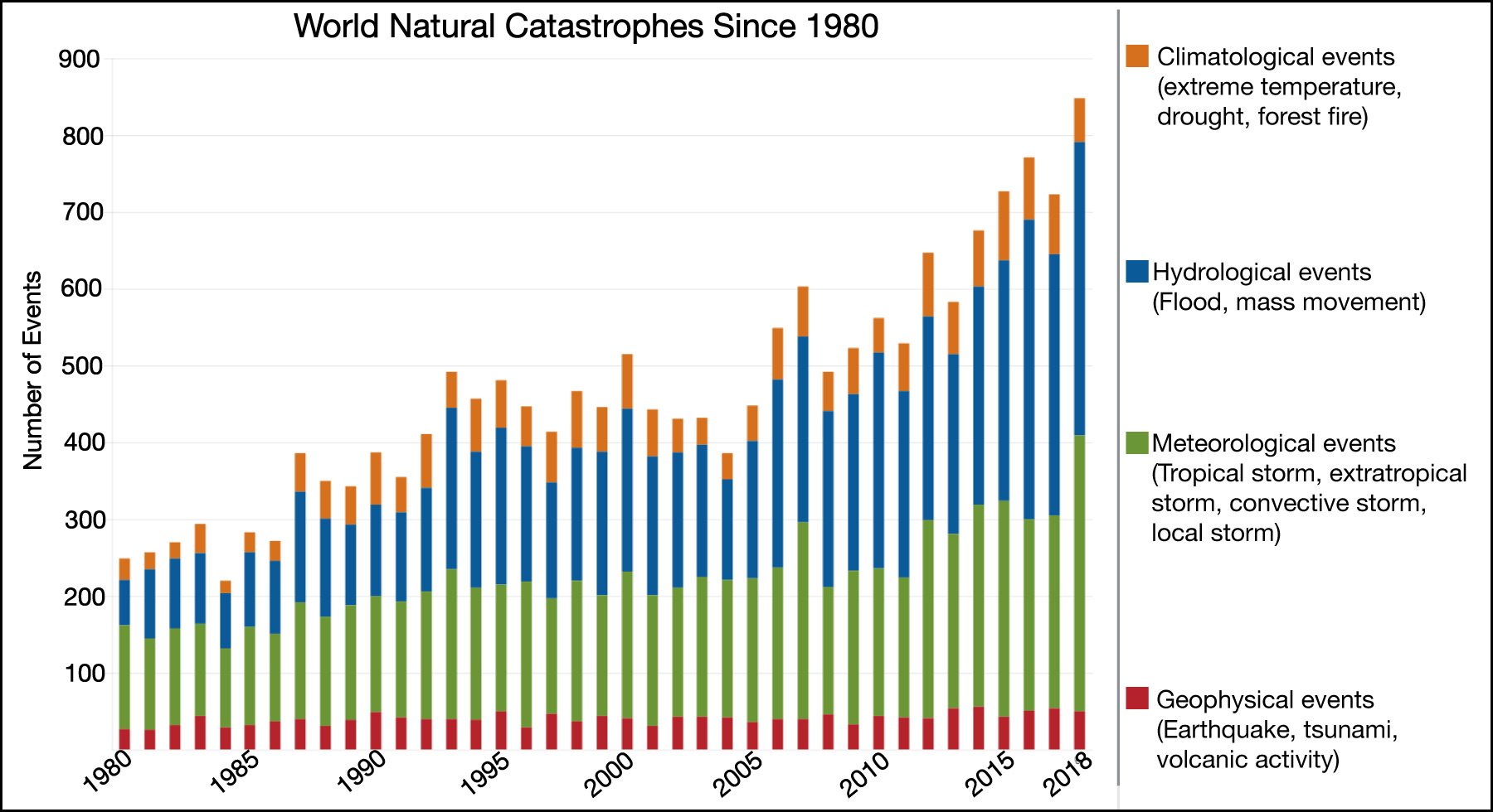
Figure 7.2.1-7 shows that extreme events are indeed becoming more common, just as we should expect . Be sure to study the key that goes with this bar chart carefully. Notice that the red portions of the bars represent geological events such as earthquakes and volcanoes, which are unrelated to global warming. But the other colors in each bar represent events linked to weather and climate, which means they can be affected by global warming. While there is quite a bit of variability from year to year, the overall upward trend is very clear, confirming the increase in extreme events.
It’s worth keeping in mind that the increase in extreme weather events sometimes causes confusion for people who haven’t studied the issue carefully. We’ll point out two common issues:
- We cannot say that global warming has caused any particular storm or weather event, since such events have always occurred, even before the recent global warming began. However, global warming makes such events likely to be either more common or stronger, or both.
Climate scientists often make this point with an analogy to “loaded” dice, which are dice that have been made heavier on one side so that they are more likely to land on that side. Just as loaded dice makes certain outcomes more likely than they would be otherwise, global warming makes extreme weather events more likely than they would be otherwise, and can cause an event that might have been closer to “normal” to instead be more extreme. In other words, climate change tips the scales in favor of extreme weather events.
Cigarette smoking offers another analogy: We can’t be sure that smoking caused a particular person’s lung cancer, but we know that on average, the more you smoke, the more likely you are to get lung cancer. In the same way, we can’t say that global warming caused any particular extreme weather event, but we know that it makes such events more likely. - Remember that we expect more extreme events of all types, and this includes extremes of winter. You’ve already seen why global warming can make what would have been a “normal” snowstorm into a major blizzard. Global warming can also lead to extreme cold spells and other unusual winter weather .
Activity
Local Extremes
Briefly investigate extreme weather events in your local area over the past few years. You should consider extreme weather of all types, including heat waves, cold snaps, major storms, floods, and drought.
- Going from memory or by asking adults, make a list of recent (within the last 5 or so years) local extreme weather events.
- Look up news reports about each event. When exactly did it occur, and what were its effects? Are any of the effects still being felt?
- Do the news reports mention any connection between each of the events and global warming? If so, explain the connection. If not, discuss whether or not you think the event was likely to have been caused by or made worse by global warming. Be sure to explain your reasoning carefully.
This activity should be fairly straightforward. It can be done either individually or in small groups. Or you could make the list of events (question 1) as a class, then assign small groups to investigate each event (questions 1 and 3).
Claim-Evidence-Reasoning Activity
Winter Skeptics
Imagine that a big winter storm has hit the northeastern United States, and you then hear a news report in which someone makes the following claim:
Claim: This snowstorm proves that global warming can’t be a real problem, because if it was, we wouldn’t get this kind of cold and snow.
Based on what you have learned, use evidence and reasoning to support or refute the claim.
This CER activity checks to make sure that students understand why global warming does NOT mean an end to winter storms, and can even mean more severe ones. The claim should be refuted. A few notes:
- In refuting the claim, students should point out that, as discussed above, global warming means that extreme events of all types — including winter storms — are expected to become either stronger or more common.
Note for your background: in the case of winter storms, the data are not yet fully clear, but they suggest that very strong winter storms (“when it snows, it blizzards”) are indeed becoming more common, but the total number of storms is dropping. In addition, some storms that would otherwise have dropped snow are now instead dropping rain, due to warmer temperatures. - Students might also point out that global warming refers to a global average, so the fact that cold weather is occurring in one particular place does not necessarily mean that the whole world is cold on that day, or in that season or year. Indeed, there have been cases in recent years where certain regions (such as the northeastern U.S. or Europe) had unusually cold winters even while the global average temperature was reaching records in the same periods.
- Fyi, this claim is surprisingly common, despite how easy it is to refute. In one famous case, a United States Senator even brought a snowball to Congress and used it to support his claim that global warming is a hoax. This occurred in February 2015, when there was a major snowstorm in Washington, DC. — but the year as a whole broke the record for the hottest year since 1880 (a record that has since been broken again).
Melting of Sea Ice
You know that heat causes ice to melt, and therefore that we should expect global warming to cause at least some melting of Earth’s polar ice caps and glaciers. Broadly speaking, there are two categories of ice melt, each with a different set of consequences:
- The melting of sea ice, like that of the Arctic Ocean.
- The melting of glacial ice, meaning ice that is on land — especially in Greenland and Antarctica — and can therefore melt into rivers or the ocean.
We’ll focus on the melting of sea ice as our third major category of consequences of global warming, saving the melting of glacial ice for the fourth category (sea level rise) that follows.
Figure 7.2.1-8 shows that ice in the Arctic ocean has been declining dramatically. The first image shows comparative maps of the summer minimum ice coverage for three selected years, and the second shows a graph of the general trend.
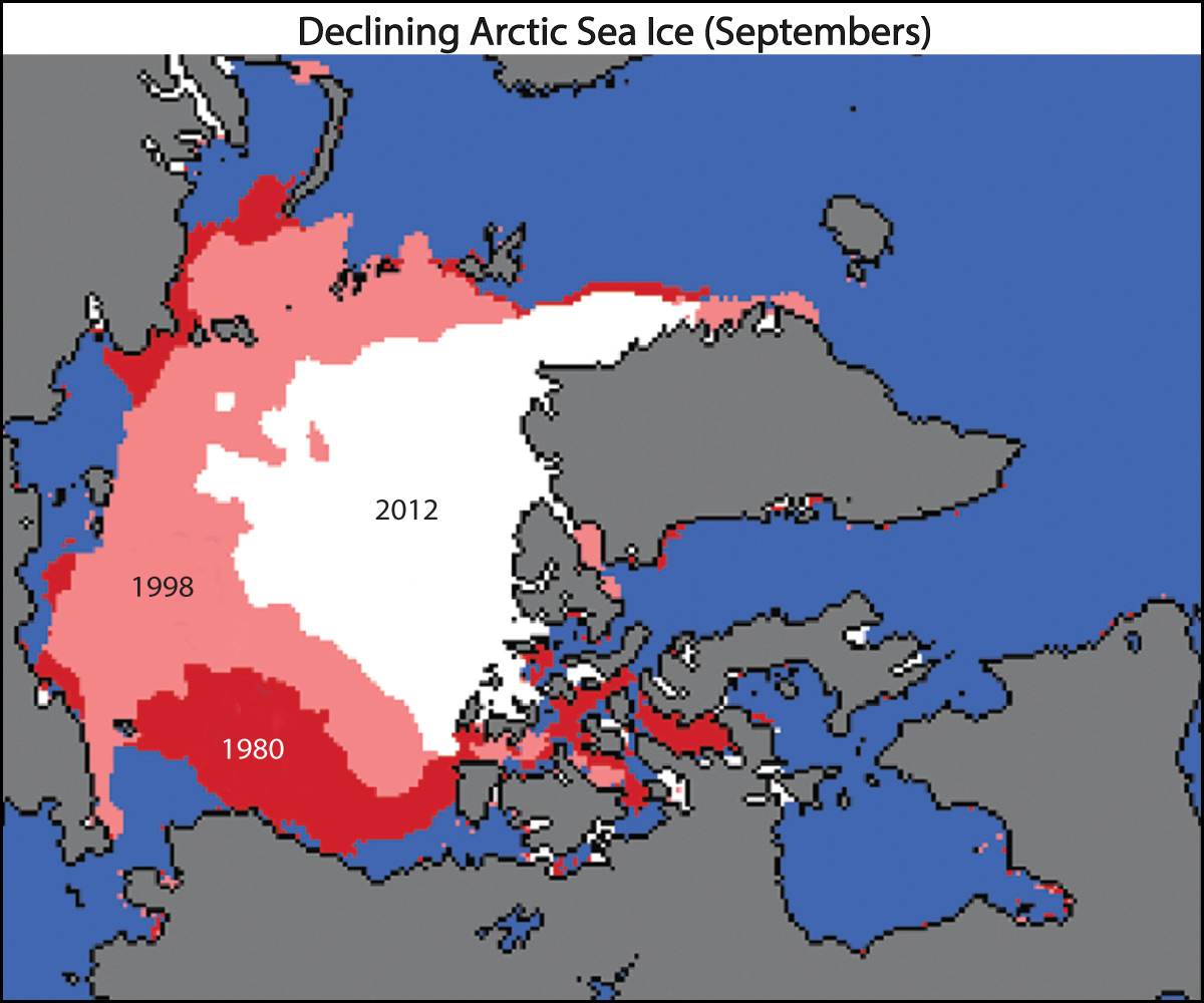
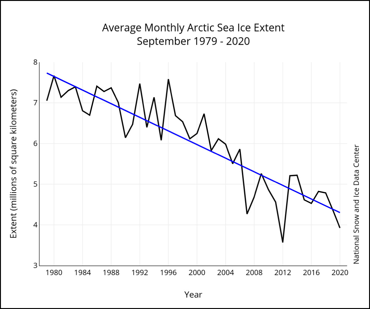
Figure 7.2.1–8 – The map and graph show how summer ice coverage has been declining in the Arctic Ocean. You can find updated data each month at nsidc.org/arcticseaicenews.
Discussion
Understanding the Sea Ice Data
In small groups or as a class, discuss the following questions about Figure 7.2.1-8.
- Why is it important to compare the same month (in this case, September) for each year?
- Why does the September ice coverage represent the minimum ice coverage for each year?
- The map at the left includes the year 2012. Was that year representative of the general trend? Why do you think that the map maker chose to show that particular year?
- Based on the general trend, about when would we expect an average year to have summer ice coverage as low as that of 2012? Given your answer, do you think it was “fair” for the map at the left to show 2012? Defend your opinion.
This discussion can be fairly brief; it is designed simply to help students interpret Figure 7.2.1-8. Notes on the answers.
- (1) The ice coverage in the Arctic ocean varies with the seasons, expanding as ice freezes in winter and declining as ice melts in summer. Therefore, a fair comparison requires looking at the same time frame each year. This figure shows September, but you would see similar trends for other months.
- (2) September is at the end of summer, when the ice has melted as much as it is going to for any particular year. After September, water begins to refreeze. Therefore, September generally represents the minimum ice coverage for the year.
- (3) As you can see on the graph at the right, 2012 had the lowest ice coverage of any year shown, although 2020 came close to that same low. So at least through 2020, it represents a record low, not a representative year. It was therefore chosen to illustrate the most dramatic effect on record, rather than the average effect.
- (4) The answer is in about the year 2030. To figure this out, students should recognize: (i) The y-axis shows that 2012 had a September ice coverage of about 3.5 million square kilometers. (ii) The trend line was at a little less than 4.5 million square kilometers for 2020, so it needs to fall a little less than 1 million square kilometers to reach the 2012 level. (iii) The slope of the trend line is about 1 million square kilometers per 12 years (you can see this, for example, by comparing its level from 2000 to 2012). So a little less than 12 years after 2019 means around the year 2030.
In terms of whether it is “fair” for the map to show 2012: This is a matter of opinion, but our (authors) opinion is yes, because showing the record low helps illuminate the change and because the trend line would reach that level anyway by about 2030.
The good news when it comes to melting sea ice is that it does not have any significant effect on sea level, because this ice was already floating before it melted.
Activity
Melting Ice and Sea Level
For this activity, you’ll need two measuring cups and some ice cubes.
- Partially fill the first measuring cup with water, and then add a few ice cubes. Carefully note the water level (not the level of the tops of the ice cubes) in the cup.
- Fill the second cup with water to the exact same level as the water in the first cup. Then set up some kind of system in which you can place a few ice cubes outside the cup, but in a way that will allow the water from them to melt into the cup.
- Wait for all the ice cubes to melt. Then observe what has happened to the water levels in each of the two cups.
- Discuss your results. Why did they occur? How are these results relevant to the statement above that melting of sea ice does not affect sea level?
This activity demonstrates that the water level in a cup does not change when floating ice melts, but does change if ice melts into the cup. Notes:
- The trickiest part of this activity is setting up the ice cubes for step 2 so that they will melt into the cup. You can consider this to be a small engineering challenge for your students. Basically, they’ll need to find a way to place the ice cubes above the cup without falling in, but with some kind of channel that will let the melt water from the cubes flow directly into the cup.
- Students should record the water levels carefully. (You might encourage them to add ice cubes in the first cup until the water level is easy to read.) For the first cup, students will see that the water level stays unchanged as the ice melts. For the second cup, the water level will rise.
- For the discussion (question 4):
- The second cup is the easiest to explain, since water from the melting cubes is flowing into the cup, making it fairly obvious that the water level will rise.
- For the first cup, students will need to think back to what they’ve learned about density to explain why the water level stays unchanged. In brief: The ice cubes float because they are less dense than liquid water, but they float at a level determined by the relative densities (roughly 5/6 of the ice in the water, 1/6 above). The melting does not change the total mass of the H2O (frozen and liquid combined), so it does not change the water level.
- The relevance to melting sea ice is that this ice is floating just like the ice cubes in the cup, so their melting does not affect sea level.
The bad news is that the melting of sea ice has many other negative effects (Slideshow 7.2.1–9). Most famously, it hurts polar bears, which depend on the ice for their hunting, but it also has several other serious consequences. Two of the most serious are:
- Melting ice changes the ocean salinity (the amount of salt in the water). This happens because ice is essentially fresh water , so melting it reduces the salinity of the surrounding ocean. The lower salinity may in turn lead to changes in ocean currents and the productivity of fisheries around the world.
- The melting of ice tends to amplify global warming. The reason is that ice reflects much more sunlight than water. Replacing ice with water therefore means that Earth absorbs more heat from the Sun. As a result, we get more global warming than we would expect from the greenhouse effect alone, because of the extra energy being absorbed by the ice-free ocean.
 Slide 1 - (a) Polar bears and many other Arctic animals (including walruses and narwhals) are suffering as Arctic sea ice declines. Credit: Andreas Preusser.


Slideshow 7.2.1–9 – These illustrations show some of the many negative effects being caused by the melting of sea ice.
Claim-Evidence-Reasoning Activity
Mining the Arctic Ocean
The Arctic Ocean seafloor is rich in many valuable resources, including oil (petroleum) and many precious metals. In addition, if not for the ice, the shortest shipping routes between many parts of North America, Europe, and Asia would be by sailing across the Arctic Ocean. As a result some people have made the following claim:
Claim: The melting of the Arctic Ocean will be economically beneficial because it will open new shipping lanes and give us access to previously inaccessible seafloor resources.
Based on what you have learned, use evidence and reasoning to support or refute the claim.
This CER activity focuses on another common claim made by those who dispute the threat of global warming, but in this case the claim has at least some validity. Nevertheless, students should refute the claim based on the following evidence.
- While it is true that the shipping lanes and resources would be economically beneficial on their own, they are not “on their own”; they come only in combination with the negative consequences listed above.
- Those consequences, particularly the amplification of global warming caused by the additional sunlight absorbed as ice melts, are likely to have negative economic consequences that will far outweigh any benefits.
- So at minimum, the claim cannot be clearly supported, since it makes a statement that takes account of only one side of the equation (the benefits, but not the negatives).
- Some students may recognize a further issue: The oil only has economic value if we use it, and since that would release more carbon dioxide and cause more global warming, using it would only cause more harm. We are much better off turning to non-fossil energy sources.
Sea Level Rise
A fourth major consequence of global warming is an expected rise in sea level. This rise actually comes from two distinct processes:
- Water expands very slightly as it gets warmer. This thermal expansion is much too small to notice in a cup of water, but there is so much water in the oceans that it has a measurable effect.
- The melting of glacial ice (Figure 7.2.1-10), which adds water that flows to the oceans.
Together, these effects have already caused global sea level to rise by more than 20 centimeters (8 inches) in the past century or so (Figure 7.2.1-11). Most of the rise so far has been due to thermal expansion, but the melting of glacial ice has the potential to cause a much larger rise in the future.
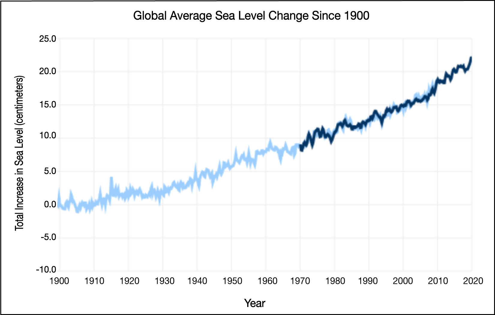
Figure 7.2.1–11 – This graph shows measurements of the overall rise in sea level since 1900. The total rise has been more
than 20 centimeters. (The two different color curves represent two different data sets; notice that they are in very close
agreement for the period in which they overlap.) Credit: NOAA. You can find an interactive version of this graph here.
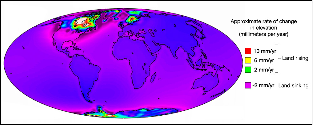
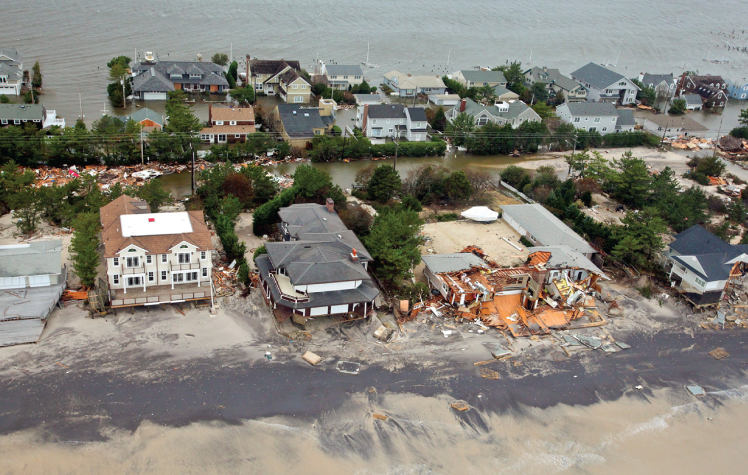
A sea level rise of 20 centimeters (to date) may not sound like much, but it is enough to cause flooding in many low-lying regions around the world. Moreover, its effects can be magnified by storms, causing storm surges to rise higher and go farther inland than they would otherwise (Figure 7.2.1-12). Also keep in mind that local sea level (along coastlines) may have changed a little more or less than this average, as a result of changes in the local land height. For example, recall from Section 5.2.2 that much of the east coast of the United States is still sinking downward following the last ice age (see Figure 5.2.2–14), which therefore magnifies the change in local sea level since the land is going down while the ocean goes up.
Discussion
Causes of Sea Level Rise
Watch this short NASA video, which summarizes the causes of sea level rise and shows how sea level is changing in different parts of the world. Then briefly discuss the following questions.
- In your own words, summarize the two causes of sea level rise.
- Which of the two causes has the potential to cause the largest future increase in sea level? Why?
- What is the role of satellites in understanding sea level? How important do you think it is that NASA and other agencies continue to launch satellites for these studies?
This should be a very brief discussion, aimed mainly at making sure that students understand the causes of sea level rise. Note that the video is only 2 minutes long, so it is well worth watching. Notes.
- (1) Students should be able to explain in their own words the ideas of thermal expansion and of rise due to melting glacial ice.
- (2) Students should recognize that melting ice could contribute far more to future sea level rise than thermal expansion alone.
- (3) The video should have shown students that satellites are crucial to understanding sea level rise. This should give them the basis for discussing their opinions about how much continued monitoring should be prioritized by NASA and other agencies.
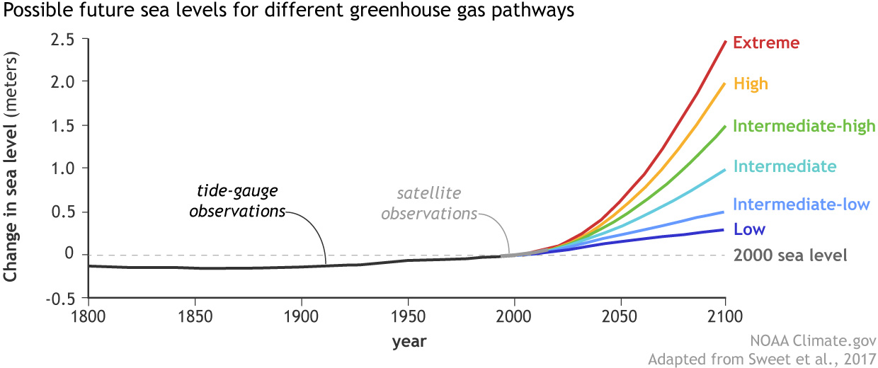
The problems will worsen as sea level rises further. The future amount of sea level rise depends on how much more greenhouse gas we continue to release into Earth’s atmosphere. Figure 7.2.1-13 shows several different curves, each representing a different future possibility calculated from models with different levels of future greenhouse gas. Notice that, even under the best (“low”) case, the models predict that sea level will rise another 20 to 30 centimeters (8 to 12 inches) by 2100. In the “extreme” case, the models suggest a sea level rise of up to 2.5 meters (8 feet) by that time .
Activity
Future Sea Level Rise
- Figure 7.2.1-13 shows 6 different future possibilities (from “low” to “extreme”). Use the graph to read off the approximate sea level rise by 2100 under each of these 6 scenarios. Then measure out each of those 6 different heights on a wall in your classroom, so that you can see exactly what they look like.
- If you live near the coast, briefly discuss what each of the different sea level rises would mean to your local community on an everyday basis. If you live farther inland, discuss the impact on communities along the coast that is nearest to you.
Optional: Use this interactive tool (from Climate Central) to explore the effects of sea level rise in much more detail. To use it, type in the name of the coastal city you are discussing, then use the slider at the bottom to see areas that become flooded as you raise the global sea level. - Continue your discussion from question 2, but this time discuss what might happen to the storm surges expected when major storms hit the communities.
- The graphs only show sea level rise to the year 2100. Extrapolate the trends to predict what would happen under the various possibilities beyond that. For example, how high would sea level rise by the year 2200 under the extreme scenario? Discuss what that would mean for the communities (yours or others) that you discussed in question 2.
This activity is designed to make the sea level scenarios a little less abstract.
- (1) Students should be able to read approximate values from the graph fairly easily. By marking them on a wall, they will get a better sense of what they mean. For example, they’ll recognize that 2.5 meters is well above the average person’s head.
- (2) Encourage students to picture how the changes marked on the wall would translate to the communities (yours or the nearest by on a coast) that you are discussing. Note: The optional part links to a Climate Central tool that shows sea level rise in detail. It is worth exploring, but we made it optional since it can be a little tricky to interpret clearly. Notice, for example, that the slider at the bottom is marked with global temperature rise (not sea level rise), but for this activity you will want to refer to the sea level changes that are shown to the right of the slider.
- (3) Use this question to make sure that students understand the general idea of a storm surge, and why it can magnify the effects of sea level rise when a major storm occurs.
- (4) There are several different ways that students could do the extrapolation, and we recommend letting them choose (and explain) their own methods. One good way would be to print the graph and paste it on a larger sheet of paper or whiteboard, then visually extend the curves to 2200. (Or do the same by copying the graph into a program such as Powerpoint and then using its tools to draw the extrapolations.)
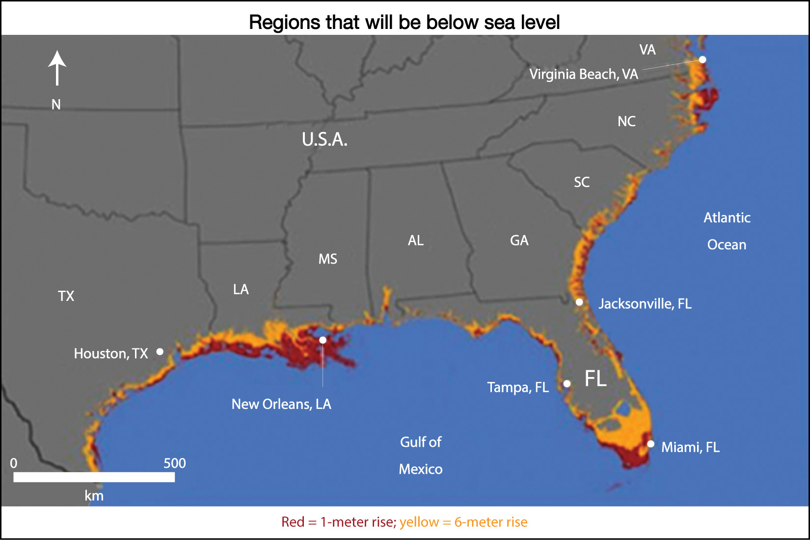
Sea level rise will clearly have major impacts on communities along coastlines around the world, with larger impacts for larger rises. Moreover, a large portion of the human population lives near coastlines, so these effects will alter the lives of a great many people. For example, the red regions in Figure 7.2.1-14 show the regions of the southeastern United States that would be flooded by a 1-meter (3 feet) rise in sea level, which is only in the midrange of possibilities by the year 2100. Tens of millions of people would be displaced from their homes in this region alone. The figure also shows (in yellow) regions that would be underwater with a 6-meter (20 feet) rise in sea level. While this much of a rise is unlikely by the year 2100, it is certainly possible by 2200, unless we dramatically slow or stop global warming.
You might also wonder how high sea level could rise farther into the future if the ice keeps melting. The answer is that complete melting of glacial ice, including all the ice in Greenland and Antarctica, would raise sea level by more than 70 meters (230 feet)! Figure 7.2.1-15 shows the vast regions of current world coastlines that would be underwater in that case.
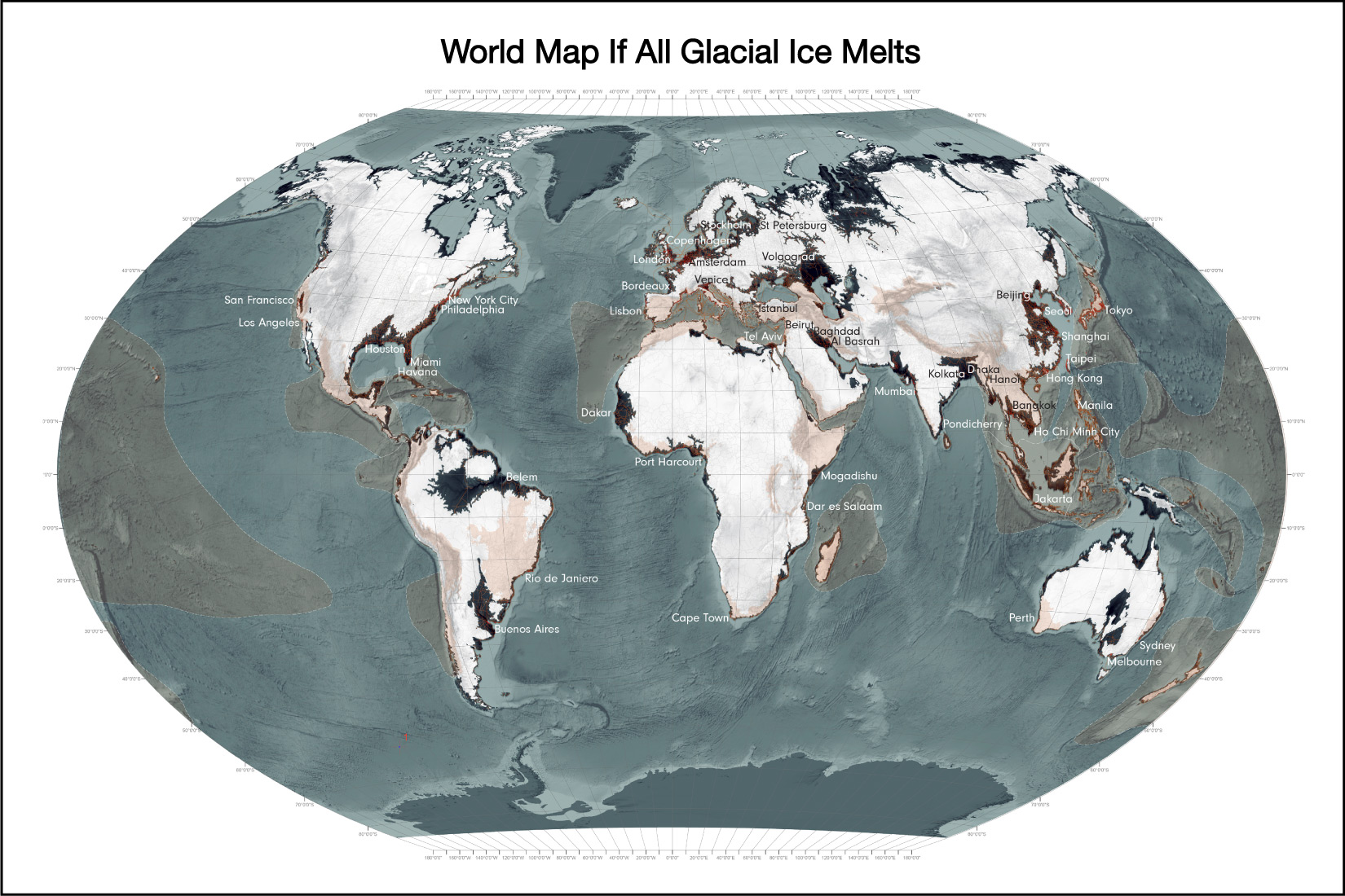
The good news is that, even in the worst case, this type of complete melting would probably take at least a couple thousand years, which means that there would in principle be time for people living in coastal areas to migrate inland. Nevertheless, we may be on track for such melting if we don’t stop global warming soon (recall the activity “Melting the Polar Caps”), which presents the dismaying possibility that future generations will need deep-sea diving equipment to explore the underwater ruins of many of today’s major cities.
Ocean Acidification
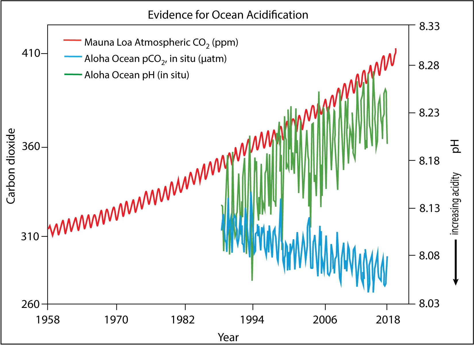
The fifth and last in our list of major consequences of global warming is ocean acidification , which occurs as carbon dioxide dissolves in the oceans and undergoes chemical reactions that make the water more acidic. We expect this to be happening because some of the carbon dioxide that human activity is releasing into the atmosphere ends up getting dissolved in ocean water. Data show it is indeed happening, just as expected (Figure 7.2.1-16).
Ocean acidification gets much less media coverage than other consequences of global warming, but it could be just as serious in terms of its effects on humans. For example, the combination of ocean warming (as global temperatures rise) and ocean acidification is already causing significant damages to coral reefs and other ocean ecosystems. Because billions of people depend on the ocean for much of their food supply, these damages could potentially lead to increasing hunger or starvation.
Discussion
Impacts of Ocean Acidification
Find and read at least one article about various ways in which ocean acidification may affect us (this article is a good starting point). Then hold a short class discussion about ways in which these effects might be felt in your community and by you and your family personally.
This short discussion should help students recognize that despite the fact that the media rarely mentions ocean acidification, it is likely to impact people almost everywhere. For example, if you live in a coastal community, there will be impacts on the local economy, and no matter where you live, there are likely to be impacts on the food supply.
Claim-Evidence-Reasoning Activity
What’s Wrong With a Little Warmth?
Here is another claim sometimes made by people who dispute the danger of global warming:
Claim: I live in a cold climate, so a little warming will just make my life more comfortable.
Based on everything you have learned about expected consequences of global warming, use evidence and reasoning to support or refute the claim. Be as detailed as possible.
This CER activity continues the theme of looking at common “skeptic” claims. Students should refute the claim, because by now it should be quite clear that the consequences of global warming are far more likely to make the person’s life less comfortable overall. You should encourage students to marshal evidence from each of the five major categories of consequence we have discussed. For example:
- From the discussion of regional climate change, students should explain why a “little” warming in terms of global average temperature is unlikely to be as comfortable as it sounds because of day-to-day variations. For example, students can look at the bell curves (Figure 7.2.1-2) to show that there will be more very hot days in summer.
- The increase in extreme weather events means devastating storms or other extreme weather events can happen anywhere, including to the person making the claim.
- The amplification of global warming caused by Arctic melting can’t be good for anyone.
- The rise in sea level may not have a direct effect on someone who lives inland, but it is likely to have economic effects on coastal regions that will likely reverberate throughout the economy.
- As in the prior discussion, ocean acidification is likely to have economic and food supply effects that can impact everyone.
Activity
Debate on Responding to Climate Change
Consider a recent climate-related event that has destroyed buildings or communities in some region. It may be something that occurred locally, or something you heard about in the news. For example, you might consider a community that has lost many homes to a wildfire, or a coastal community that has been devastated by a strong storm and storm surge. Briefly research exactly what happened to cause the losses, and then consider whether global warming makes it more likely that such an event will repeat in the future. Then divide into two teams and hold a debate as follows:
- Team 1 will argue in favor of rebuilding in same places that were previously destroyed, but will advocate specific strategies for making the new structures less susceptible to a repeat of a similar event in the future.
- Team 2 will argue in favor of relocating the destroyed buildings to locations that will be less susceptible to similar damages in the future.
Both teams should be sure to consider the relative costs and benefits of their strategy.
This activity engages students in what is a very real debate happening in communities around the world: namely, whether to rebuild or relocate after damages that are more likely to recur in the future as a result of climate change. A few notes.
- You may wish to help students select the particular event that they will debate. If you live in a region that has recently bit hit by such an event (e.g., destructive wildfire, flooding, storm), then that would be a good choice. Otherwise look for an event that has made the news recently.
- There is obviously no “correct” answer to this debate, so you should serve as the moderator to make sure the debate stays on track.
- You should also help students understand the economics, since most won’t be familiar with the tradeoffs in each case. For example, it might be easy to say that relocating is better, until you consider the associated costs given that people own the damaged homes and land.
- To take this debate a step farther, have students consider both shorter and longer term considerations. For example, while rebuilding a coastal community might make sense over the next decade or two, consider whether it still makes as much sense for the longer term given sea level rise expected by the year 2100.