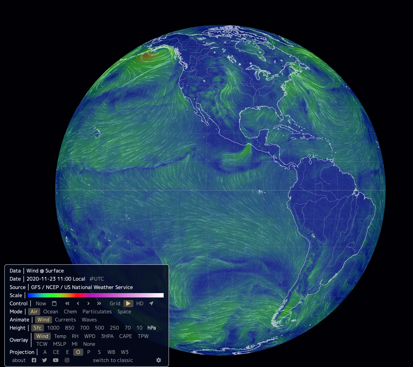
Take a few minutes to watch the mesmerizing motions visible on the globe of The Earth Project shown in Figure 6.2–1. When you first open the project, it shows supercomputer visualizations of winds around the world as they are blowing today. You can switch views to see ocean currents and other data as well.
If you return to this project each day (or use its “Control” option to view past dates), you’ll see that while localized patterns may differ from day to day, there are some global patterns that stay nearly the same at all times. In this section, we’ll explore what drives these global winds and ocean currents, and then look at their general global patterns.
For context, it’s worth noting how this section compares to what we did in Section 6.1. There, we discussed Earth’s air and water — the atmosphere and hydrosphere — in what you might call an “average” sense. For example, we talked about how the pressure and temperature vary on average with altitude in the atmosphere, and about the overall distribution of fresh and salt water on Earth. Here, we are moving on to a dynamic view of these systems, exploring the constant motion of air and water on our planet Earth.
Section Learning Goals
By the end of this section, you should be able to answer the following questions:
- What drives global winds and currents?
- What is the general pattern of winds on Earth?
- What is the general pattern of ocean currents?
Before you continue, take a few minutes to discuss the above Learning Goal questions in small groups or as a class. For example, you might discuss what (if anything) you already know about the answers to these questions; what you think you’ll need to learn in order to be able to answer the questions; and whether there are any aspects of the questions, or other related questions, that you are particularly interested in.
Activity
Explore the Earth Project
Open The Earth Project of Figure 6.2–1. Locate and open the menu in the lower left. By default, it should look like the following screen shot, with the top line (Data) reading “wind @ surface.” If it doesn’t, selected the options shown (the highlighted buttons for Mode, Animate, Height, Overlay, and Projection) until it matches this view. The map will then be showing you today’s surface winds around the world.
- Notice how scrolling over an item in the menu brings up a little bit more information about it (shown in the lower right of the screen). Still using your starting map (“wind @ surface”), what does the “Scale” bar represent? Use this to explain the meaning of the colors on the “wind @ surface” map. What do the lengths and directions of the arrows on the map represent?
- Learn how to rotate and zoom in or out on the globe, and notice what happens when you click a spot on the globe. Then use your latitude and longitude to zoom in on your location. What is the general direction of winds in your area today? Does this agree with what you see outside?
- Change the selected Overlay option from “wind” to “temp.” What does the Data line say now, and what does the color scale represent now? Do you notice any patterns in the global temperatures right now? If you didn’t already know the date, could you use these patterns to determine what season it is right now? Explain.
- Now change the Overlay to “MSLP,” which is short for “mean sea level pressure.” This essentially tells you the local pressure around the world (“mean” is another word for “average”). What does the color scale represent now? Do you notice any patterns in how winds flow between regions of higher or lower pressure?
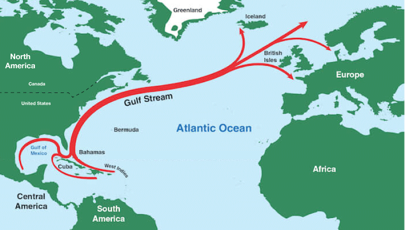
5. Return to the original menu settings (for “wind @ surface”), then set the Animate line to “currents.” The Data line should now say “Ocean currents + wind @ surface,” and the map should be showing ocean currents. You may wish to explore some of the ways you can change other menu options to see the currents more clearly. Recall that one famous ocean current is the Gulf Stream (see Figure 4.33). Can you identify the Gulf Stream on the map? Discuss any other major currents or patterns that you notice.
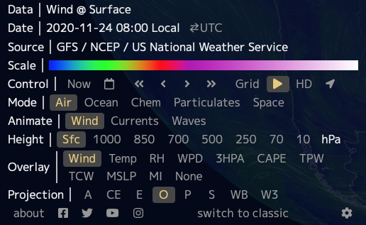
6. Unless you’ve changed it, the Control menu should still be set to “now.” Explore how you can use the other Control options to view the map for other dates and times. Choose a few other dates/times and look at both winds and ocean currents. Which tends to change more with time?
This activity is designed to help students (and you) begin to explore the many interactive options built into the Earth Project, and to use it to begin thinking about ideas we’ll discuss in this section. Notes:
- General note 1: This activity can in principle be done individually or with groups of any size. However, if you have the option, we suggest that you project your screen in the front of the classroom and have students work on their own screens at the same time. This will ensure that as they try each interactive option, they can also look at your screen to verify that they are doing it correctly.
- General note 2: Each time you change any of the map settings, it may take a few seconds for the new data to load. For this reason, be sure students don’t click through changes too fast.
- General note 3: If you explore the menu, you will see that the tool has additional options beyond those we ask students to make use of in this activity. These are explained in a little more detail on the web site’s “about” screen. You may wish to explore some of these other options with your students.
Note: The “about” screen also has keyboard shortcuts that students can use if they are having difficulty with rotating or zooming with a mouse or on screen. - Question (1) Make sure students see how scrolling over the “Scale” bar shows the wind speeds represented by the different colors and that they also notice how the speeds are shown to the lower right on the screen. They should then recognize that the colors are corresponding to general wind speed in an area. The arrow directions indicate the wind direction and the arrow lengths represent the wind speed (longer arrow means faster winds).
Note: If you wish, you could take this opportunity to introduce the concept of a vector. Recall that vectors have a magnitude and a direction; in this case, the wind arrows are vectors because the arrow length represents the magnitude (the wind speed) and the direction is shown. - (2) Students should note that clicking a location brings up a latitude/longitude window, so as long as students know their own latitude and longitude, they can use this tool to find and zoom in on your location. You can also use the “HD” option (on the “Control” line) to see higher resolution. Students can look at a flag to see if it is blowing and if its direction agrees with what you see on the map. Note that it might not, since your particular location may be affected by localized effects that are beyond the map resolution.
- (3) This change should now show Data as “wind + temperature @ surface”; the map colors now correspond to surface temperature around the world, while the arrows still show winds. Students should recall that the seasons are opposite in the northern and southern hemispheres, so they could determine the season from which hemisphere is warmer right now.
- (4) The color scale now corresponds to surface pressure. Students should notice that winds flow from higher pressure to lower pressure regions – which is an important concept that we will discuss in Section 6.2.1.
- (5) Be sure to note that you need to keep “currents” selected as you change other options. Some options may make the currents move visible than others. Students should be able to see the Gulf Stream based on the map from Figure 4.31, and may notice some other major currents around the world.
- (6) Here, students learn to use the time controls. Notice that the second button (after “now”) allows you to select a particular date; the << and >> buttons move one day at a time; and the < and > buttons move a few hours at a time. Students should notice that wind patterns change with time more than ocean current patterns. Note: In addition to being able to look at past data, the tool also allows you to see projections from super computer models for up to a few days into the future. You can’t go further into the future than that, since predictions beyond a few days become increasingly unreliable.
Journal Entry
Our Interconnected World
Look again at The Earth Project map in Figure 6.2–1. Notice that while the map shows the outlines of continents and major rivers, it does not show national or state borders. Spend a few minutes watching global winds and exploring other features of the map that are visible over land. For example, watch winds along with temperatures or pressures (questions 3 and 4 in the above activity explain how to view these). Then write anywhere from a few sentences to a few paragraphs about what your observations tell you about ways in which the many nations of our world are interconnected when it comes to things like weather, climate, and air and water pollution.
Throughout this online book, we have been dealing primarily with a global perspective in discussing ideas such as how Earth fits into the universe and how geology shapes our planet. This section represents the first time that students are really seeing dynamics on a time scale that has constant effects on our well-being, with these effects coming through weather and climate. As such, this is a great opportunity to have students begin to think about global interconnectedness, particularly as it relates to important issues such as air and water pollution, and global warming. We hope you’ll get interesting and thoughtful journal entries on this topic.