Measurements can tell us how global warming is affecting us so far, but how can we predict what will happen in the future?
One obvious way to do this is by extrapolating from current data. For example, if you determine how much the global average temperature has increased in the past two decades, you could assume the same rate of increase to figure out what you might expect in the next two decades. However, this approach has an obvious problem: It assumes that current trends continue exactly as they are, with no slowdowns in greenhouse gas emissions and no feedback processes that might either slow or amplify changes. This is not a very good assumption, because the emissions are unlikely to stay exactly as they’ve been, and because we already know that there are many feedback processes that apply.
Therefore, a much better way to predict what will happen in the future is to use a model that is built from the best available understanding of how the climate works. Here, we will briefly discuss how climate models work and what they tell us about future possibilities for global warming.
Climate Models
The principle behind a climate model is relatively simple. Scientists create a computer program that represents the climate with a grid like that shown in Figure 7.2.2-1, so that each little grid cube, or element, represents one small part of our planet over one range of altitudes in the atmosphere. The “initial conditions” (meaning the starting point) for the model consist of a mathematical representation of the weather or climate within each element at some moment in time. This representation might incorporate data on such things as the temperature, air pressure, humidity, and wind speed and direction at the time the model begins. The model uses equations of physics (for example, equations that describe how heat flows from one element to neighboring elements within the model) to predict how the conditions in each element will change in some time period, such as the next hour. It then uses the new conditions and the equations to predict the conditions after another hour, and so on. In this way, the model can simulate climate changes over any period of time.
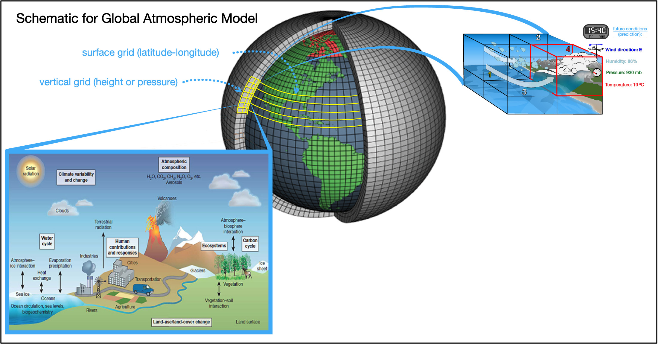
Today’s models are so sophisticated that they require some of the world’s most powerful supercomputers to run them. Even so, they are only able to make fairly general predictions for the future. As a result, scientists are continually working to improve models, both by making the element sizes smaller (to provide more detail) and by refining the equations and other details as we learn more about how the climate works.
Discussion
Climate Models
In small groups or as a class, briefly discuss the following questions about climate models.
- In general, which will give a climate model better results: using more, smaller elements or fewer, larger ones? Why?
- In general, which will give a climate model better results: using shorter time steps (for example, 1 minute) or longer time steps (for example, 1 hour)? Why?
- Given your answers to questions 1 and 2, why don’t scientists simply use the best possible set of elements and time steps? (Hint: remember that sophisticated climate models require powerful supercomputers.)
- How do you think that scientists can decide whether or not a climate model is reliable?
- Bonus: Watch this TED talk about climate modeling by NASA scientist and climate modeler Gavin Schmidt. Then briefly discuss what you have learned about climate models and what they predict for the future.
This short discussion should help students understand the basic concept behind climate models. Notes on answers:
- (1) Smaller grid elements mean better resolution and therefore should make better models.
- (2) Shorter time steps similarly should give better results because they have better time resolution.
- (3) The number of calculations – and hence the computer speed — required for a model is larger if the grid size is smaller or the time elements shorter. It simply isn’t possible to make the sizes and times as small as you want, because the calculations would take too long even on the most powerful computers. Scientists must come up with acceptable tradeoffs that can realistically run on today’s computers.
- (4) This question is answered under the next subheading, so it is here to see if students can come up with some ideas for themselves.
- (5) The referenced TED talk is very good but fairly sophisticated, so you many need to help students understand it. We recommend it because it is very clear and has great visuals associated with it.
Activity
Using A Simple Climate Model
Try out this “very, very simple climate model,” which allows you to change the amount of carbon dioxide emissions per year and the time steps. The model then uses equations (hidden inside the computer code) to calculate and show you the model’s predictions for the future atmospheric carbon dioxide concentration and global temperature. You can explore the model independently, or your teacher may provide you with a structured activity. How do you think this “very, very simple” model compares to the models that climate scientists use?
This activity, developed by the Center for Science Education at the University Corporation for Atmospheric Research (UCAR), introduces students to a “very, very simple” computer model. In this model, the only variable is the emission rate for carbon dioxide, and it can be set only at a fixed annual rate (that is, you can’t have emissions going up or down with time). Still, it should provide students with some insight into what climate models can do.
- If you would like to provide a structured activity, you can make use of this lesson plan developed by UCAR: https://scied.ucar.edu/activity/very-very-simple-climate-model-activity. Click the “Instructions” link for the lesson plan, and the “background and extensions” link to learn more about the model itself.
Verifying Model Reliability
No climate model can be a perfect representation of Earth’s climate, because the climate is far too complex. So how do we know if we can trust the predictions made by models?
To understand the answer, you need to understand a little bit about how climate models have developed over time. The earliest climate models were very simple — so simple that they could be done with pencil and paper. For example, way back in the year 1896, a scientist by the name of Svante Arrhenius created a simple climate model and used it to predict what would happen to Earth’s average temperature if the carbon dioxide concentration doubled from its pre-industrial level of 280 parts per million to 560 parts per million. He found that such a doubling would raise Earth’s average temperature by about 5°C — which is remarkably close to what today’s sophisticated computer models also predict.
Over time, scientists made more complex models that required computers for the calculations. In this way, they could consider not only the global average temperature but also changes that would occur locally and regionally. They also began to include more complex feedbacks and equations, so that the models could consider factors like how the oceans store heat and the effects of clouds.
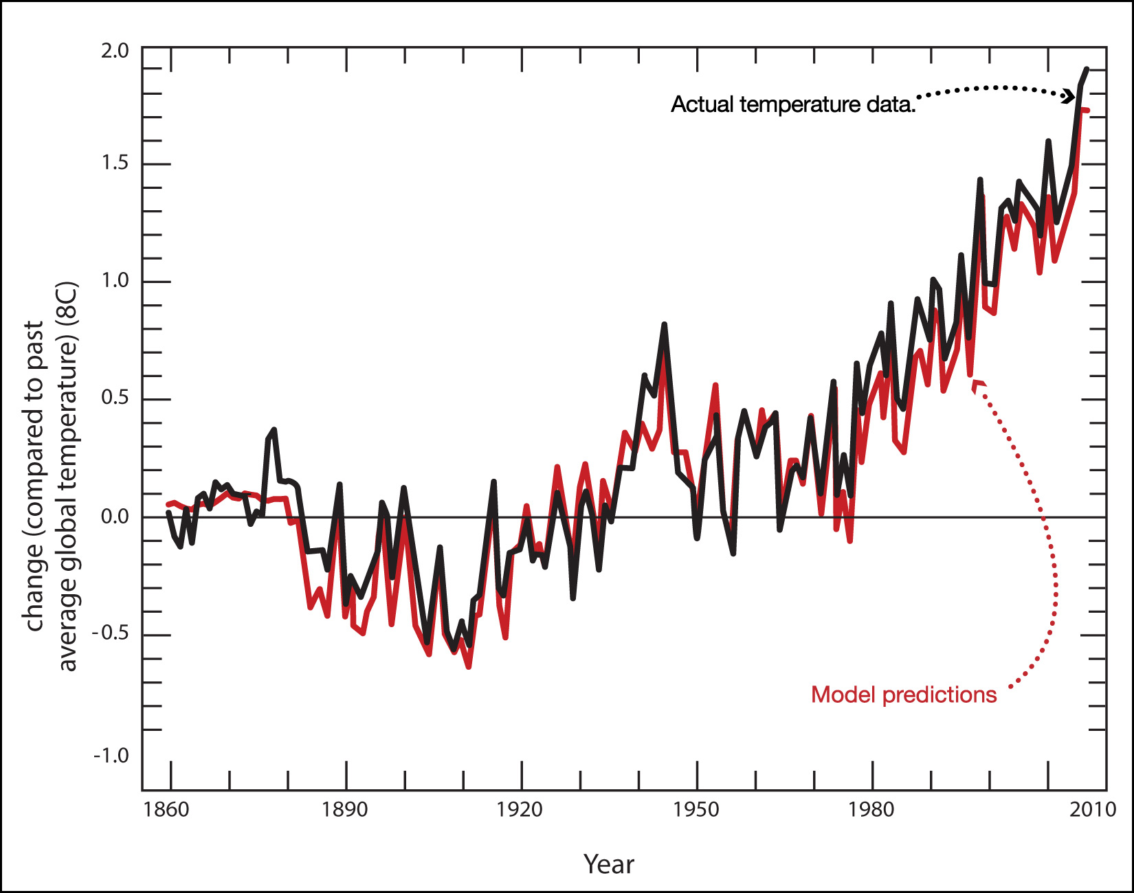
Each time scientists made a model, they used it to “predict” the past climate. That is, they’d start the model on a computer from some past date, such as the year 1880, and then run the model to see if it could successfully match actual observations since that time. If it did, then they’d have at least some confidence that the model was on the right track. If it did not, they’d go back to try to figure out why the model was giving inaccurate results. In essence, scientists conducted experiments by varying the models, and with trial and error they gradually made their models into better and better matches to reality.
Today, there are a few dozen different climate models that have been developed by different climate research groups around the world. Each of these models represents decades of refinement and improvement over older climate models. Scientists are now very confident in these models, for three major reasons:
1. Today’s models “predict” the past climate very successfully. Figure 7.2.2-2 repeats the comparison of models and actual temperature data that you saw earlier (in Figure 7.1.3–3), but this time showing only the “full” models (including both human and natural factors). The excellent agreement between the models and the observations provides very strong evidence that the models must be very good representations of the actual climate. After all, if the models were missing any major factors that affect the real climate, then we not would expect them to work so well at matching the observed climate.
2. The many different climate models being used by different research groups all agree quite well with each other, despite their differences. To understand why this is important, remember that each model is like a different experimental version of the climate. Therefore, just as scientists gain confidence in some measurement (for example, measuring the strength of gravity) when different measurement techniques all give the same result, getting similar and correct predictions from different climate models gives confidence in these predictions.
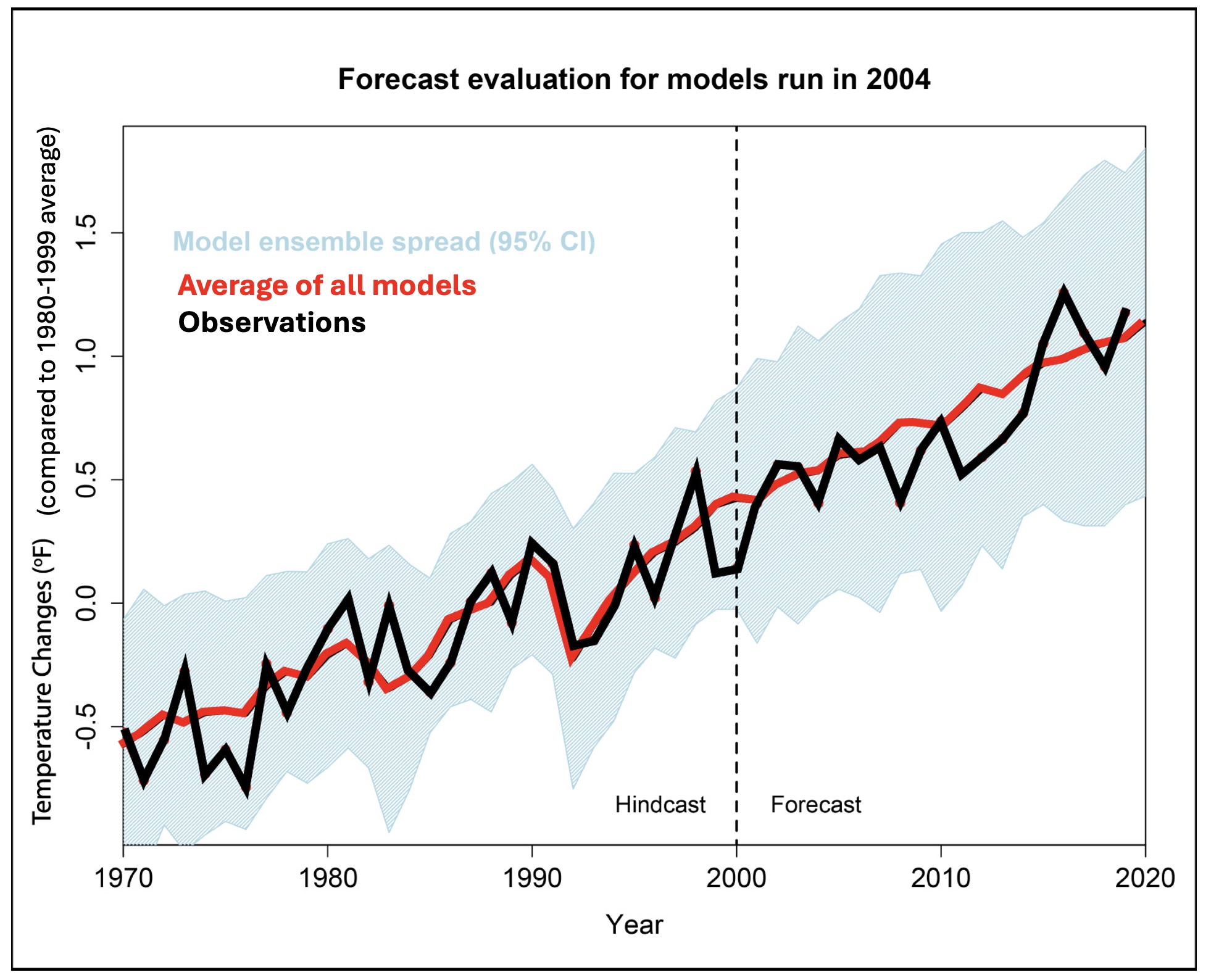
3. Because today’s models are generally refinements of models first created decades ago, scientists can also compare the predictions that these models made in the past to what has actually happened. Figure 7.2.2-3 shows that such predictions have proven quite reliable, giving us further confidence in modern climate models.
Activity
Putting Models to the Test
Sophisticated climate models predict not only global average temperature but also regional changes in climate. The video below compares a NASA model from the year 2005 (left) to actual observations through that year (right).
Video 1- Watch the video closely. How well does the model simulate what actually happened around the world? What does this suggest to you about the reliability of the model? Explain.
- The model was also used to forecast what might happen after 2005, based on assumptions at that time about the most likely amount of greenhouse gas that humans would continue to add to the atmosphere. The first (left) video below shows the predictions through 2100, and the second (right) video repeats Video 7-1 showing actual data. If you focus on the period 2005 to 2020 in both videos, how well did the model predict what actually happened?
Video 2 - Click to watch a video of climate model projected changes through the year 2100.
Figure/Video 7–1 - This map shows how regional average temperatures in recent years compare to their averages from the 20th century (specifically, the average from 1951–1980). Press play to watch how the temperatures have changed since 1880. Credit: NASA Scientific Visualization Studio.
- Now watch the model continue to the year 2100. Briefly describe its general predictions for the future. Be sure to notice that the darkest color in the model video represents a larger temperature increase than the darkest color in Video 7-1.
- What does the model predict for the increase in average temperature for your region by 2100? If you are in the U.S., give your answer in both Celsius and Fahrenheit (remembering that each increase of 1°C represents an increase of 1.8°F).
- Remember that this model is based on assumptions made in 2005 about future greenhouse gas emissions. Actual emissions to date have actually been higher than had been expected at that time. How would you expect this fact to affect the reliability of the model’s predictions through 2100?
- Suppose we want to have lower temperature increases than the model predicts for the year 2100. What would we have to do? Explain.
This activity builds on the above discussion to help students see how model reliability can be evaluated.
- (1) This can be a challenging question, because there clearly are differences between the model predictions and reality. You should help students focus on the “big picture,” which is that overall, the model does an excellent job. The general trend is correct most everywhere, and even the size of the trend is very close. This general agreement should give confidence in the reliability of the model, even if we know it won’t be perfect in its details.
- (2) The comparison may be a bit tricky in terms of trying to watch the correct time period in both videos together, but again, students should notice that the general trend of the predictions is pretty accurate.
- (3) Be sure that, as noted in the question, students pay attention to the different meaning of the darkest color. They will then see that the model is predicting substantial increases in global temperatures by 2100.
- (4) Students should be able to read the increase for your region in Celsius from the map, and convert to Fahrenheit by multiplying by 1.8. You may then wish to have students give the increase some context by, for example, considering how much hotter it would make typical winter days and summer days, assuming the average held true year-round.
- (5) The fact that the model used an underestimate of emissions to date would suggest that it probably also underestimated what the future temperature increases would be.
- (6) Be sure students recognize that a model is only as good as its assumptions, which means we are NOT “doomed” to what the model shows. However, if we want to have less increase than the model predicts, we likely need to lower our greenhouse gas emissions compared to what was assumed.
Model Predictions for Global Warming
The fact that today’s climate models have proven to be quite reliable means that they should be useful in predicting possible climate futures. But note the emphasis on possible. Any particular model prediction requires an assumption about the amounts of greenhouse gases that we will release in the future.
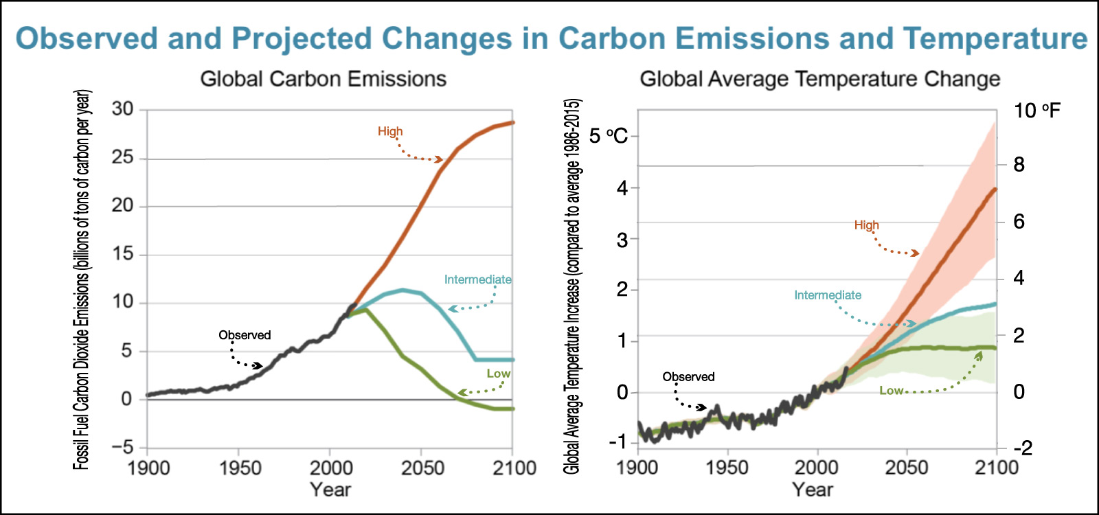
For this reason, scientists use models to predict a range of possible futures based on differing assumptions about future carbon emissions (from both carbon dioxide and methane). Figure 7.2.2-4 shows three possible future pathways for these emissions (part a), along with the predicted increases in global average temperature (part b). Study the graphs and captions carefully, then try the questions that follow to make sure you understand how to interpret them.
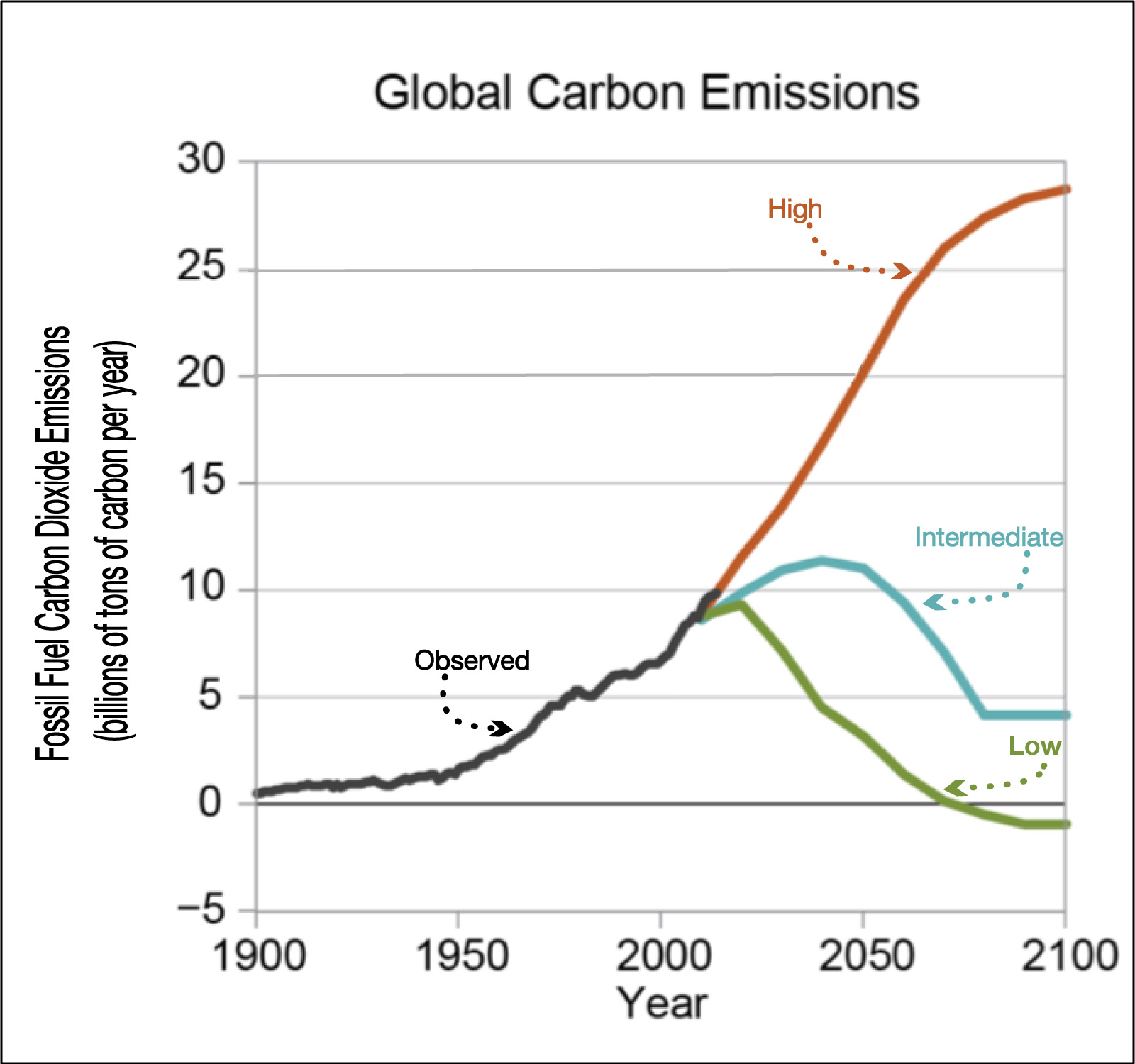
control, since these emissions come from human activity.
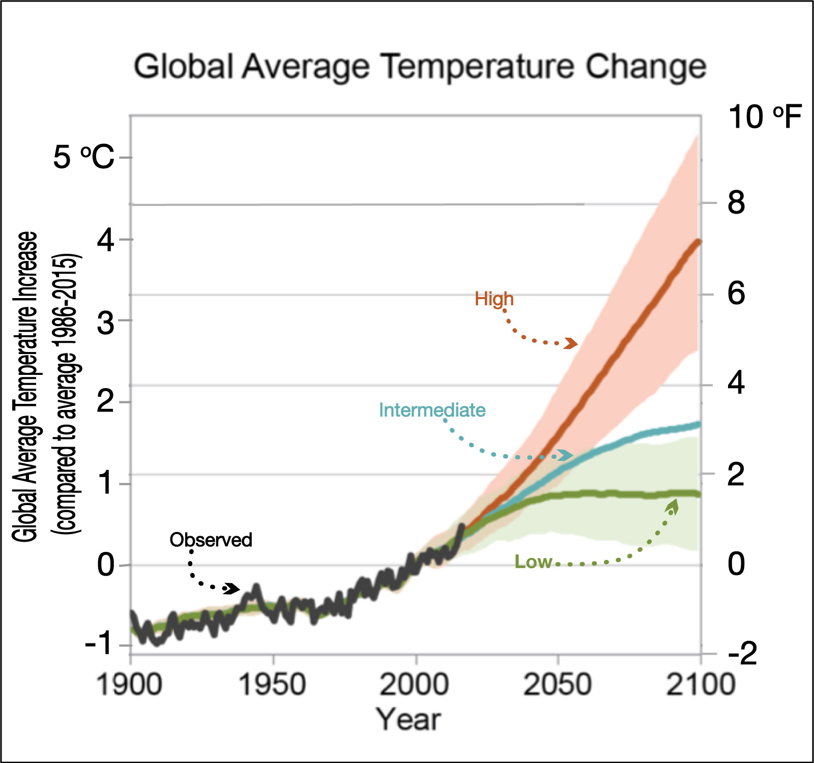
(b) This graph shows model predictions for the temperature increase under each of the three carbon emissions pathways from (a). The color swaths represent the range of possible outcomes (with 95% confidence) for the low and high pathways , with the solid line representing the most likely outcomes.
Figure 7.2.2-4 – Three possible future pathways for global warming. On each graph, the black curve represents actual observations to date and the color curves represent low, intermediate, and high pathways for future carbon emissions. Credit: Fourth National Climate Assessment, Volume 2 (U.S. Global Change Research Program), based on IPCC model pathways.
Before you continue, discuss the following questions about Figure 7.2.2–4 with a classmate, then click to open the answers and see if they agree with what you came up with.
- Suppose we wish to follow the “low” pathway for carbon emissions. When would emissions have to begin falling from their current level, and when would they have to reach zero?
The low pathway is shown in green, and for this question you want to use the graph in part (a) showing carbon emissions. The green curve on this graph shows that emissions would need to begin falling immediately — in fact, this scenario assumes that emissions began a steady fall starting in 2020. The emissions would need to be reduced to zero not long after 2050. Notice that this pathway also assumes that emissions go negative after that (for example, by planting enough trees to soak up some of the carbon dioxide that is already in the atmosphere).
- Briefly describe what the intermediate and high pathways assume about future carbon emissions.
The intermediate pathway is shown in blue, and you can see that it assumes that emissions continue to rise (but ever more gradually) until about 2050, and then begin to fall. The high pathway is shown in red, and it assumes that emissions continue to increase at a rate similar to the current rate of increase until late in this century, when the rise begins to slow.
- Which of the three pathways represents what we should expect to happen if we continue to use fossil fuels for the same proportion of global energy that we use them for today? Explain.
The high (red) pathway. The reason this pathway keeps rising is because world energy consumption is expected to keep rising (as a result of a growing population and the fact that people in developing nations are likely to need much more energy in the future). Therefore, if fossil fuels continue to account for about the same proportion of global energy as they do today, then their use will also keep increasing.
- Suppose we follow the “high” pathway in carbon emissions. What do the models predict for this case as the most likely increase in the global average temperature by the year 2100 (compared to the average for 1986-2015)? What is the range of possible temperature rises for this case?
The answer to this question is shown by the high (red) curve on the future temperature increase graph. You can see that the most likely temperature increase is about 4°C (or 7°F), while the range (the reddish swath) is from a little less than 3°C to more than 5°C (or 5°F to 9°F).
- Suppose we would prefer to have the lower temperature increases predicted for the intermediate or low pathways. What would we (as a civilization) need to do to make that possible?
If we want to follow the low or intermediate temperature pathways, then we need to follow the corresponding emission pathways. This would require dramatic changes from our current path, so that emissions quickly begin dropping rather than continuing their current rise. Whether we end up on the low or intermediate pathway depends on how quickly we make this reduction happen.
Claim-Evidence-Reasoning Activity
Limiting the Future Temperature Rise
If you’ve successfully answered the above questions about Figure 7.2.2-4, then you know that the main message of the figure is that we will choose our future pathway for global warming by the decisions we make with regard to our carbon emissions. In this activity, we’ll explore the figure and these decisions in a little more depth.
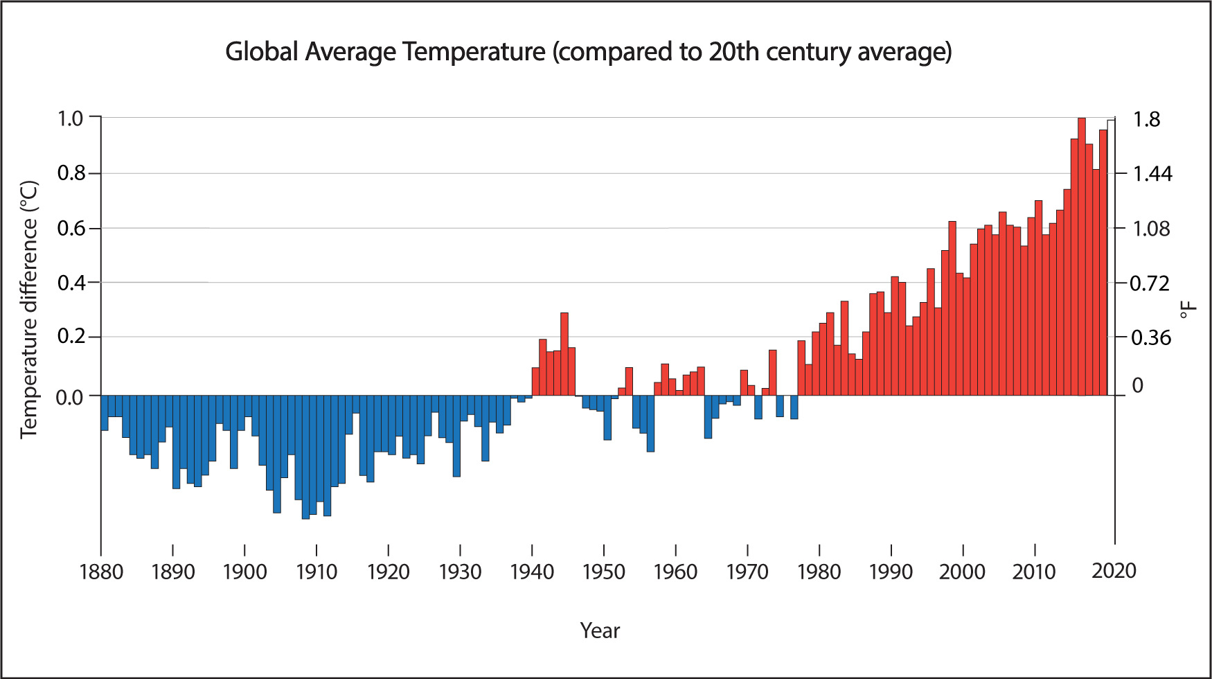
1. One important issue in interpreting figures that show future warming possibilities is to understand the meaning of the zero line. For example, the y-axis in Figure 7.2.2-4b tells us that its zero line represents the average temperature for the time period 1986-2015. In contrast, if you look back at Figure 7.1.3–1, you’ll see that its zero line is the average for the entire 20th century, and it shows that global average temperatures have already risen by almost 1°C from that average. Suppose you remade Figure 7.2.2-4b using the 20th century average (rather than 1986–2015) as the zero line. Would that change the any of the curves on the graph? Would it change the “increase” in temperature predicted by the models? Explain.
2. When you hear scientists talk about the importance of, say, limiting future warming to “no more than 2°C,” they are not always clear about what zero line they are comparing to. If you go by the values shown in Figure 7.2.2-4, what type of pathway would we have to follow in carbon emissions in order to limit the warming to 2°C by the year 2100? How would your answer change if instead we wanted to limit the warming to 2°C compared to the 20th century average? Explain.
3. Imagine extending Figure 7.2.2-4 to show model predictions beyond the year 2100. Would you expect any of the three pathways to limit the longer-term (beyond 2100) warming to less than 2°C? Explain.
4. Based on what you have learned, use evidence and reasoning to support or refute the following claim made by someone your age.
Claim: In order to have a total warming of less than 2°C by my 100th birthday, we must begin reducing carbon emissions almost immediately and bring them to zero by about 2050.
- (1) To answer this question, students should recognize that the 20th century average was almost 1°C lower than the 1986–2015 average. This does not affect the shapes of the curves at all, nor does it change what the models predict for the future. However, it does change the values we’d read from the graph as the “increase,” making each of them almost 1°C higher. For example, the most likely temperature increase for the high pathway would be almost 5°C when compared to the 20th century average, instead of about 4°C when compared to the average for 1986-2015.
Note: This concept is important because, as the two graphs show (both taken directly from their original sources), scientists don’t always choose the same zero line. - (2) If you read directly from the graph in Figure 7.2.2-4, both the intermediate (blue) and the low (green) curves would keep us below 2°C of future warming. However, if you use the 20th century average as a baseline, then as found in question 1 above, the increases would all be almost 1°C higher than you read from the graph. In that case, only the low (green) pathway keeps us below 2°C of warming.
For your background, the reference point in the IPCC reports (and most other scientific reports) is usually the “pre-industrial” global average temperature, which is a little lower than the 20th century average. However, for our purposes here, we will ignore this difference. - (3) Only the low (green) pathway appears likely to keep the total warming below 2°C for the longer term, because it is the only pathway for which the model predicts a temperature that is no longer rising in the year 2100. The intermediate (blue) pathway is still rising at that time and looks likely to surpass 2°C not long after 2100 (and even before if we compare to the 20th century average).
- (4) First, students should recognize that by asking about the 100th birthday of someone their age, we are looking beyond the year 2100. In general, students should support this claim by noting that the low (green) pathway is the only one that keeps the warming below this level, and this pathway assumes that we immediately begin reducing emissions and bring them to zero not long after 2050.
However, there is a bit of wiggle room in this answer, since the graph only shows 3 possible pathways. For example, we might be able to wait a few years on beginning the reductions of emissions if we then bring them to zero at a faster rate than the low model assumes, or if we find a way to draw carbon dioxide out of the atmosphere. There may also be some pathways in between the low and intermediate models that would work. Still, students should recognize the key point: Sooner is better for reducing emissions if we hope to limit the future warming.
Claim-Evidence-Reasoning Activity
Model Skeptics
The climate is so complex that we can never expect a climate model to be a perfect representation of Earth’s actual climate. Some people have used this fact to argue that, as a result, we should not trust predictions about the future made with climate models. We’ll consider this type of argument in this activity.
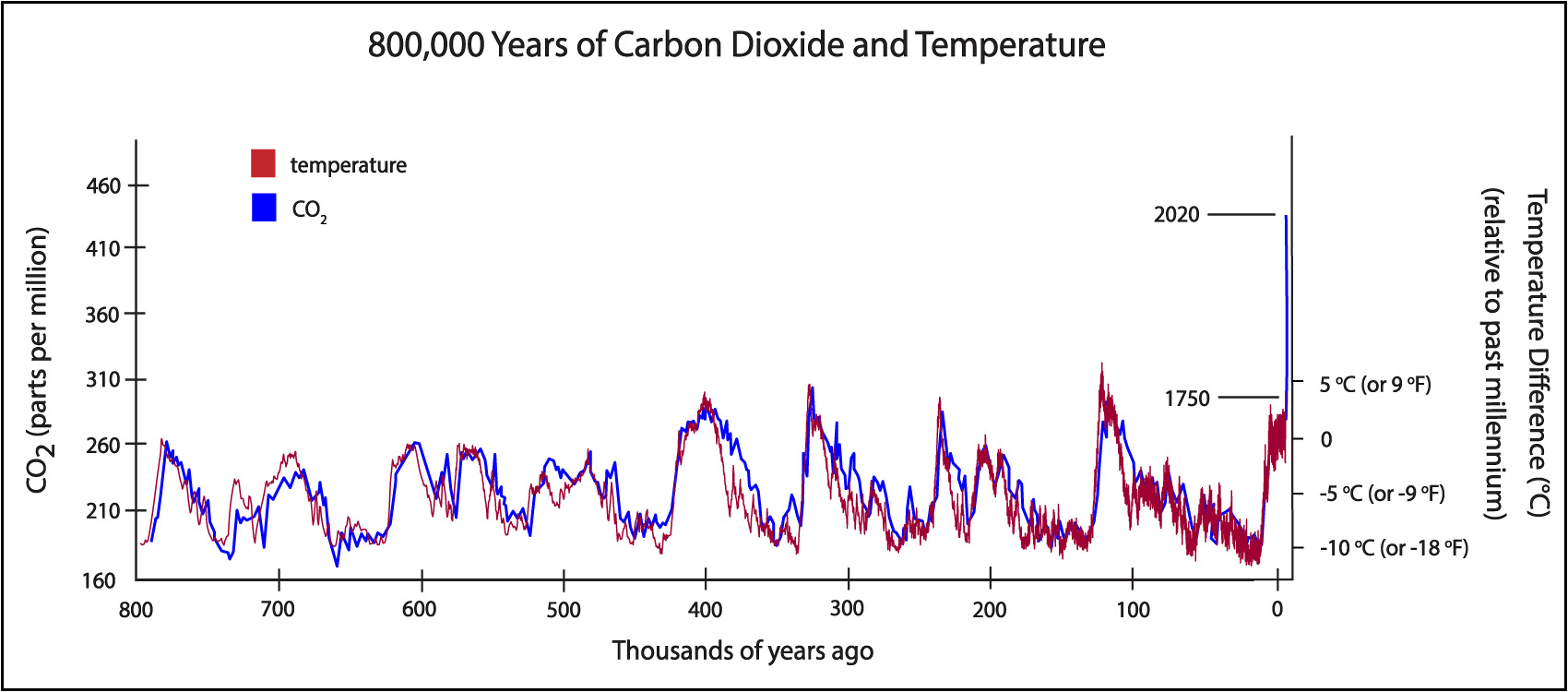
1. One alternative to using a model for future predictions is instead to use past data. For example, you know from prior activities that the high (red) carbon pathway shown in Figure 7.2.2-4 would lead to a carbon dioxide concentration well above double the pre-industrial value (that is, above 560 parts per million) by the year 2100. Now, look back at Figure 7.1.4–1 showing the 800,000-year ice core record of carbon dioxide and temperature. Based on that data, would you expect a carbon dioxide concentration of double the pre-industrial value to cause a global temperature rise of more or less than what the models predict? Explain clearly.
2. Based on what you’ve learned about models and your answer to question 1, use evidence and reasoning to support or refute the following claim.
Claim: I don’t trust climate models because the climate is far too complex for scientists to predict, and without these models, there is no evidence that our use of fossil fuels could lead to future warming of more than 2°C.
This CER activity addresses another common skeptic claim, this one about the reliability of models. There is some room for legitimate debate about models, but in general, concern about model predictions is overstated. A few key notes:
- Question 1: There isn’t an unambiguous answer to this question, but Figure 7.1.4-1 shows that:
- Over the past 800,000 years, the largest upward swings in the natural carbon dioxide concentration have been from about 180 to 280 parts per million, which is an increase of about 60%.
- These 60% increases in carbon dioxide concentration have been accompanied by temperature increases of about 8°C to 10°C (14°F to 18°F).
- Putting these two facts together, the past data seem to suggest that a 60 increase in the carbon dioxide concentration can cause warming of 8°C or more. This is substantially greater warming than even the high (red) models suggest for the rest of this century, even though these models assume a doubling (100 increase) of the carbon dioxide concentration well before the century ends. In other words, the projection you would make from actual past data would seem to be worse than what the models predict.
- Caveat: The fact that we were already in an interglacial warm period (near the high temperature of the past 800,000 years) before human-caused global warming gives skeptics some wiggle room. In particular, the common skeptic argument is that given this starting point, the climate is less sensitive to increases in the carbon dioxide concentration than it would be if we had been in an ice age, and therefore we should expect a much lower amount of warming. In other words, the models depend on how they account for the “climate sensitivity,” and the skeptics argue that the models are missing factors (for example, detailed effects of clouds) that cause them to overestimate the climate sensitivity. We cannot completely rule out this possibility, but there are at least two strong counterarguments that most scientists think make the skeptic claim highly unlikely: (1) If the models were missing any factors that would have significant effects on climate sensitivity, then we would not expect the models to match existing climate data as well as they do; that is, the success of the models at simulating the past climate makes it highly unlikely (though not impossible) that the models could be missing something that would have a major impact on future predictions. (2) Although we are near the high temperature for the past 800,000 years, Earth has been much warmer in the more distant past, which suggests that we are nowhere near the limit of what could happen with a rising carbon dioxide concentration.
- Question 2: This is another common claim made by climate skeptics, but it should be refuted as follows:
- First, regardless of what anyone believes about the first part of the statement (“the climate is too complex for scientists to predict”), the second part (“without these models, there is no evidence”) is clearly false: As discussed in question 1 above, the ice core data provide evidence that is independent of the models and that suggests that a doubling of the carbon dioxide concentration would cause a rise much larger than 2°C.
- While there may be some opinion-based component to the first part (“the climate is too complex for scientists to predict”), students should be able to cite what they’ve already learned about how scientists evaluate the reliability of models. This offers plenty of evidence that models are indeed useful, even if they are not perfect.
