Why does Figure 7.1.3–2 show an “11-year average”?
Glad you noticed that. You can understand the answer by looking at the light blue curve which shows sunlight without averaging.
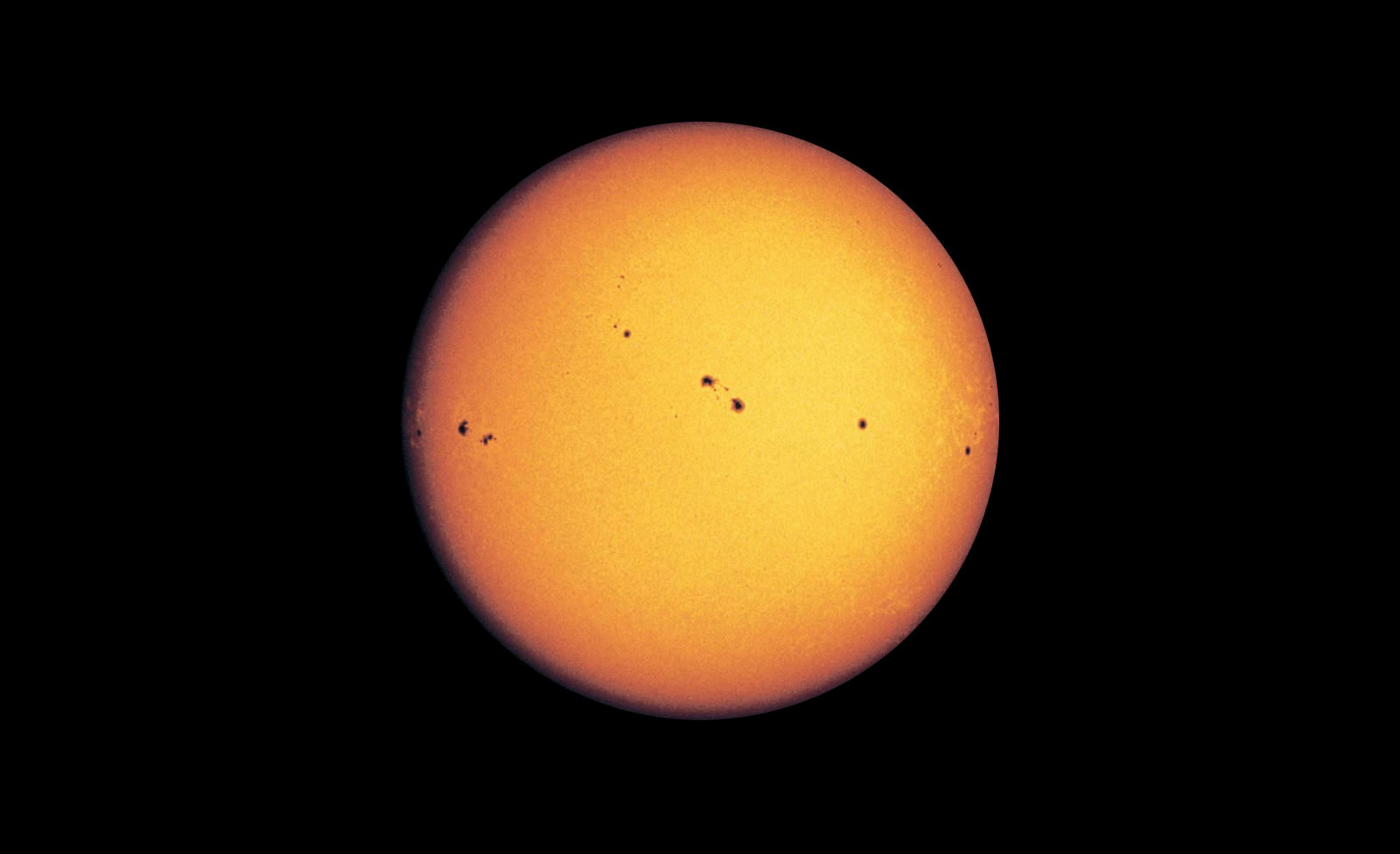
Notice that sunlight goes up and down in a pattern that repeats approximately every 11 years, which represents what is called the sunspot cycle. Recall that photos of the Sun usually show relatively small, dark sunspots on its surface. Because these sunspots are a bit dimmer than the rest of the Sun, the amount of sunlight is a bit lower when there are a lot of sunspots and a bit higher when there are few. For reasons that scientists do not yet fully understand, the number of sunspots varies in an approximately 11-year cycle, explaining the light blue curve on the graph.
This variation means that if we look at sunlight from one year to the next, the variations due to sunspots can make it difficult to see longer-term trends. Therefore, by averaging over 11 years, we get a “fairer” view of how the Sun is changing with time. And since we are averaging the sunlight data over 11 years, it’s important to do the same for Earth’s temperature data, so that we’ll have a fair comparison.
