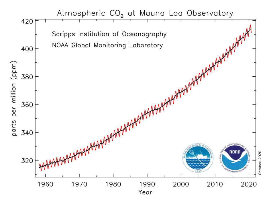
What are the small wiggles on the graph?
The small wiggles that you can see on the red curve on the graph (repeated below) represent seasonal variations in the carbon dioxide concentration. They occur because plants and trees absorb carbon dioxide as they grow in spring and summer, then release it as they decay in fall and winter. The global pattern follows the seasons of the Northern Hemisphere because (as you can see on any globe) that is where most of Earth’s land mass — which also means most of the plants and trees — is located. The seasonal wiggles peak each year in May, because that is when most of the Northern Hemisphere’s vegetation from the prior year has decayed (releasing its carbon dioxide) but the new vegetation is just getting started.

Note: NOAA updates this graph monthly at www.esrl.noaa.gov/gmd/ccgg/trends.